Unleash Your Creativity: Enhance Your Divi Mobile Menu Design
With 77% of global retail site traffic coming from smartphones, making an optimized mobile menu is essential for online success. If you’re operating a WordPress site, the Divi builder offers a handy way to create said menu, but the default designs often fall short of creative expectations. These standard menus often lack visual appeal due to restricted customization options, making it challenging for visitors to navigate complex site structures and truly grasp your brand’s message.
Thankfully, there are solutions, and we’ve got them all right here! We’ll cover the manual customization options available, with a selection of CSS snippets for advanced users, as well as take you through the most flexible option of all – the Divi Mobile Menu plugin.
Get ready to learn how to craft beautiful and functional mobile menus and keep your website visitors online for longer!
The best choice for Divi mobile menu design: Divi Mobile Menu plugin
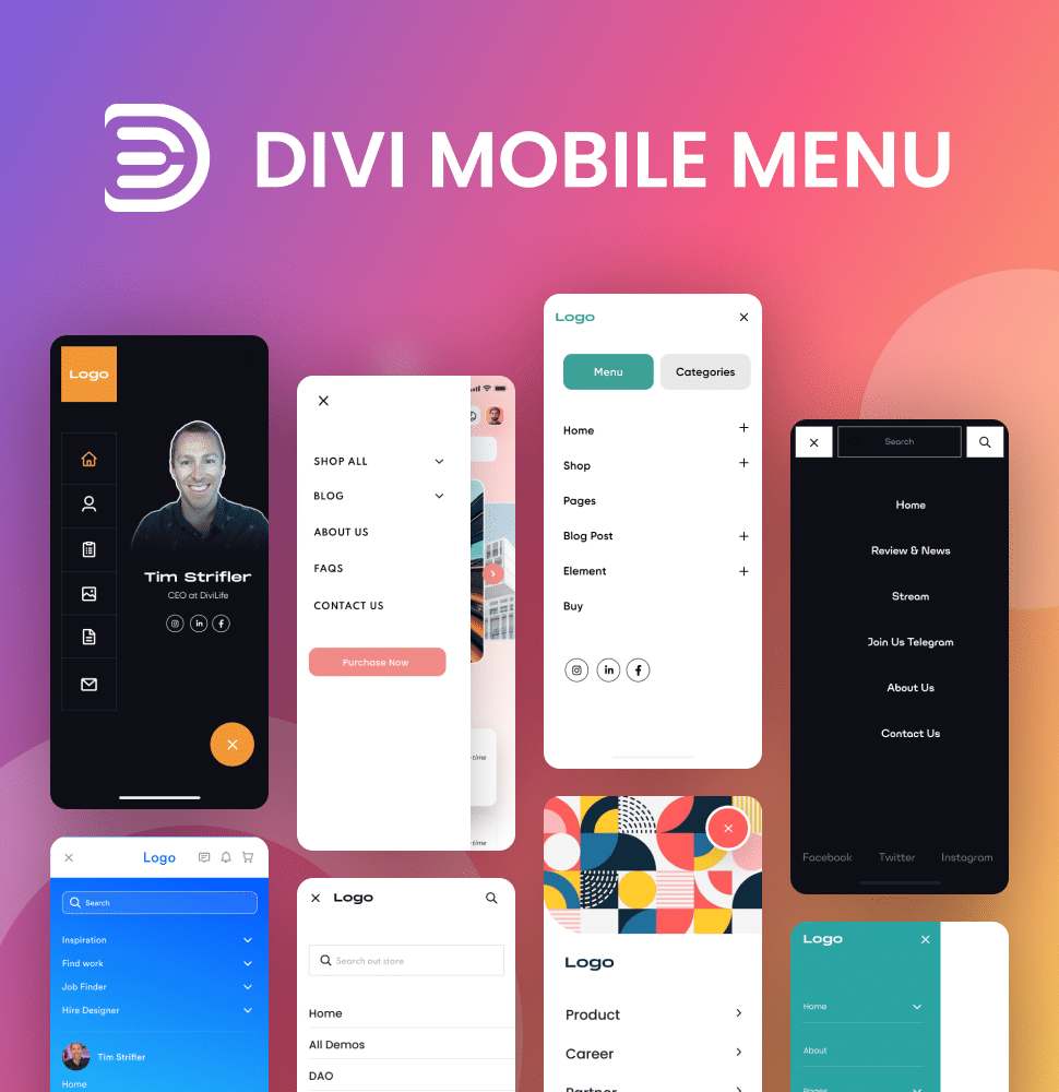
When it comes to creating custom mobile menus in Divi, our Divi Mobile Menu plugin beautifully addresses the limitations of default options. Many Divi users have found the standard mobile menu to be lacking in flexibility, resulting in a less engaging UX than the one desired. With Divi Mobile Menu in your locker, you can easily overcome these challenges by using premade layouts or designing your mobile menu from scratch with the intuitive Divi Builder.
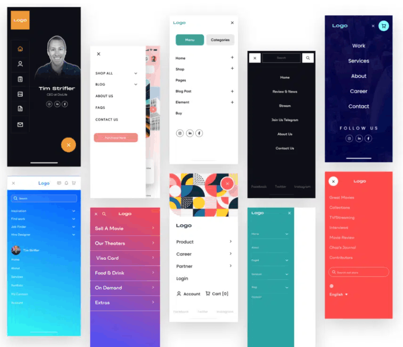
What truly sets Divi Mobile Menu apart from other plugins is its extensive customization capabilities – put simply, there’s nothing else to compare. You’ll have access to all of Divi’s default modules and design elements, allowing for a level of personalization that can match your brand’s identity. Incorporating unique elements such as background images, custom fonts, and colors ensures that your mobile menu is not only functional but also attractive to the eye. You’ll be able to change everything from animations to location and design.
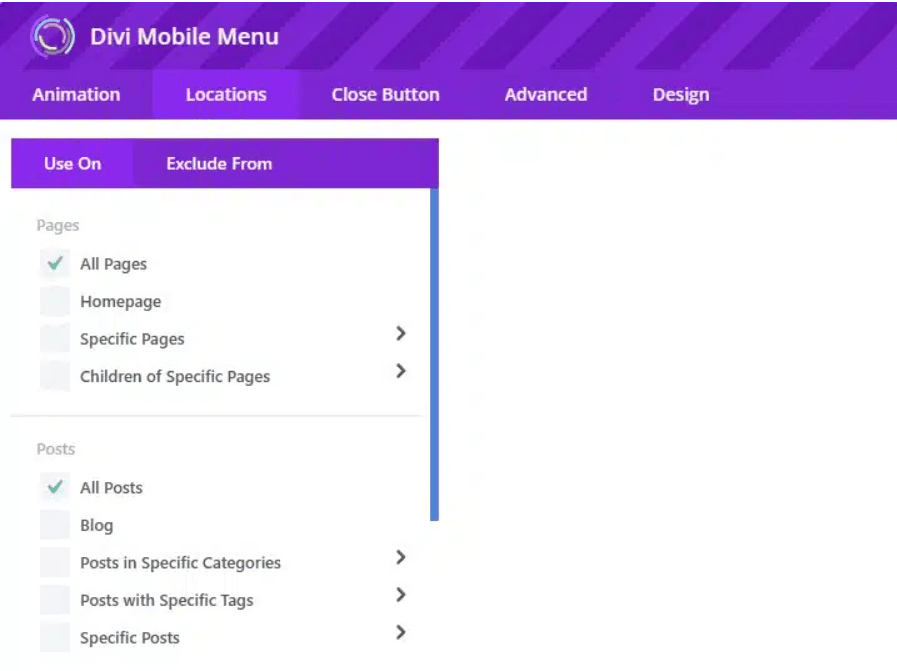
Best of all, we’ve designed our Divi Mobile Menu to be user-friendly for both beginners and advanced users, so everyone can come join the party! A straightforward setup process makes it easy to implement, and our plugin is compatible with both the Divi Theme and Extra Theme, ensuring integration with your existing projects.
One of our favorite features of Divi Mobile Menu is its ability to implement collapsing nested menus in a way that’s much quicker than using Divi’s native Theme Builder method. This nifty technique allows for a clean and organized navigational structure, making it easier for visitors to explore complex site hierarchies without being overwhelmed by the number of pages on offer.
For those ready to take their mobile navigation design into the stratosphere, creating with Divi Mobile Menu is simple – check out our guides to getting started, and how to import premade layouts. By choosing Divi Mobile Menu you’ll be creating a cohesive and engaging mobile experience that keeps visitors coming back for more!
Enhancing your mobile menu with Divi layouts
Pairing your mobile menu design with Divi layouts can take your mobile menu design to the next level. Divi layouts help maintain a consistent look and feel across your site, including your mobile menu. This consistency reinforces your brand identity and improves user experience.
Using Divi layouts for mobile menus offers real convenience for users. Divi’s intuitive drag-and-drop page builder allows users to create and customize layouts without any coding knowledge. This way, you can incorporate interactive elements directly into your mobile menu, as well as change the likes of colors, fonts, and backgrounds. Such customization ensures that your mobile menu will look visually appealing and serve as an effective tool for guiding visitors through your website.
Key benefits:
- UX: Custom mobile menus improve navigation and engagement by providing intuitive access to site content. A well-designed mobile menu can increase user satisfaction and reduce bounce rates.
- Brand consistency: Divi layouts enable mobile menus to align with the overall site design, reinforcing brand identity. Such consistency is vital for user recognition and trust.
- Advanced functionality: Features like full-screen overlay menus with background images can be implemented, creating visually appealing navigation options. Integrating social media icons directly into the menu boosts connectivity without cluttering the interface.
Looking for a wide range of Divi layouts that complement your mobile menu? Look no further than our own Divi Bricks, which features mobile-optimized layouts, and our Divi Headers Layout Pack which offers professional quality results that can all be optimized for mobile. Here’s a taste!

You can also combine layouts with a dedicated tool such as our Divi Mobile Menu plugin to offer even greater features and functionality.
How to create a global Divi mobile menu without a plugin
Another option – albeit a lengthier one – is to go plugin-free. You won’t have the same number of customization options that you’ll find in our Divi Mobile Menu tool, but you can still achieve a good-looking mobile menu by following these steps:
Step 1: Setting up the Menus in WordPress
- Navigate to your WordPress Admin dashboard.
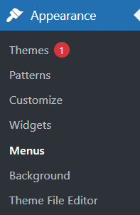
- Go to Appearance > Menus.
Step 2: Create or Select Your Menu
- Ensure that your desired menu is selected for editing. If you need to create a new menu, do so and assign it as your Primary Menu.

Step 3: Organize Menu Items
- Drag and drop your menu items to set up the hierarchy, ensuring any submenus are correctly nested. Remember to save changes.
Step 4: Test Your Mobile Menu
- Access your site on a mobile device or use a responsive design tool.
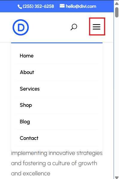
- Click on the hamburger icon to ensure that the menu appears correctly.
- Ensure that all links work and you’re good to go!
“Manually creating a mobile menu in Divi offers developers fine-grained control and can be a great learning experience. The main advantages are complete customization freedom and no reliance on third-party plugins. However, it’s time-consuming, requires CSS knowledge, and can be challenging to maintain across updates. For complex sites or those wanting quick implementation, a dedicated plugin like Divi Mobile Menu often proves more efficient and feature-rich in the long run.”
– Jennifer Rodriguez, Lead Developer at Divi Life
Advanced CSS customizations for your Divi mobile menu
Heads-up, you can customize your Divi mobile menu’s appearance and functionality even further through the miracle of CSS snippets! Check out the following examples for starters:
Add text left of the hamburger menu icon
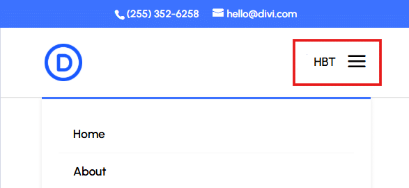
To provide a more intuitive experience for your users, you can add text next to the hamburger icon. This addition helps clarify the purpose of the icon and makes it clear that clicking on it will reveal the mobile menu.
/* Add text to the left of the hamburger icon */
#et_mobile_nav_menu:before {
  content: 'MENU';
  font-size: 14px;
  position: absolute !important;
  bottom: 29px;
  right: 40px;
  color: #000000;
}
*/
Replace ‘MENU’ with your desired hamburger text. You can also adjust the font-size, bottom, right, and color values to match your design preferences.
Change the collapse hamburger icon to an X when open
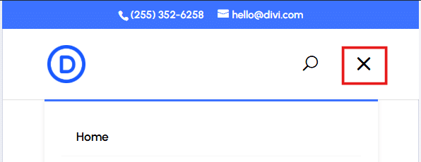
To create a clear visual cue for closing the mobile menu, you can modify the hamburger icon to an ‘X’ when the menu is expanded. This change helps users understand that clicking on the icon will collapse the menu.
/* Change the hamburger icon to an 'X' when the menu is open */
.mobile_nav.opened .mobile_menu_bar:before {
  content: '\4d';
  font-size: 32px;
  color: #000000;
}
*/
Adjust the font-size and color values as needed.
Remove the mobile menu top border line
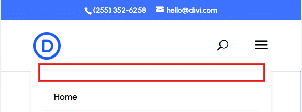
To achieve a cleaner look, you can remove the default blue top border from the mobile menu.
/* Remove the top border from the mobile menu */
.et_mobile_menu {
  border-top: none !important;
}
*/
Center-align mobile menu link items
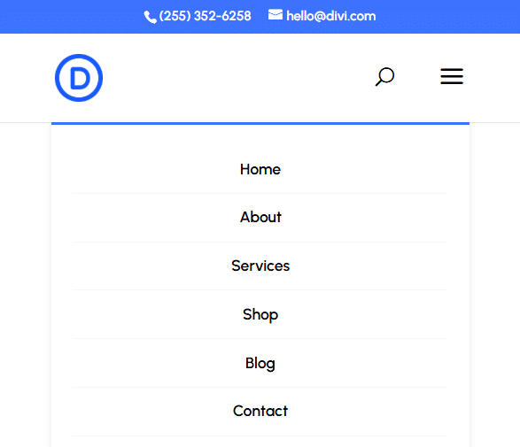
To create a more polished mobile menu, center-align the menu items.
/* Center align the mobile menu link items */
.et_mobile_menu li {
  text-align: center !important;
}
*/
Make the mobile menu full-width
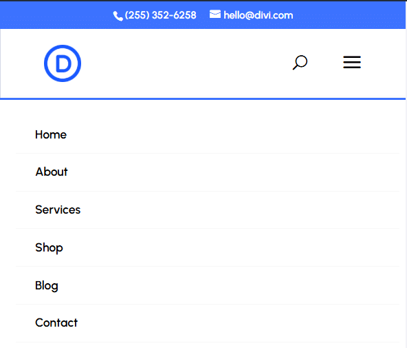
To provide a more immersive experience, you can make the mobile menu span the full width of the screen.
/* Make the mobile menu full width */
.et_mobile_menu {
  min-width: 100vw;
  margin-left: -10vw;
}
*/
Make the mobile menu full height
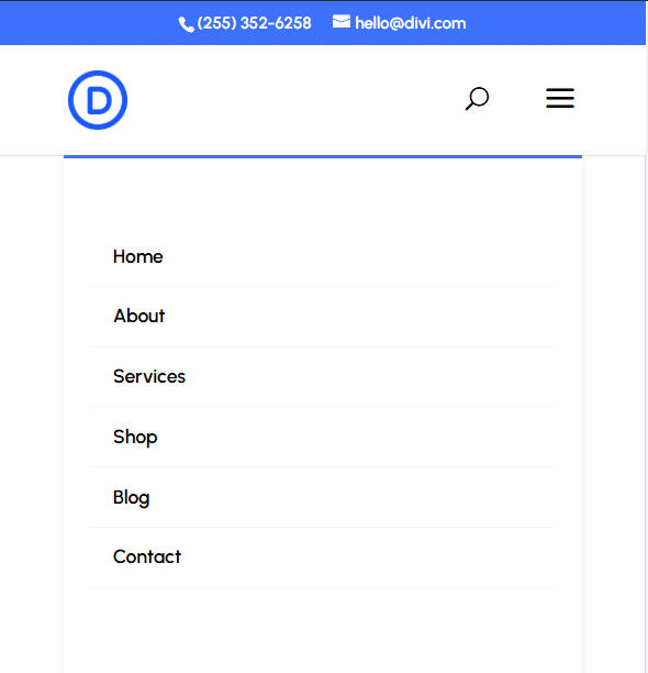
To create an app-like experience, you can make the mobile menu span the full height of the screen, which is great for longer menus that require some scrolling.
/* Make the mobile menu full height */
.et_mobile_menu {
  min-height: 100vh !important;
  min-height: -webkit-fill-available;
  padding-top: 50px !important;
}

html {
  height: -webkit-fill-available;
}
*/
Changing hamburger menu icon colors
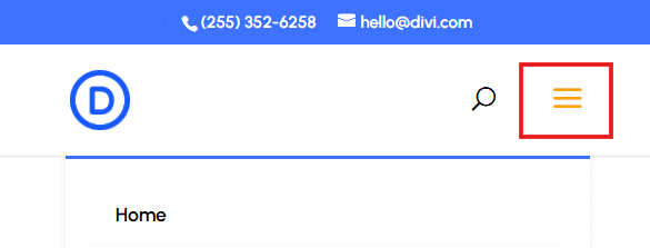
To match your design and branding, customize the color of the hamburger icon.
/* Change the hamburger icon color */
.mobile_menu_bar:before {
  color: #000000;
}
*/
Replace #000000 with your desired color. Our example uses #FFA500 for standard orange.
Changing mobile menu font size
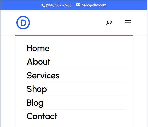
To improve readability, adjust the font size of the mobile menu items.
/* Change the mobile menu font size */
.et_mobile_menu li a {
  font-size: 18px !important;
}
*/
Adjust the font-size value as needed.
Transform your mobile navigation: Get started with Divi Mobile Menu
If you hadn’t already noticed, we’re living in mobile-first times, and that means presenting your site in a way that works for smartphones. Transforming your website’s mobile navigation into something super appealing is a must-have for any brand wanting to charm their visitors into staying put.
To create something unique and memorable, nothing comes close to using our Divi Mobile Menu plugin. Whether you choose to use one of the plugin’s premade layouts or design from scratch with the intuitive Divi Builder, the possibilities are endless. This powerful tool not only enables you to create your dream designs, but you’ll be improving your site UX and aiding navigation – you’ll be amazed at the improvements a great-looking menu can bring to overall performance.
Get started with Divi Mobile Menu and unlock the full potential of your Divi website today!


0 Comments