Introduction
The Divi Mobile Menu plugin seamlessly integrates the robust capabilities of the Divi Builder, providing you with the flexibility to design unique and engaging mobile menu experiences with Divi. With this feature, you can leverage the full spectrum of Divi Builder modules to craft dynamic and visually appealing menus tailored for mobile devices. You can incorporate accordion modules for streamlined navigation, blurb modules for concise and eye-catching information, text modules for clear communication, or any other module you desire! You can even add premium Divi modules to your mobile menus.
Divi Mobile Menu empowers you to unleash your creativity, allowing you to gorgeous and highly functional mobile menus that align with your website’s aesthetics and user experience goals. Whether you’re aiming for a sleek and modern design or a more elaborate and intricate menu structure, the Divi Mobile Menu enables you to achieve your vision with ease.
Step 1: Download and install
To download Divi Mobile Menu, go to your Divi Life Customer Portal > Purchase Downloads or if you’re All Access Pass Member go to Divi Life Customer Portal > All Access Pass Downloads
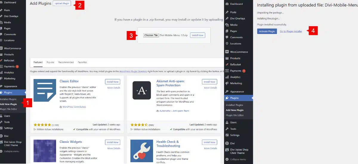
1. Go to WordPress dashboard > Plugins > Add new
2. Upload plugin
3. Choose file > Select divi-mobile-menu.zip
4. Activate plugin
Step 2: Adding a new mobile menu
Creating a custom mobile menu with the Divi Mobile Menu plugin is easy! After you create your menu and configure the settings, Divi Mobile Menu will automatically replace the default Divi dropdown menu with your custom mobile menu when the user presses the mobile menu icon (aka hamburger icon).
Let’s get started creating the mobile menu:
Go to the new Divi Mobile Menu option at the left sidebar of your WordPress admin screen. Then, click on ‘Add New’.
Create your Mobile Menu using the Divi Builder and add all the modules you need and style it as you need. You can

Step 3: Setting Up the Divi Mobile Menu Options
Divi Mobile Menu comes with a lot of useful features that can be used to change the behavoir of the menu.
3.1 Animation
Within the animation settings, you have the ability to define both an entrance and an exit animation. The entrance animation takes effect when the menu is opened, imparting a dynamic visual element to the unveiling of the menu. Conversely, the exit animation is activated upon closing the menu, providing a visually engaging transition as the menu gracefully exits the screen. This dual animation feature enhances the overall user experience, adding a touch of sophistication to both the opening and closing interactions of the menu.

3.2 Locations
The Location tab presents an overview of all available pages, posts, categories, products, archive pages, 404, etc., allowing you to specify where the mobile menu will be displayed. To showcase the menu across the entire site, simply choose “All Pages” and “All Posts” from the available options. This streamlined selection ensures that your mobile menu seamlessly extends its presence throughout every page and post on your website. This level of control provides you with the flexibility to tailor the visibility of your mobile menu based on your specific content structure and user navigation preferences.

3.3 Close button
Location:
In the styling section, you have the option to customize the appearance of the Divi Mobile Menu close button. Under the location settings, you can precisely define where the close button appears within the Divi Mobile Menu container. Choose from strategic placements such as Top Left, Top Center, Top Right, Bottom Left, Bottom Center, or Bottom Right.
Moreover, you have granular control over the vertical and horizontal offset. These settings allow you to fine-tune the exact positioning of the close button, ensuring it aligns perfectly within your mobile menu layout. This level of customization ensures that the close button not only complements the overall design but also enhances user experience by being intuitively placed for easy accessibility.
Close Clicking outside the Content:
Enable this option if you want to enable the option to close the menu by clicking outside the content.
Hide Main Close Button:
Enable this option to disable the close button.
Customize Close Button:
When enabled, you can style the font color, font size, background color, radius and padding.

3.4 Advanced
In the advanced tab, there are two options:
- Advanced.
CSS Class Trigger: Add a custom CSS class that can be used on any module to trigger the mobile menu. This is useful if you wan to use any other module to open the mobile menu.Add default Divi Menu: This will add the deafult Divi menu to the Divi Mobile Menu. - Conditios: Using the logic conditions to show the menu based on user logged, time, etc.

3.5 Advanced
On this tab, you can control the size of the mobile menu and its position.
- Sizing: From here, change the width and height values. You can adjust the values as you need it in your front end.
- Positioning: From here, enable the vertical center if you need the menu to be centered. Disable it and play with the vertical and horizontal offset to create a slide in mobile menu.
