Introduction
In this tutorial we will show you how to create a custom close button to your Divi Overlays using a few lines of HTML and CSS. Divi Overlays has a default close button in the upper right hand corner of the screen that can be customized (size, color, background, etc). However, in some cases, you may want to create completely custom close buttons to have more control over the design and position.
This majority of this tutorial will focus on the design and position of the custom close button, but keep in mind that you can make anything a close button by simply adding the CSS class close-divi-overlay to the element.
For example, you can add the CSS class close-divi-overlay to the CSS class field of a Divi button module, to make the button close the overlay when clicked.
Now, let’s get started creating a completely custom close button and positioning it outside of the main content.
Step 1: Go to Divi Overlays Posts
1. Go to WordPress dashboard
2. Open Divi Overlays CPT (Custom Post Type)
3. Go to your Divi Overlays Post
Step 2: Add the Custom Close Button
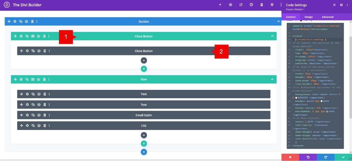
1. Add a new row, this row will contain the module for your custom close button.
Note: This row must be first row on your content.
2. Add a new code module and paste the code below.
<pee><a class="close-divi-overlay" href="#close">×</a></pee>

<style>
a.close-divi-overlay {
/* a) Control the position of the close button*/
right: -20px!important;
top: 30px !important;
z-index: 10010 !important;
display: block !important;
position: absolute !important;
/* b) Size of the close button - Adjust if is necessary*/
width: 46px !important;
height: 48px !important;
font-size: 28px !important;
line-height: 48px !important;
/* c) Background and border of the close button*/
background: none repeat scroll 0 0 #ffffff !important;
border: solid 0px #fff !important;
border-radius: 50% !important;
box-shadow: 0 2px 3px #888 !important;
/* d) Font styles*/
color: #333 !important;
font-family: !monospace !important;
font-weight: bold !important;
text-align: center !important;
text-decoration: none !important;
  }
</style>
The code is in two parts, the HTML part with the class and the href (URL) and the CSS used to style the close button. Notice the Class used for this is “close-divi-overlay”
You can check this tutorial for more was to close an Overlay.
Here are the instructions to set your custom close button:
a) Change the position of the close button:
To change the position of the close button, if in your design does not align with the section, please play with the RIGHT and TOP values. You can use negative values if you need it.
b) Change the size of the close button:
To change the size of the close button, change the values WIDTH, HEIGHT, FONT-SIZE and LINE-HEIGHT.
c) Styles of the close button:
To change the styles of the background color of the close button, change the BACKGROUND value by your HTML or RGBA color.
The border settings by default are set with 0px with white color. If you want to change the values, you can change the width and color.
If you want a square shape for the close button, please change the BORDER-RADIUS to 0%.
d) Font Styles
Here you can change the values for the color of the X icon.
Change the FONT-SIZE value to make the icon bigger or smaller.


