Divi Fullscreen Mobile Menu: Improving User Experience and Engagement
For those looking to wow their customers and keep them engaged online, a well-designed mobile menu is a no-brainer. The best menus increase accessibility, improve navigation, and reinforce brand identity through visual appeal.
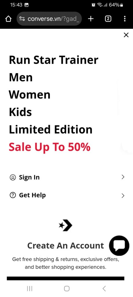
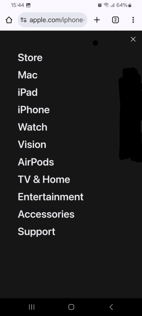
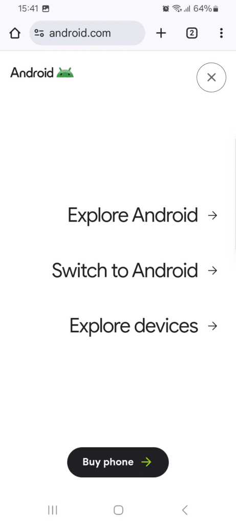
Many Divi users encounter issues with the default mobile menu, such as inconsistent displays, limited customization options, and performance hiccups. A customized full-screen mobile menu is a technique used by big brands such as Android, Apple, and Converse, and if you’re using Divi you can implement one as well!
To overcome the limitations of Divi’s default options, third-party plugins – such as those created by ourselves at Divi Life – offer much greater flexibility and customization. Here we’ll guide you through creating a full-screen mobile menu using Divi’s built-in features, then show you how our nifty Divi Mobile Menu plugin allows you to create beautiful menus in a matter of clicks.
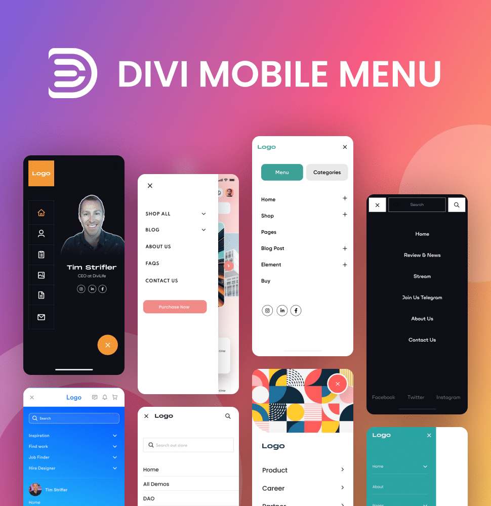
Create Better Mobile Experiences
The Divi Mobile Menu plugin allows you to craft custom mobile menu experiences like the big brands do. No more smushing your desktop menu into a mobile screen! 📲
Creating a Custom Full-Screen Mobile Menu with Divi
A custom fullscreen menu improves navigation and looks better on the eye, potentially increasing user engagement. A full-screen layout allows users to easily access menu items minus any clutter, leading to a more enjoyable browsing experience. Here’s how to achieve this using Divi:
Step 1: Setting up the Menus in WordPress
- Navigate to your WordPress Admin dashboard.
- Go to Appearance > Menus.
Step 2: Create or Select Your Menu
- Ensure that your desired menu is selected for editing. If you need to create a new menu, do so and assign it as your Primary Menu.

Step 3: Organize Menu Items
- Drag and drop your menu items to set up the hierarchy, ensuring any submenus are correctly nested.
Step 4: Activate CSS Classes
- Click on the Screen Options tab in the upper right corner.
- Check the box for CSS Classes to enable adding custom classes to your menu items.

Step 5: Adding Custom CSS for Fullscreen Menu
Go to Divi > Theme Options > General > Custom CSS or add it directly to your child theme’s style.css file.
/* Fullscreen Mobile Menu Styles */
.et_mobile_menu {
    position: fixed;
    top: 0;
    left: 0;
    width: 100vw;
    height: 100vh;
    background-color: #fff; /* Change background color as needed */
    z-index: 9999; /* Ensure it appears above other content */
    display: flex;
    flex-direction: column; /* Align items vertically */
    justify-content: center; /* Center items vertically */
    align-items: center; /* Center items horizontally */
    opacity: 0; /* Hidden by default */
    visibility: hidden; /* Hidden by default */
    transition: opacity 0.3s ease-in-out, visibility 0.3s ease-in-out;
}

.et_mobile_menu.open {
    opacity: 1; /* Fully visible when open */
    visibility: visible; /* Make it visible */
}
Step 6: Making the Header Full Width
- Customize Header Settings:
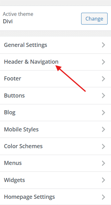
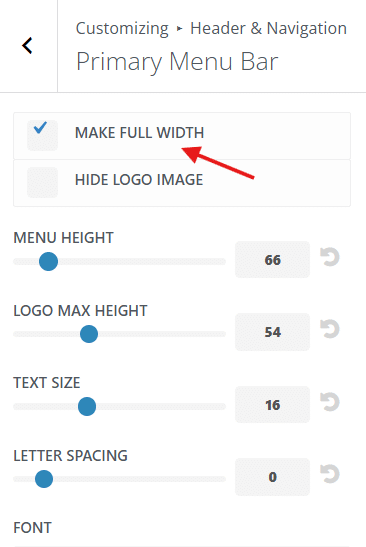
- Navigate to Divi > Theme Customizer > Header & Navigation > Primary Menu Bar.
- Enable the option for Make Full Width, then select Publish.
Step 7: Test Your Mobile Menu
- Access your site on a mobile device or use a responsive design tool.
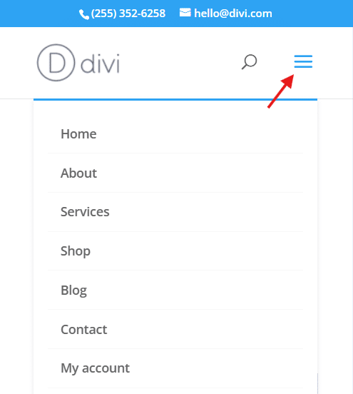
- Click on the hamburger icon to ensure that the fullscreen menu appears correctly.
- Ensure that all links work and you’re good to go!
Advanced CSS Customization Techniques for Styling
Advanced CSS customization is required to boost the mobile menu’s user experience and visual appeal. While Divi offers basic styling options, these can be limiting when trying to achieve a unique and engaging design, so it’s time to put your coding hat on! Custom CSS allows for greater flexibility, enabling you to create a more tailored experience to capture the attention of your customers.
Changing z-index for Menu Visibility
The z-index property is essential for ensuring that your mobile menu appears on top of other elements on the page. Using z-index effectively can prevent your menu from being obscured by other components, ensuring a seamless user experience.
To adjust the z-index of your mobile menu, use the following code snippet:
        .custom-mobile-menu {
          z-index: 100;
        }
Adding Animations and Transitions
Incorporating animations and transitions can also make your menu more visually appealing and stand out amongst a sea of static pages! For example, a slide-in effect can draw attention to the menu as it appears, keeping users engaged on your site and more likely to stay for longer.
Here’s how to implement a slide-in animation:
        .custom-mobile-menu {
          animation: slideIn 0.5s ease-in-out forwards;
        }

        @keyframes slideIn {
          from {
            transform: translateX(-100%);
		opacity: 0;
          }
          to {
            transform: translateX(0);
		opacity: 1;
          }
        }
Controlling the duration and timing of animations also contributes to a great user experience, ensuring that transitions feel smooth and natural.
For a fade-in effect, you can use the following snippet:
@keyframes fade-in {
  from {
    opacity: 0;
  }
  to {
    opacity: 1;
  }
}

.fade-in-element {
  animation: fade-in 2s ease-in forwards;
}
And here’s how to achieve a bounce effect:
@keyframes bounce {
  0%, 20%, 50%, 80%, 100% {
    transform: translateY(0);
  }
  40% {
    transform: translateY(-30px);
  }
  60% {
    transform: translateY(-15px);
  }
}

.bounce-element {
  animation: bounce 2s infinite;
}
Customizing Menu Items
Styling individual menu items, including fonts, colors, and spacing, enhances the overall look of the list, keeping everything within your chosen brand aesthetic.
You can customize menu item appearance with the following CSS:
        .custom-mobile-menu a {
          color: #fff;
          font-size: 18px;
          padding: 10px 20px;
        }
Incorporating Backgrounds: Images and Videos
“Incorporating background images and videos into your fullscreen mobile menu can further enhance the user experience. Dynamic backgrounds create a visually engaging and immersive environment that will encourage your users to navigate through your website.”
– Jennifer Rodriguez, Lead Developer at Divi Life
Adding Background Images
To add a background image to your fullscreen mobile menu using CSS, follow these steps:
body #page-container .et_slide_in_menu_container {
    background: url('INSERT IMAGE URL') center center !important;
    background-size: cover !important;
}
In this code snippet:
- body #page-container targets the main page container
- .et_slide_in_menu_container selects the fullscreen mobile menu container
- background: url(‘INSERT IMAGE URL’) sets the background image URL
- center center positions the image at the center of the container
- background-size: cover ensures the image covers the entire background area
When choosing background images, opt for high-resolution, relevant visuals that complement your site’s theme and branding.
Incorporating Background Videos
To add a background video to your fullscreen mobile menu, use the following HTML structure:
<div class="video-background">
    <video autoplay muted loop id="myVideo">
        <source src="INSERT VIDEO URL" type="video/mp4">
    </video>
</div>
Pair this HTML with the corresponding CSS to ensure the video fits the background:
.video-background {
    position: absolute;
    top: 0;
    left: 0;
    width: 100%;
    height: 100%;
    overflow: hidden;
}

video#myVideo {
    position: absolute;
    top: 50%;
    left: 50%;
    min-width: 100%;
    min-height: 100%;
    width: auto;
    height: auto;
    z-index: -1;
    transform: translate(-50%, -50%);
}
This CSS ensures the video covers the entire background area and is positioned behind other content. Customize the video settings as needed, such as autoplay, muted, and loop.
When using background videos, consider potential load times and mobile data usage, as videos are power-hungry and can impact page performance, especially on slower connections.
Combining Images and Videos
For an even more dynamic background experience, consider combining images and videos to truly wow your visitors. You could use a static image as a fallback for slower connections or older devices that may not support video playback.
This approach ensures that all users have access to a visually appealing background, regardless of their device capabilities, and they’ll be more likely to stay onsite.
Troubleshooting Common Issues with Divi’s Native Mobile Menus
While creating a full-screen mobile menu with Divi can certainly give your site a visual boost, you may encounter some common issues along the way. Let’s take a look at these challenges and how to solve them – a glitchy, laggy mobile menu is of no use to anyone!
- Menu not covering full screen: Ensure the height is set to 100vh and 100vw (viewport height and width) instead of 100% to make sure the menu covers the entire viewable area of the screen. Set the margins (top and bottom) to zero on mobile to avoid any gaps.
- Menu overlapping content: Check for z-index issues and ensure the mobile menu has a higher z-index than other elements. This adjustment ensures that your menu appears above all other content.
- Slow performance: If speeds are sluggish, optimize images and videos used in the menu to reduce load times. Use lazy loading techniques for background images and videos. Consider using performance optimization plugins like WP Rocket, W3 Total Cache, or Smush if you’re experiencing any speed issues on your Divi site.
- Menu not responsive: Ensure all custom CSS is mobile-friendly and uses relative units like em and rem as opposed to absolute units like px. Test the menu on various devices and screen sizes to ensure compatibility. Tools like BrowserStack or Sitechecker’s Mobile-Friendly Test can be helpful for this purpose.
- JavaScript conflicts: A range of conflicts can arise when using third-party plugins, from duplicate script loading to incorrect script dependencies and placement. Check for console errors in your browser’s developer tools and troubleshoot by disabling conflicting scripts or plugins one by one to get to the root of the problem.
The Better Option: Use the Divi Mobile Menu Plugin
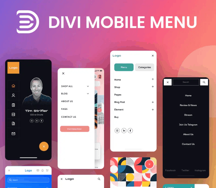
So, our mission at Divi Life is to improve the functionalities of the Divi theme, and we’ve created an innovative collection of plugins to achieve our goal. All of our tools take native Divi into new territory, by adding advanced features and greater customizations, improving the user experience, and giving more power to website builders.
Among these, our Divi Mobile Menu plugin provides the best method for creating full-screen mobile menus – it’s easy for Divi designers of all levels to use and offers far greater customizations than you can achieve through coding, as we’ll detail below:
- Wide range of pre-built layouts: You can easily import various pre-designed layouts into your Divi Builder, allowing for quick customization without starting from scratch.
- Animation settings: Plugin menu settings allow you to customize entrance and exit transitions to create engaging animations.
- Location settings: You can specify where your mobile menu appears, ensuring it integrates smoothly into your site’s navigation structure.
- Close button customization: Adjust the placement and styling of the close button for precise control over your menu’s appearance.
- Advanced options: Further options allow you to utilize CSS class triggers and logic conditions to control menu visibility based on user behavior, providing a tailored experience for your visitors.
Overall, our plugin gives you the keys to unlock the full potential of your mobile menus, transforming them into an attractive component that aligns with your website’s overall design.
Next, we’ll take a look at how to get started.
Step-by-Step: Creating a Full-Screen Mobile Menu with Divi Mobile Menu
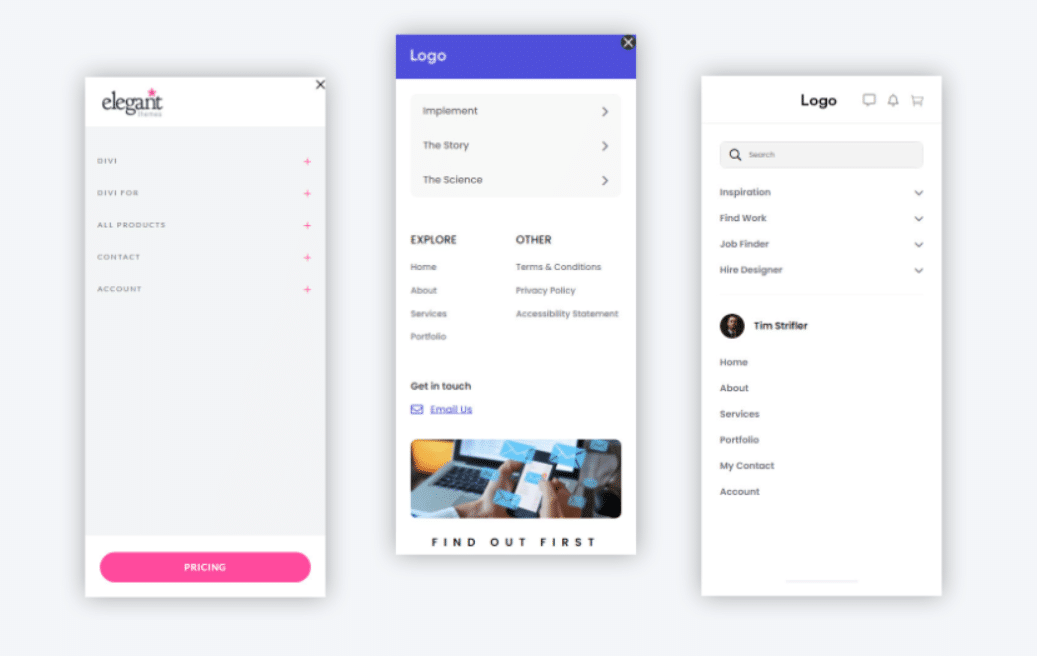
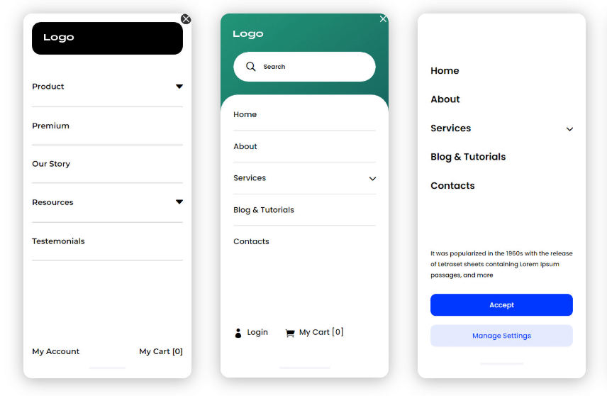
The Divi Mobile Menu plugin simplifies the process of creating a full-screen mobile menu, making it far easier than using the native Divi alternative. With its user-friendly interface, you can set up a lip-smacking mobile menu in just a few steps:
Step 1: Install the Plugin
- Download the Divi Mobile Menu plugin from the Divi Life website.
- In your WordPress dashboard, go to Plugins > Add New.
- Click Upload Plugin, select the downloaded zip file, and activate the plugin.
Step 2: Create a New Mobile Menu
- Navigate to the Divi Mobile Menu in the WordPress sidebar.
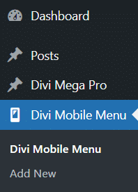
- Click on Add New to create a new mobile menu.
- Use the Divi Builder to add modules like Accordion, Blurb, or Text to structure your menu.
- Configure your menu items and arrange them as desired.
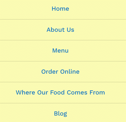
Step 3: Customize the Menu
- In the menu settings, adjust Animation options for entrance and exit transitions.
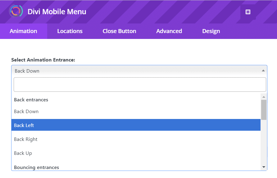
- Set Location to define where the menu appears (e.g. all pages).
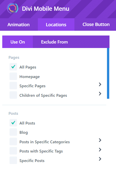
- Customize the Close Button for positioning and styling.
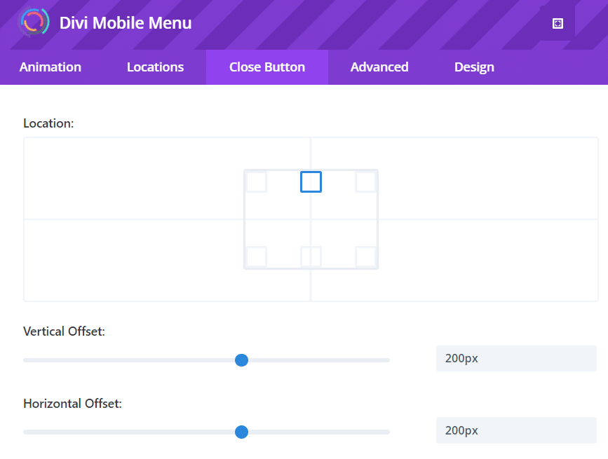
- To make the menu full screen, go to Design > Sizing.
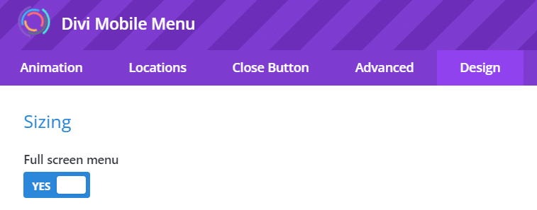
Step 4: Style with CSS
You can use custom CSS to modify the hamburger icon to an ‘X’ and adjust padding and backgrounds. Here’s an example of how to transform to ‘X’ when the menu is active:
.hamburger.open div:nth-child(1) {
    transform: translateY(10px) rotate(45deg);
}

.hamburger.open div:nth-child(2) {
    opacity: 0;
}

.hamburger.open div:nth-child(3) {
    transform: translateY(-10px) rotate(-45deg);
}
And here’s how to adjust the padding and background when the menu is active:
.hamburger.open {
    padding: 12px; /* Adjust padding when open */
    background-color: #e74c3c; /* Background color when open */
    transition: background-color 0.3s ease;
}
Pair this with the accompanying JS code:
document.querySelector('.hamburger').addEventListener('click', function() {
    this.classList.toggle('open');
});
Step 5: Preview and Optimize
- Remember to test the menu on various devices to ensure responsiveness across different screen sizes.
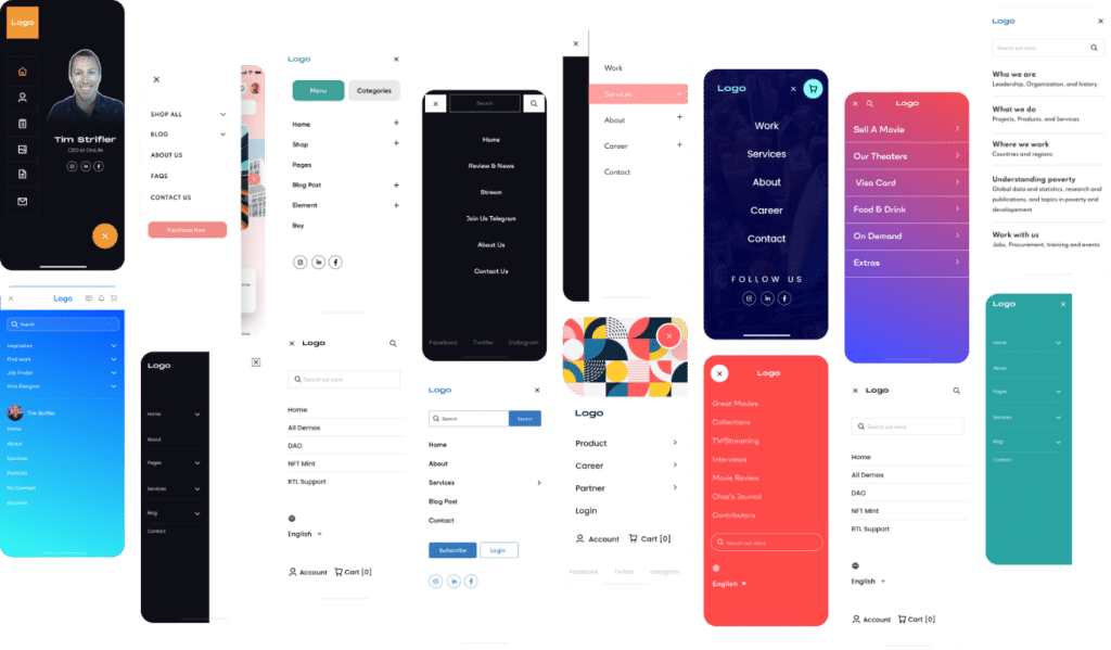
- Optimize performance by minimizing heavy elements. Check out some more cool examples below!
Divi Mobile Menu for Advanced Functionality
We get it – there are a lot of users out there who’ve encountered challenges and frustrations with Divi’s default mobile menu options. Limited customization, a lack of advanced features, and potential usability issues are commonly found gripes. Our Divi Mobile Menu plugin effectively addresses these problems, allowing developers to build menus free from the usual constraints.
Our plugin integrates with the Divi Builder and comes with extensive customization options – including animations, backgrounds, and typography – plus advanced functionality such as CSS class triggers and logic conditions. A responsive design ensures compatibility across all devices.
By improving navigation, the Divi Mobile Menu leads to lower bounce rates and higher user satisfaction. It enables the creation of professional, visually appealing mobile menus that align perfectly with your website’s design. Best of all, its user-friendly interface allows even those without extensive coding knowledge to implement advanced features with ease.
Don’t miss out on transforming your mobile navigation – try the Divi Mobile Menu plugin today!


Thanks for sharing!