How to Create a Divi Carousel Without a Plugin
We are back with another awesome Divi tutorial! And in today’s tutorial, we’re showing you how to create a Divi Carousel WITHOUT using a plugin! 😍
Not only do you not need to purchase a plugin, but this carousel tutorial is also EXTREMELY lightweight. All the carousel resources are 100% contained to the page you place it on, and it won’t slow down your website!
BONUS: You can get a FREE Divi Carousel Layout when you subscribe to the Divi Life Email List 🥳
(keep reading to see the free carousel layout and to download the freebie)
UPDATE: We’ve recently released Divi Modules Pro which includes our gorgeous (and feature rich) Divi Carousel Module. And best of all, our new and unique dynamic asset framework will only load the carousel Javascript and CSS on the pages you’re actually using the module! This means it won’t slow down your website like other carousel modules will! You can now have your cake and eat too 🥳
Carousels are super popular right now in web design, however they can be rather resource intensive. And most of the Carousel plugins/modules that are available today will load ALL the plugin’s resources on ALL pages of your website no matter what.
We discovered this the hard way when we were building our new Divi Popup demo site for Divi Overlays. So we ditched the plugin we were originally using and built the carousels manually using the Slick.JS Slider Carousel Framework. It’s worth noting that just about every Carousel module or plugin on the market uses either Slick or Swiper to power the carousels. So with the method in today’s tutorial (adding the carousel framework to just one self-contained page), you’re getting the same functionality but without the full site bloat!
After we built the testimonial carousels shown above, we decided to release a pack of Divi Carousel Layouts (19 total). If you like the sound of simply importing layouts to the Divi Library and then customizing the layouts with Divi, then definitely check out the carousel layouts! Okay, let’s take a look at what we’ll be creating today! (And if you want to skip the tutorial and download the Divi carousel layout for FREE, click here)
The Divi Carousel Layout We’ll Be Creating
- Create a one-column row with desired carousel items (modules)
- Add the CSS class to the column & modules (to define the carousel & carousel items)
- Add the carousel CSS/JS code to the page in a code module
Not so bad right? Let’s get started!
Step One: Create a One-Column Row with Desired Carousel Items (Modules)
We’ll be creating the carousel within the Digital Marketing Layout by Elegant Themes, and using the gorgeous service blurbs as carousel items.
But whether you’re following along exactly using the same layout, or if you’re creating the row and modules from scratch, make sure to keep the following things in mind:
- The row must only have one column
- All the modules that you want in the carousel must be within the same column
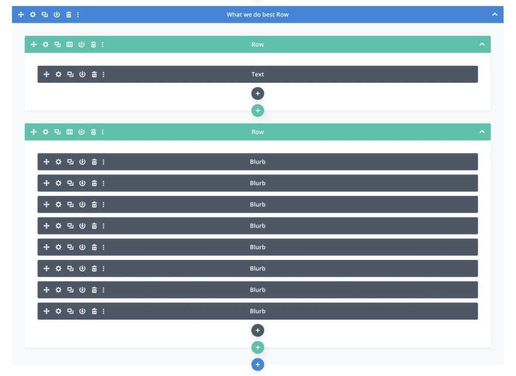
For the Digital Marketing Layout, we created a new row and moved all the service blurbs into a new one column row, so now they look like this:
Step Two: Add the CSS Classes to the Column & Modules
This step has two parts:
- Adding a CSS class to the column (only done once to define where our carousel is).
- Adding a CSS class to each module in the carousel (needs to be done for each module in the column).
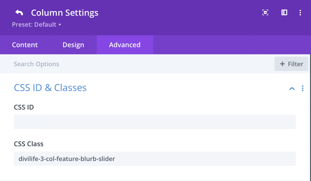
Simply copy the CSS class below, and add it to the CSS class field within the Advanced Tab of the column (not to be mistaken with the row):
divilife-3-col-feature-blurb-slider
It should look like this:
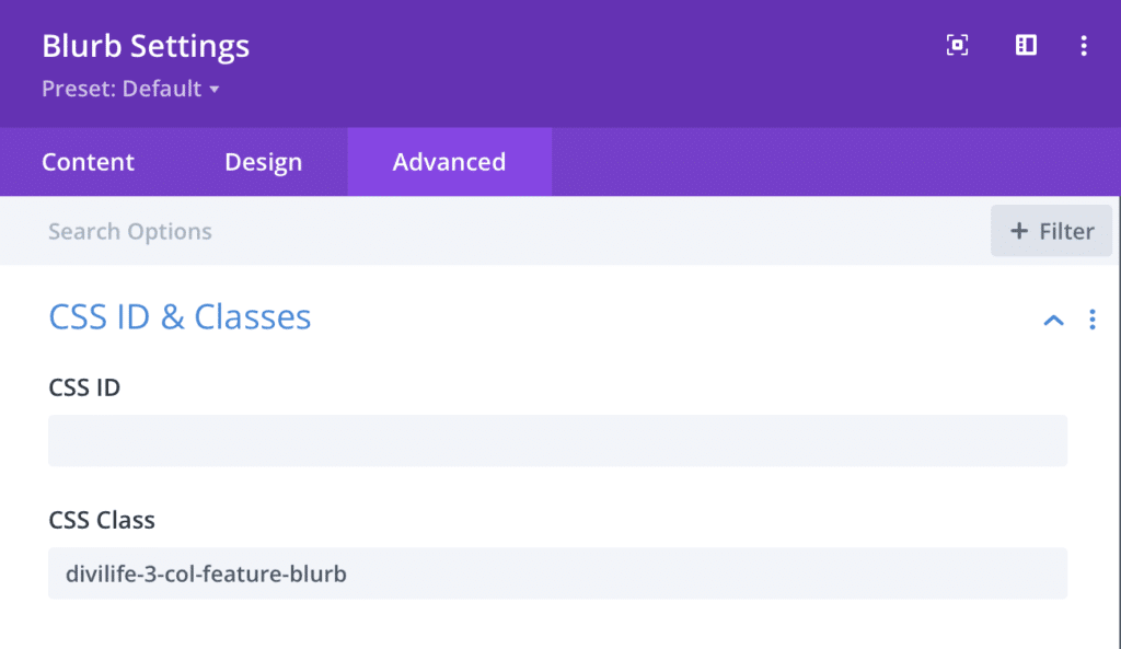
divilife-3-col-feature-blurb
It should look like this:
Step Three: Add the Carousel CSS/JS Code to the Page in a Code Module
So we’ve made this step VERY easy for you by containing ALL the CSS/JS code to just one code module. It’s not only easy to set up, but it’s also easy to maintain. And it’s the best method for performance purposes too. Other similar tutorials I’ve seen will have you add the Slick.js code to Divi Theme Options in the integration tab. The downside to this method is it will load the entire Javascript framework on every page of your website which isn’t ideal or necessary.
There’s essentially three parts to the code below:
- The Slick.js Javascript Framework (being pulled from a CDN)
- The CSS for our Carousel
- The Script that controls the settings for our carousel (slider buttons, pagination dots, number of slides in view, etc)
Now, copy the code below and paste it into a code module in a separate one-column row.
<style>

.slick-slider {
  -webkit-user-select: none;
  -moz-user-select: none;
  -ms-user-select: none;
  user-select: none;
  -webkit-touch-callout: none;
  -khtml-user-select: none;
  ms-touch-action: pan-y;
  touch-action: pan-y;
  -webkit-tap-highlight-color: transparent;
}
.slick-list {
  position: relative;
  display: block;
  overflow-x: hidden;
  margin: 0;
  padding: 0 0 0px;
}

.slick-track:before, .slick-track:after {
  display: table;
  content: '';
}

.slick-slide {
  position: relative;
  float: left;
  height: 100%;
  min-height: 1px;
}

.divilife-3-col-feature-blurb-slider .slick-arrow, .divilife-3-col-feature-blurb-slider .slick-arrow:hover, .divilife-3-col-feature-blurb-slider .slick-arrow:focus {
position: absolute;
font-size: 0;
line-height: 0;
padding: 0;
color: transparent;
outline: none;
background: rgba(122,105,230,0.3);
border: none;
cursor: pointer;
top: 50%;
transform: translateY(-50%);
z-index: 100;
height: 50px;
vertical-align: middle;
border-radius: 50%;
width: 50px;
}
.divilife-3-col-feature-blurb-slider .slick-prev { left: -50px; }
.divilife-3-col-feature-blurb-slider .slick-next { right: -50px; }

.divilife-3-col-feature-blurb-slider .slick-arrow:before {
font-family: ETmodules;
color: #000;
background: transparent;
opacity: 1;
font-size: 46px;
vertical-align: middle;
color: #7a69e6;
text-align: center;
}
.divilife-3-col-feature-blurb-slider .slick-arrow:hover:before { opacity: 0.8; }
.divilife-3-col-feature-blurb-slider .slick-prev:before { content: '\34'; }
.divilife-3-col-feature-blurb-slider .slick-next:before { content: '\35'; }

.entry-content ul.slick-dots {
  position: absolute;
  bottom: 0;
  display: block;
  width: 100%;
  padding: 0;
  margin: 0;
  list-style: none;
  text-align: center;
}
.slick-dots li {
  position: relative;
  display: inline-block;
  margin: 0 5px;
  padding: 0;
  cursor: pointer;
}
.slick-dots li button {
	font-size: 0;
	line-height: 0;
	display: block;
	width: 10px;
	height: 10px;
	padding: 0;
	cursor: pointer;
	color: transparent;
	border: 0;
	outline: none;
	background-color: #B7B7B7;
  border-radius: 10px;
}
.slick-dots li.slick-active button { background-color: #f7828e; }

@media(max-width: 980px) {
	.divilife-3-col-feature-blurb-slider .slick-prev { left: -32px; }
	.divilife-3-col-feature-blurb-slider .slick-next { right: -30px; }
}
@media(max-width: 499px) {
	.divilife-3-col-feature-blurb-slider .slick-prev { left: -26px; }
	.divilife-3-col-feature-blurb-slider .slick-next { right: -24px; }
}

</style>

<script src="https://cdnjs.cloudflare.com/ajax/libs/slick-carousel/1.6.0/slick.js"></script>
<script>
jQuery(document).ready(function() {
	jQuery('.divilife-3-col-feature-blurb-slider').slick({
    dots: true,
    slidesToShow: 3,
    slidesToScroll: 1,
    responsive: [
      {
        breakpoint: 980,
        settings: {
          slidesToShow: 2
        }
      },
      {
        breakpoint: 767,
        settings: {
          slidesToShow: 1
        }
      }
    ]
  });
});
</script>In the Column Design Settings:
- Make the Width 90%
- Make the Max Width 1220px
In the Blurb/Module Design Settings:
- Make the Content Width 100%
- Make the Margin Top/Bottom 50px
- Make the Margin Left/Right 25px
- Reduce the Drop Shadow Blur Strength to 20px and decrease the Shadow Color Opacity to .10
Remember to duplicate the module settings to ALL modules within your column!
We’re done! It should look like the below image or the live carousel at the top of this post (if you followed along exactly).





Excelent post Tim,
Greetings from Madrid.
Thanks Luis 🙂
awesome Tim, I tried before slick.js now i get what i did mistake in my process, thankyou
Keep going Tim
You’re welcome! Yeah it can be tricky, and one little mistake can keep it from working. I’m glad the tutorial was helpful for you 🙂
Thank you! Is this possible for the blog module? If so, a tutorial for that would be amazing!
Yes it is possible with the blog module. You can see we have several blog carousels in our Divi Carousel Layout Pack. Here’s the demo for one of them.
I’m really excited about using this with the blog module. How would you set the CSS class for the individual elements from the blog roll?
Hi Tim, I have downloaded the layout and unzipped it but when I try to import it in the divi library it says it does not seem to be a WXR file or that the number of the WXR is not valid or missing. Have I done something wrong?
Thanks for your help
Hmm that doesn’t make sense. It should be a .JSON file which is what Divi layout files are. Maybe reach out to Divi support?
Awesome Layout and Design!
Is it possible to have two blurb boxes in a vertical row? E.g. two icons / logos one above the other?
Hi Niklas,
Yes, it’s possible, but you would have to restructure the carousel. In this tutorial, the column is the carousel container and all the child items within the column (the modules) are the carousel items. To achieve what you’re asking, you would have to make the section the carousel container, and then make the rows the carousel items. So you would have to move the CSS classes to those levels. There will probably be a lot of adjustments to make to control the spacing and sizing to make it look good. But it’s definitely achievable. 🙂
Can we use a a testimonial module as a single colunm slider?
Yes, absolutely. We actually have a one-column testimonial carousel as part of our Carousel Layout Pack. You can see the demo of it here.
You can customize this tutorial to do that by replacing the blurb modules with testimonial modules, then adjusting the code in Step Three (lines 118 and 124) to be slidesToShow:1. You’ll then also want to decrease the row’s max-width to your desired width (~500px or so).
Is automatic start possible?
Yep! Just add autoplay: true, after slidesToScroll: 1, in the code module in Step Three. 🙂
I used it for the testimonials. How can I make all columns the same height? That you get something like read more text.
Now I have them all in different sizes and a lot of blank space.
I’m not really sure of a way to do this automatically with Divi’s built in testimonial module. Your best option is probably to try and trim them down so they’re all close to the same length. Or, you can trim them and have a “Read More” link like you said that links to either a Divi popup, or another page altogether.
Is it possible to remove the arrows without having the previous and next buttons show up? The dots with autoplay work really well.
Hi Pamela, yes it’s definitely possible. Add arrows: false, in between lines 118 and 119 of the code in Step Three. 🙂
Thank you. One more…what tweak would I need for adjusting the autoplay a bit slower? Sharing this is really a gift!
I’m glad you like it, Pamela! 🙂
You can add autoplaySpeed: 3000, to the code after line 117. 3,000 (milliseconds) is the default, so try changing it to 2,000 or less. 🙂
This is great stuff. This is something I’m going to use. ThanksTim
I’m glad it’s helpful for you, Bert!
Do you have a cat?
Dog 🐶
Can this carousel be done full-width?
Definitely. You can make it full width by changing the row to full width. You will likely also want to increase the number of slides showing though which can be done by editing the slidesToShow value in line 118 of the code in Step Three.
hi Tim, i have import the free layout but it doesnt look like a carrousel this is the website http://www.nunamasajes.com
I follow the steps, maybe you can point me where i am wrong?
Do you have Divi’s Performance settings turned on in Theme Options? You may need to turn them off, at least for testing this. For example, the Defer Jquery may break the functionality of the carousel. Let me know!
I have errors on the website with this layout
This is great, I just (finally) learned about multiselect & efficiency tools…
FYI: I downloaded your layout example and I modified the script in the code module with the latest download link from slick, plus I made the sample to perform smooth scrolling with autostart, like this:
jQuery(document).ready(function() {
jQuery(‘.divilife-3-col-feature-blurb-slider’).slick({
speed: 9000, autoplay: true,
autoplaySpeed: 0,
cssEase: ‘linear’,
slidesToShow: 3,
slidesToScroll: 1,
responsive: [
{
breakpoint: 980,
settings: {
slidesToShow: 2
}
},
{
breakpoint: 767,
settings: {
slidesToShow: 1
}
}
]
});
});
Awesome, love it! Thanks for sharing! The Slick framework is SUPER powerful. I love that you made changes 🙂
What if you want to make the carousel a global module to use on the site? Is this possible?
Definitely! However since the carousel is two Divi rows, you will need to make the entire row(s) or the section global. 🙂
Hi.
If I understand correctly, this should work will all type of modules, right?
I just tried it with images, but they appear just in one column and not as a carousel.
Hi.
If I understand correctly, this should work will all type of modules, right?
I just tried it with images, but they appear just in one column and not as a carousel.
Am I missing something, or do I have to modify the code maybe?
Bob
Hi guys.
I’m sorry!
Please forget about my 2 comments.
It works all good. I put the first css class in the wrong position.
🙁
shame on me.
Good job!
Sounds good, thanks for reporting back! 🙂
Hello, in the desktop version it works perfectly, but in the mobile version it generates a width that exceeds the device screen
Fixed, it was a conflict between the carousel and a module with a horizontal scroll
Okay great, glad you got it figured out 🙂
I am having this same issue. I have no horizontal scroll though. Any idea what I can change to adjust this? Thanks
Having the same issue, I solved it by just removing the left and right arrows altogether. That did the trick for me. Also, play with the width of either the section/row or blurbs for mobile version.
Merci beaucoup Tim pour ces connaissances.
See you
You’re welcome 🙂
Thank you it’s really helpful
You’re welcome! 🙂
Just what I was looking for. Awesome!
Needed a simple image carousel.
https://www.dejavustudios.net/
Awesome, I’m glad that did the trick! 🙂
hello i can´t get the spacing between the items in the columns to spread apart seems like the margin is not working did both the tutorial and dowloaded from the page botht the same , any suggestions ?
Try adjusting the width instead of the padding/margin. If the freebie download is having the same problem, then there is likely something on your page that overwriting the styles.
Hello Tim!
Thanks a lot for this great tutorial! Before I give it a try, I’d like to make sure this doesn’t slow down web pages too much. Any chance you could tell me your opinion on that?
Best wishes 🙂
It shouldn’t slow down your website at all since it’s only loaded the carousel code on the page you place the carousel. This is why we built it this way. Other solutions will load the carousel code on all pages regardless if you’re using a carousel. The exception to this would be our carousel in Divi Modules Pro. We built the modules in our plugin to only load code when it’s being used.
https://divimodules.com/modules/divi-carousel-module/
Hi, many thanks for this tutorial! Is it possible to get a scrolling effect without stops (for logos for example)? How to do that?
Hi Juliane,
Unfortunately the carousel library doesn’t have a feature for a continuously scrolling carousel. So I don’t think it’s possible with this javascript framework.
Hey Tim! Everything works really well, thank you! But I have a strange problem that I have a really big white space under the carousel. It’s like the white space is the space the column takes when I’m in the Divi builder. Can you help me?
Hi Glenn,
Try removing any padding or margin from within the rows and columns. That should typically solve it
This is fine for me but I have. a few thing I’d like to adjust as I’m trying to stay away from plugins. wonderful Is there a way to make the images in the carousel butt up against one another? Is there a way to make the carousel show more than three blurbs at a time? Is there a way to make the carousel rotate slowly through the images automatically? I’d also like to have the bullets removed but could not find where in the script.
You can customize the script to control the number of columns that show at once in the carousel. You can also adjust the auto rotate too. There’s documentation for the carousel script that we link to at the beginning of this tutorial that will show you how to make those changes.
Thank you for the helpfull tutorial!
Is it possible to make the item in the middle larger and the two next to it smaller?
It’s possible but would require a lot of customization, which is beyond the scope of this tutorial. Sorry!
Hi
thank you a lot, I just used it for my mobile version. It worked perfectly.
Thank you a lot
That’s awesome! I’m glad it’s working well for you 😎
Hi! Thanks for the tutorial, it was really helpful. I’ve put up a carousel with 9 images, and I adjusted 4 columns to scroll 2 at a time, but there’s a specif point where instead of continuing moving forward, it comes back one and then it advances to the one it was supposed to have gone. Do you know where I can fix it? I couldn’t find it by myself.
Thank you!!
Hi Tim,
it is great tutorial!
But I have small problem with dots. They always appear on left side of the collum (screenshot: https://ibb.co/S5q5C7X), not in center and I don´t know what I mest up. Even if I paste unmodified code, they are still on left.
Thanks fot answear!
Hanka
This works pretty well. On my site, however, the navigation arrow on the right side is shown as three (3) symbols: a “target” (circle inside a circle), a “down-arrow”, and a “right-arrow”. The left side is only showing the “target”. I haven’t drilled into the code yet, but wondering if someone else already has?
I was mistaken in my previous comment, the left side of the carousel is showing a “target”, a “down-arrow”, and a “LEFT-arrow”. I downloaded the section JSON to see if that made a difference. It did not.
One last thing 🙂 – here’s a link to the screenshot: https://www.portal608.com/images/carousel-thing-t.png
Hey, Tim – this is great, thank you. I am having trouble with the navigation arrows – 3 divi icons are being displayed at each side of the grouping. Here is a screenshot: https://www.portal608.com/images/carousel-thing-t.png and here is the live website where it’s occurring: https://www.friendsofthefort.org/#events Any pointers?
Hi Randy,
There’s a weird glitch with Divi’s importer that it will stripe out certain characters within custom CSS blocks. So likely, the slash (\) got stripped out of the CSS for the slider arrows. Compare the CSS in your layout to the CSS in lines 66-67 on the blog post. If you make sure those match, then that should fix it. 🙂
I got your email about this on the very day I was about to go searching for a solution, so perfect timing – thank you!
I had a good play around with the code and discovered you can do quite a lot with it by tweaking values.
I’m using it to display images and got it looking exactly how I wanted.
Love it!
Thanks Steve! 🙂
Hi Tim!
Thanks for the tutorial, it has been really useful 😊
I was wondering if it’s possible to have two different carrousels in the same page? I tried and the one code module works for both of them, is there any way to change this? (so each carrousel can have their own timing and colors).
I was wondering this too!
I hope someone can answer this.
Hello Tim, thank you so much for this tutorial.
I followed this tutorial and everything looks great when I’m logged in to my wordpress dashboard, but when I view the site on incognito, or I’m not logged in, it just shows a vertical single column row of blurbs. Any chance you could possibly advise/have a look? Would be so greatly appreciated!!!
The carousel is on the home, web design and portfolio pages.
It’s likely cache since it’s working while logged in (there’s no cache when logged in). So clear your cache and it should fix it. This will help: https://divilife.com/how-to-clear-all-your-caches-on-your-divi-wordpress-website/
Hey Tim,
Thanks so much for this one! This is exactly what I needed and it actually works. I cant express how much this has been of great help to me! Subscribing to divilife was one of the best choices I have ever made and I’m looking forward to more!
🥳
Is there a way to make it react to the mouse wheel scrolling?
Hey Tim, excellent work. I have few questions for you:
1- How can I have arrows buttons of slider outside of slider container down side just like: https://www.chime.com/blog/.
2- How I have nested columns like image+ text,image+ textimage+ text.
Please reply asap
Adding this to my page breaks any existing JS . Any ideas what could be causing the conflict?
Hi Tim,
thank you very much for the light weight methode to create a logo carousell!!!
I have one question on that:
How can i verticall align (form the center) the logos in the carousell? At the moment the are all allingend at the very top.
Thank you so much for your feedback,
Willy
Hi Tim,
Thanks a lot for this carousel that helped me a lot.
I want that the carousel stops after the last module (so not an inifite left-right scroll), and ideally the arrow should be hidden.
Would it be possible?
Thanks a lot,
Anto
I love this–it works beautifully!
Just one question: does the carousel code have a parameter that allows Divi’s native hover image to display? — currently, upon hover instead of swapping to hover image, it just shows a blank. I know…I’m pushing it.
nevermind—for hover, instead of swapping image, I just used the filters (in design tab)–and all works well. As all the hover did was show a full-color version of same image.
Hi Tim,
I just moved from brizy builder to Divi for good; One feature I really miss that Brizy offers as default is the carousel feature where you can add dynamic content.
For example if i select dynamic content “latest posts” it will automatically update the corousel content.
It displays “featured images” “post title” and “author name”
Can we do something similar in Divi ?
I had this working, but after the latest update it stopped working 🙁 Any ideas?
It seems that there is a compatibility issue with the following plugin: https://www.cookieyes.com/.
It seems there is a conflict with Cookie Yes plugin. Any ideas of how to sort this out? Thanks!
Thanks for this tutorial Tim. It works perfectly for me, except for one thing…
The dots at the bottom of the carousel have tiny dots at the bottom corner of them, and I have no idea how to get rid of them… Here’s an image: https://ibb.co/JKWGYhg
Any ideas?
can i move arrow to one row and draggable list(blurb) to other
Hi! If I have a two-row slider showing 6 columns, is there a way that I can incorporate an equal height piece of code, as there are one or two columns that are not aligning even if I try and use padding with vh instead of pixels. Hope this makes sense?
I am just trying to get all the columns to align across different screens given it’s two rows and not just one like in this tutorial 🙂
Great tutorial, thank you! slidestoshow is not working for me. I will only display 4 slides no matter what that number is set to. Have you seen that before? Any tips? it’s being used inside a Divi Overlays pop up.
Works great but is there a way to remove the dots?
Thank you for this tutorial it’s all worked great except one small problem.. I can’t seem to get a space between them they are butted right up against each other. I’ve tried padding margin all sorts 🙁
Hi Tim, great tute, thanks for that.
For anyone finding the slick-dots align left instead of center, I did this workaround:
In the Row Settings/Advanced/Custom CSS/Main element, add
text-align: center;
Then in first content module (I used Blog module), Settings/Design/Text and align it left (if you want your module content to align left!). Extend to other modules.
Thank you for this great resource. I am using testimonials; the profile image is now next to the text instead of above. This changes on mobile when we see a single column. I am looking for a way to change this. Do you have a tip for me?
Tim I knopw you uploaded this a fair while ago and any support you’ve offered here is amazing. Just in case you still ghet notifications here just a very quicxk question – if I want to use images rather than blurbs do I need to change anything eg the CSS class? Does it need to say image instead of ‘blurb’ in the class and in the code?
Nope it should work just fine, as long you add the correct classes to the modules as shown in the tutorial. 🙂
Works great too thanks
HI,
I don’t know anything about coding but was able to follow this! Yaii! Only 2 hiccups that are driving me nuts.
I want the whole sliding carousel to have smaller images (its so big now) and no matter what I do they don”t change site. Also there is no distance between the images even though I tired over and over to find what I missed… Please help.
Right now the carousel is at the bottom of the page…
Glad you were able to follow it! I looked at the page and it looks like you got it figured out. Great job! 🙂
Hello! great tutorial. thank you.
I have a question can we equalize the blurbs because my text is not the same, some columns are short and some are long can make all of them equal?
You can try setting a minimum height for the blurb module. Let me know if that solves it!
Amazing, thank you SO much for sharing this Tim.
You’re welcome!!
First of all thank you! This is exactly what I needed and it’s stunning.
I have spent an hour just trying to remove the circle background around the arrows. I’m sure I’m missing something very obvious, but I just want the arrows without a circle background for the slider navigation. Thank you!!
Here you go! Add this CSS code to the bottom of the CSS code:
.divilife-3-col-feature-blurb-slider .slick-arrow, .divilife-3-col-feature-blurb-slider .slick-arrow:hover, .divilife-3-col-feature-blurb-slider .slick-arrow:focus {
background: none;
}
Or, you could also find the CSS in the code and change the background color to none.
Hi, I uploaded the layout to my thank you page 😉 But it does not work. What could be wrong?
Did you try importing our free carousel layout to see if that works on your page?
Hi Tim! Thanks for this amazing, comprehensive tutorial. I’ve followed the instructions and used images instead of blurbs, and everything worked perfectly. My only issue is that the left-right arrows and dots beneath the carousel change position (bumping up) after I scroll through two or three of the images. I’ve been trying to figure out why the arrows and dots keep shifting up but I’m lost. Is this a glitch? All of the images I’m using are the same size (1920px x 1080px) so I don’t think it’s being caused by inconsistent image size. I’ve looked through the code a few times, and even tried to adjust the dots position, but to no avail. If you have any insight into what I can do to prevent this from happening, I would greatly appreciate it.
I’m assuming it’s because the heights of the carousel items are different. So when one comes into view that is a different height, it will shift the layout slightly.
Hello, sorry to bother you, but I followed your tutorial, and it’s not creating a carousel. I added images with text attached to them, but nothing is happening. Can someone please help me?
Did you try importing the free layout that comes with the tutorial?
I have tinkered and tinkered and tinkered. There’s something I’m not figuring out. I have it set to autoplay and removed the arrows, but I want a single testimonial displayed at a time. The testimonials are offset. I can’t figure out how to get them to be centered on the page. I’ve set slidestoshow: to 1. It looks like there’s a couple commas missing the javascript, which I added. Any hints on how to fix this? I’m using this option as the carousel slider I had installed is causing a new conflict.
Thanks a lot. Congratulations. Time to learn more about Divi Theme.
An excellent article to create a divi carousel without any module. thanks, Tim Strifler
You’re welcome! 🙂
Thanks for the tutorial, it helped me a lot!
I replaced the arrows but I can’t give it the size and proportion I want, how can I do it?
You can see how to control the carousel in the documentation for Slick Slider here: https://kenwheeler.github.io/slick/
can we add star ratings while using portfolio module
That’s not a built in option unfortunately.
Hi there, I’m using your carousel without a plugin on the homepage of our site. There are 41 modules in the carousel currently.
When you view it on a responsive device, you can see all the dots for each slide (which seems a bit much). And when you click on the dots, it doesn’t correctly interact. For example, if I click on any dot in the 2nd or 3rd rows, they don’t change color and don’t take me to the correct image.
Ideally there’d be a lot fewer dots to contend with on responsive options. Can you help?
For a carousel of that size, I’d recommend removing the dots. You can do this by setting the dots to false in the carousel script.
Hello! I followed the exact instructions and it wasn’t presenting as a carousel. I then imported the free layout and imported the section to my website and it wasn’t a carousel either 🙁
It sounds like you have some optimizations that may be blocking the carousel library from loading on your site. If so, try excluding it, or deactivating the optimizations temporarily.
Carousel is very slow to load. It takes more than ten seconds. https://frejm.cz/ It is under title Společenské akce. Can you help me?
It’s loading slow since they’re all YouTube videos. The code for YouTube’s video player loads pretty slow. So it doesn’t have anything to do with the carousel itself. It’s just the vast number of videos that are being loaded. You can optimize the YouTube videos so that they won’t load until the user clicks on them. This is the best for performance. And it will simply show a picture of the video until the user clicks on it to load the full video. This (among lots of other things) is what I teach in my speed optimization course: https://divilife.com/divi-speed-course/
I’m trying this with video modules, but the arrows and dots are not appearing. Any idea what the issue could be?
Can you try with videos embedded in a text module instead and see if it works?
Is this ADA compliant?
This carousel is powered by “Slick Slider” which does have the ability to control the slider with tab key and arrow key. But I’m not sure if that would make it fully ADA compliant or not. You can see the setting options on the Slick Slider page: https://kenwheeler.github.io/slick/
Thanks! I’ll check it out.
This worked great…but is there any way to make subsequent sections visible/not visible by what blurb is currently in the middle of the Carousel?
Hi Nate, that’s likely possible with some custom coding, but not something that is built into the carousel script by default.
Hi What if i just wanted 1 full width col?
🙂
Yes, you can definitely do that. You just set that in the carousel script. Just set slidesToShow: 1, for all breakpoints. 🙂
Is there an option to auto play the sliding ?
Yes, absolutely! Just add this to the code:
autoplay: true,
autoplaySpeed: 2000,
Great post! I love how you broke down the steps for creating a Divi carousel without using a plugin. The visuals really helped clarify the process, and I appreciate the tips on customization options. Can’t wait to try this out on my website!
Glad you enjoyed it! 🙂
This tutorial was incredibly helpful! I always thought carousels required a plugin, but now I see how simple it can be with Divi. Thank you for breaking down the steps so clearly! Can’t wait to try it out on my site!
You’re welcome! 🙂
Hey Tim, I used this code – thank you! – and put video embeds as the modules – i’m embedding reel-sized videos from Vimeo. When the page is published, the dots are really far below the videos (like it’s accounting for the height if their were only one column instead of 3). I also can’t get the colors of the arrows and dots to change even though I’m editing the hex codes in the code.