How to Create a Divi Footer Reveal Effect Without a Plugin
In this tutorial, I’m going to show you how to create a engaging Footer Reveal Effect on your Divi Website!
Footer Reveals are a great way to take a boring and ordinary footer, that is typically ignored, and make it engaging so that your users actually look at it.
How to Create a Footer Reveal in Divi
- Add the CSS to Make the Footer Fixed & to Add Margin to the Main Content (CSS Provided)
- Adjust the CSS to Fit Your Exact Footer Size
That’s it! Super Simple!
Step One: Add the CSS to Make the Footer Fixed & to Add Margin to the Main Content (CSS Provided)
Copy and paste the CSS code shown in the box below to your custom CSS box within Divi Theme Options, or in your Divi Child Theme.
#main-content {
	margin-bottom: 458px;
	z-index: 2;
}

#main-footer, .et-l--footer {
    z-index: 0;
    position: fixed;
    bottom: 0;
    right: 0;
    left: 0;
}
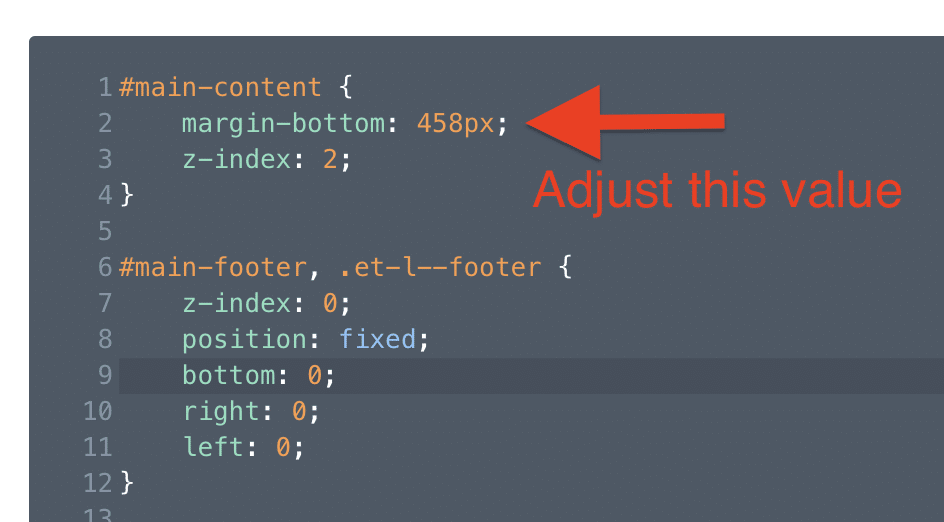
Step Two: Adjust the CSS to Fit Your Exact Footer Size
Depending on the height of your footer, you may have to adjust the CSS to accommodate the size of your footer.
So if your main content is not revealing the entire footer, or it’s revealing too much (showing whitespace), then you’ll need to adjust the value for the margin-bottom.
You can either eyeball it until you get it right. Or, you can inspect the element with your browser developer tools and get the exact height of your footer, and use that value for the margin-bottom.
Keep in mind your footer will change height at different widths, so test it on different browser widths to accommodate the shift in heights. You could also write media queries to adjust the shifts in footer height at different widths, but we won’t cover that in this tutorial.
And we’re done! We now have a sneak Footer Reveal effect that will engage our users and draw them into whatever the footer entails (so make your footer matter!).
Let us know what you think in the comments, and don’t forget to subscribe below to get access to all of our Divi Tutorials, Freebies, and more.


Hello,
Thanks for this tutorial.
I set up on a site and it really gives a nice effect!
Nice tutorial. Definitely an eye-catcher for additional info.
However, it requires multiple media quires for different mobile devices. Especially when using such a large footer with multiple columns like this sample layout. So I just used this effect for desktop viewports only by dropping this in a “min-width:1024px” media query.
Yeah the footer reveal is definitely best suited for Desktop, so that’s a great solution 🙂
I only want the footer reveal to show on desktop only, not on tablet or mobile. How can I do this?
Change the min-width to 1080px 🙂
Thank you for the great tutorial.
Since i have installed the reveal footer, the blogpost pages are transparant on the left and right side.
Only the column with the text scrolls over the footer. How can i fix that?
The website isn’t online yet, my client doesn’t want that yet. The site is http://www.asantecare.nl
Problem is solved with z index negative
Great! 🙂
For anyone that wants to know how to make it only for their desktop version (I did because it was too short from my mobile version) –
@media only screen and (min-width: 992px) {
#main-content {
margin-bottom: 475px;
z-index: 2;
}
#main-footer, .et-l–footer {
z-index: 0;
position: fixed;
bottom: 0;
right: 0;
left: 0;
}
}