Using the CSS Selector Trigger Feature
Setting popup Click Triggers on Divi Modules is very easy for most modules. You simply just add the overlays unique CSS ID to the module’s CSS ID field in the advanced tab. However, you may have noticed that there’s only one CSS ID field per module. This means that you can not set the overlay trigger for just one aspect of the module. And for certain modules this can be problematic. For example, you may want to have different triggers for each slide button in the slider module, or make the call to action module’s button a trigger without making the title and description text a trigger too. With the standard method of setting click triggers the above examples aren’t possible (without manual button creation), so that’s why in Divi Overlays 2.0 we added the CSS Sector Trigger Input field. This gives you the ability to add your own CSS string which will become a click trigger for the overlay. This gives you much more control on setting click triggers.
So how does this work? In a nutshell, you just add the CSS string to the CSS Selector Trigger input field for the element on the page that you want to trigger the overlay. If that sounds complicated, it’s easier than you may think, and we’re going to help you through it below with shortcuts for some of the more common modules.
Here’s the two steps you’ll need to follow:
- Add a unique ID to the module where you want to set a click trigger
- Copy the CSS class of the element you want to be the trigger
- Add your custom ID plus the CSS class to the CSS Selector Trigger field and hit save!
Let’s break those steps down!
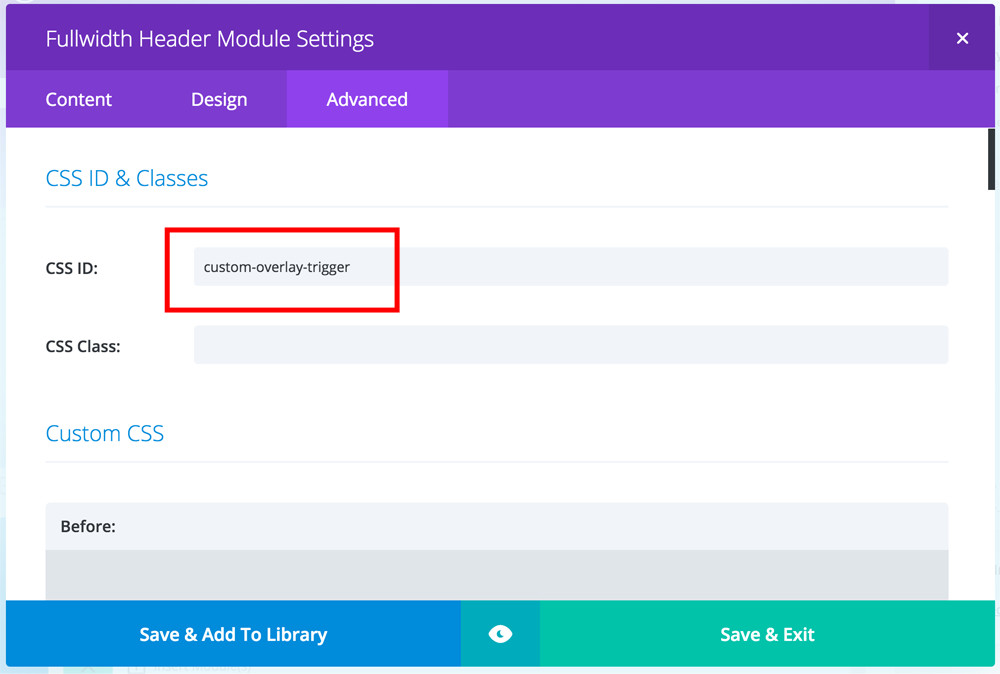
Step One: Adding a Unique ID to the Module
This isn’t a mandatory step, but it is recommended. For example, say you want to set triggers for two different overlays for each of the buttons in the full width header module. You could just paste in the CSS classes into each of the overlay’s CSS Selector Trigger field and call it day. However, if you have another full width header on a different page (or the same page) then the triggers would be set for those other full width header modules as well. So to prevent this from happening, we need to add a unique ID for the module.
So we’re going to add custom-overlay-trigger to the CSS ID field of the module where we want to set a click trigger.
Step Two: Copying the CSS class for the Element we want to set as the trigger
We have shortcuts for all the most common modules. So you can skip this step if you’re using one of the modules we have the shortcuts for.
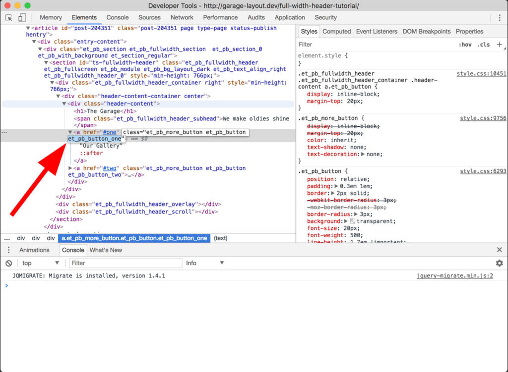
This can be a little tricky if you’re not familiar with using your browser’s developer inspector tool. Most of the leading browsers should have developer tools that are suitable, however Google Chrome’s tools are what we use and recommend.
So first, right click (or Control + Click on Mac) and then select inspect. Next, copy the last class for the element (button, etc) that you selected. In this first example, we’re looking at the Full Width Header Button One. So the last class is: et_pb_button_one
Step Three: Adding your custom ID plus the CSS class to your overlay
Now we need to navigate to the overlay edit screen for the overlay you’d like to trigger. Find the meta box titled “Additional Overlay Settings.” You’ll notice the first setting is the CSS Selector Trigger input field. Now, copy your unique CSS ID that you added to the module on your page. For our example we’re using custom-overlay-trigger but now we need to add the # sign to signify that it’s an ID.
So we’ll add #custom-overlay-trigger to the box, and then now we’ll add the CSS class after it. However, since it’s a link we need to the “a” to it first. So we’ll add a.et_pb_button_one after our ID.
So our box now has this in it: #custom-overlay-trigger a.et_pb_button_one
(If you need to set multiple triggers for the same overlay then add a comma after your first CSS string, then add the next)
And that’s it! Please feel free to refer to the below shortcuts for all the most common modules where this method of adding click triggers is needed.
But don’t forget to add your custom ID to the module on your page as outlined in step one above!
Full Width Header Module
Full Width Header Button One
a.et_pb_button_one
Full Width Header Button Two
a.et_pb_button_two
Pricing Tables Module
Pricing Tables Column One Button
.et_pb_pricing_table_0 a.et_pb_pricing_table_button.et_pb_button
Pricing Tables Column Two Button
.et_pb_pricing_table_1 a.et_pb_pricing_table_button.et_pb_button
Pricing Tables Column Three Button
.et_pb_pricing_table_2 a.et_pb_pricing_table_button.et_pb_button
Slider Module
Slide One Button
.et_pb_slide_0 a.et_pb_button
Slide Two Button
.et_pb_slide_1 a.et_pb_button