When designing responsive in Divi, the columns stack order is always a little tricky to solve. The easiest way to solve is duplicate the row and disable on desktop and adjust the stack order. However, this is a bad practice, since it bloats the page of content.
To solve this, we have created this little tutorial on how to control the column stacking order on mobile. It will be divided in two parts:
1. When using a row of two columns.
2. When using a row with more than two columns.
This solution will use a few lines of CSS, but pretty easy to implement.
How to control the Divi Column stacking order when using a row with two columns on mobile
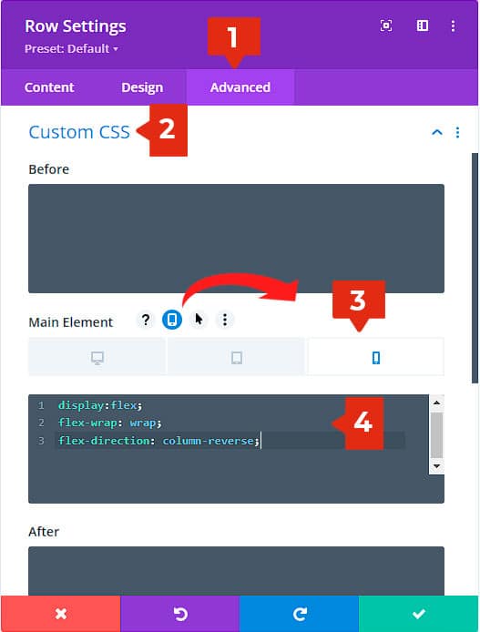
Most of times, the issue comes when using two columns on mobile. For this, we’ll do this.
- Go to the row settings > Advanced tab
- Custom CSS
- Main element > Enable Responsive options > Change to mobile (This is important, since this will apply the custom CSS only on mobile. You can also paste it on tablet if it’s necessary)
- Paste this snippet:
display:flex;
flex-wrap: wrap;
flex-direction: column-reverse;

How to control the Divi Column stacking order when using a row with more than two columns on mobile
When using rows with 4, 6 or more columns (via custom CSS), you may need to change the stacking order for each column. For this, we have two ways to do it:
1. Using CSS into each column.
2. Using a global snippet and then just add CSS classes.
Both ways are easy.
Let’s start with the CSS into each column.
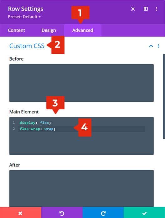
Row settings:
- Go to Advanced tab
- Custom CSS
- Main Element
- Paste this snippet:
display: flex;
flex-wrap: wrap;

This will enable flex in the row. To prevent the shrink of the columns, it is necessary to add the “wrap” value.
Now set the order of the columns on mobile.
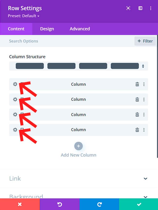
Columns settings.
It is important to set this value into each column, and only for mobile by using the responsive options.
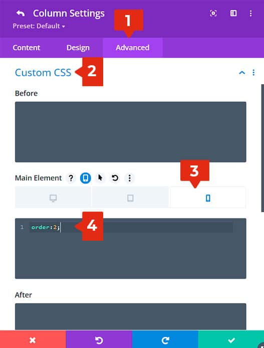
Go to the columns settings:

- Go to the advanced tab
- Custom CSS
- Main element > Enable the responsive options > Select “Mobile”
- Paste the snippet:
order: 2;

Set the order you need on your columns on mobile:
Column 1:
order:2;
Column 2:
order: 1;
Column 3:
order: 4;
Column 4:
order: 3;
This will set the inverted order on mobile 🙂
A universal solution using custom CSS
Here is an additional solution for order stacking on mobile using an universal snippet. This solution will need two steps:
1. Paste the snippet
2. Add a CSS class to the row and columns.
Step 1: Paste the snippet
Paste this snippet in Divi theme options > Custom CSS:
@media (max-width:767px){
.column-reverse {
display: flex;
flex-wrap: wrap;
}
.column-reverse .col-1{
order:2;
}
.column-reverse .col-2{
order:1;
}
.column-reverse .col-3{
order:4;
}
.column-reverse .col-4{
order:3;
}
.column-reverse .col-5{
order:6;
}
.column-reverse .col-6{
order:5;
}
}
Step 2: Add the different CSS classes
Add this class to the row (Advanced tab > CSS ID & Classes > CSS Class)
column-reverse
Then go to the column settings > advanced tab > CSS ID & Classes > CSS Class. Depending on the number of the column, add the different CSS Classes.
First column:
col-1
Second column:
col-2
Third column:
col-3
Fourth column:
col-4
Fifth column:
col-5
Sixth column:
col-6
After this, on any row and column you add the class, it will automatically set the stacking order for mobile.
