
Divi Toggle Module Complete Setup and Troubleshooting Guide
Divi gives you two built-in modules for collapsible content: Toggle and Accordion. Both come free with your Divi theme.
However, a third option exists for more complex needs. The Content Toggle Module from Divi Modules Pro switches between complete layouts rather than expanding text blocks.
The native Toggle module keeps items independent. Open one; the others stay as you left them. The native Accordion forces one-at-a-time display. Open a new item, and the previous one closes automatically.
Neither native module can swap entire sections. If you need to switch between monthly and yearly pricing tables, you need premium solutions, such as the Content Toggle Module from Divi Modules Pro.
Everything in this guide works without custom code. All configurations happen through the Divi Builder interface. Both native modules and the Content Toggle Module fully support Divi 5.
Let’s get you acquainted!
Understanding your Toggle options in Divi
The Divi Toggle module shows and hides content when users click a header. It comes free with your Divi theme and works in any column. Each Toggle operates independently. Open one item, and others remain in their current state.
This makes Toggle ideal when users might want to compare multiple answers side by side.
The Accordion module looks similar but behaves differently. When a user opens one item, all others close automatically. The first item opens by default on page load.
Unlike Toggle, Accordion has no built-in State control. Changing this default requires a jQuery workaround.
Toggle includes a State setting in the Content tab. You control whether each item starts open or closed without code. This single difference drives most of the Toggle versus Accordion decision.
Use Toggle for FAQ sections where users browse freely. Use Accordion when space efficiency matters and users need only one answer at a time.
Both work well for service descriptions, menu breakdowns, product specifications, team bios, and event schedules.
Both modules expand content vertically. They reveal text blocks beneath a clickable header.
Neither can swap one complete layout for another. You cannot use them to switch between monthly and yearly pricing tables. That horizontal replacement behavior requires the Content Toggle Module from Divi Modules Pro.
Choose Toggle when you want full control over default states. Choose Accordion when automatic closing improves your user experience. Choose the Content Toggle Module when you need layout switching.
How to add the Native Toggle Module
Adding the native Toggle module is as straightforward as adding any other one:
1. Open your page in the Divi Visual Builder.
2. Click the + icon inside the row where you want the toggle.
3. Search for “Toggle” in the module search field and select it.

4. In the Content tab, enter your toggle title and body content. The body field supports text, images, links, and other media through the standard Divi text editor.

That should get the module on your page. A few more things you could do right away include:
- Under the Design tab, configure typography, colors, icon style, borders, and spacing to match your site’s look.
- In the Advanced tab, set display conditions based on user roles, device visibility, or custom CSS classes.
To build FAQ-style pages, add multiple Toggle modules within the same section. Each Toggle operates independently with its own title, content, and settings, so you can configure them individually without affecting the others.
How to set default open or closed state for the Native Toggle
State control is exclusive to the native Toggle module. The native Accordion module does not offer this setting.
- Open the Toggle module settings.
- Go to the Content tab.
- Find the State dropdown.
- Select Open or Close.

Each Toggle on the page has independent state control, so you can mix open and closed defaults freely. A good practice for FAQ pages is to set the first Toggle to Open so visitors immediately see an example of the content format, and leave the rest closed for progressive discovery.
⚠️ With the native Accordion, the first item always opens by default with no built-in state control. Changing this requires a jQuery workaround. If you need all items closed on load, use multiple Toggle modules instead of an Accordion.
Styling Native Toggle for open and closed states
All per-state styling lives in the Design tab:
- Icons have separate Closed Icon and Open Icon settings that let you control color, size, and the specific icon used for each state.
- Title text controls the open state appearance.
- Closed Title Text provides independent font, color, size, and weight settings for the closed state.
- Body text uses standard typography controls (font, color, size, line height, text shadow) that apply to the expanded content area.
- Borders let you configure rounded corners, border width, color, and style (solid, dashed, dotted).
Layout, spacing, and advanced settings
For even deeper customization, look into the following options:
- Sizing and spacing use width, max-width, and alignment settings to match your column layout. Margins control external spacing between toggles, and padding controls internal spacing around the content.
- Animations offer fade or slide entrance effects with configurable duration and delay. Keep these subtle because heavy animation slows down the user experience.
- Device visibility lets you toggle display on or off per device type (phone, tablet, desktop) to tailor content presentation across breakpoints.
- CSS ID and Classes assign custom identifiers so you can target specific toggles from global stylesheets. This is useful when you need consistent styling across multiple pages without editing each module individually.
- Display conditions let you show or hide toggle content based on user login status, membership tier, or browser type. This is particularly valuable for membership sites where different users need different information.
- Visual enhancements include Box Shadow to add depth, scroll effects to enable sticky positioning or parallax behavior, and background patterns and masks to allow for unique designs beyond solid colors.
- Transform and filters provide scaling, rotation, and color filter adjustments, but these are rarely needed for standard toggle implementations.
Troubleshooting common native toggle issues
Most Toggle problems trace back to settings conflicts or mobile viewport issues.
Toggle click opens a link instead of expanding content
If clicking a toggle opens a page or jumps somewhere instead of expanding, there’s a URL in the Module Link field in the Content tab. That field overrides normal toggle behavior and turns the whole header into a link.
A toggle that navigates instead of expanding has a URL in the Module Link setting. This field lives in the Content tab. When populated, it hijacks all clicks. Delete any URL there to restore normal toggle behavior.
If removing the link doesn’t fix it, an overlapping element is capturing clicks instead. Another module with a higher z-index sits invisibly over your toggle header. Use your browser’s developer tools to inspect the area. Look for positioned elements above the toggle.
Toggle doesn’t work reliably on mobile devices
When taps on a toggle work sometimes but not others on mobile, the tap area is too small, or another element is sitting over it and stealing touch events.
Inconsistent tap response on mobile means your touch targets are too small or something is blocking them.
First, check your Advanced tab Visibility settings. A disabled Phone visibility setting hides the toggle entirely.
If visible but unreliable, the tap target has shrunk below the 44×44 pixel minimum that WCAG guidelines specify. Custom CSS that reduces padding or font size causes this. Absolute-positioned elements drifting over toggle headers at narrower viewports cause it, too.
Accordion won’t start with all items closed
When your Accordion always loads with the first item open, that’s the built-in default behavior. Native Accordion doesn’t include a setting to start with all items closed.
An Accordion that loads with the first item expanded is working as designed. Native Accordion provides no State control to change this default. A jQuery workaround exists, but it adds complexity.
A simpler approach is to replace the Accordion with multiple Toggle modules. Each Toggle has independent State control. Set them all to Closed. You get the visual result you want with no code.
Want to toggle an entire section or row with a button
If you want a button to open and close an entire section or row, Native Toggle can’t do that. Its behavior is limited to showing and hiding its own built-in content area.
Native Toggle cannot control other page elements. It only expands and collapses content within itself. Custom CSS and JavaScript workarounds exist, but break easily during updates.
The Content Toggle Module from Divi Modules Pro handles this use case properly. It switches between complete Divi Library layouts in the same space without requiring custom code.
How the Content Toggle Module works (Divi Modules Pro)
The Content Toggle Module switches between two complete Divi Library layouts in the same visual space. Users click a toggle switch and one layout replaces another. There’s no vertical expansion or accordion behavior.
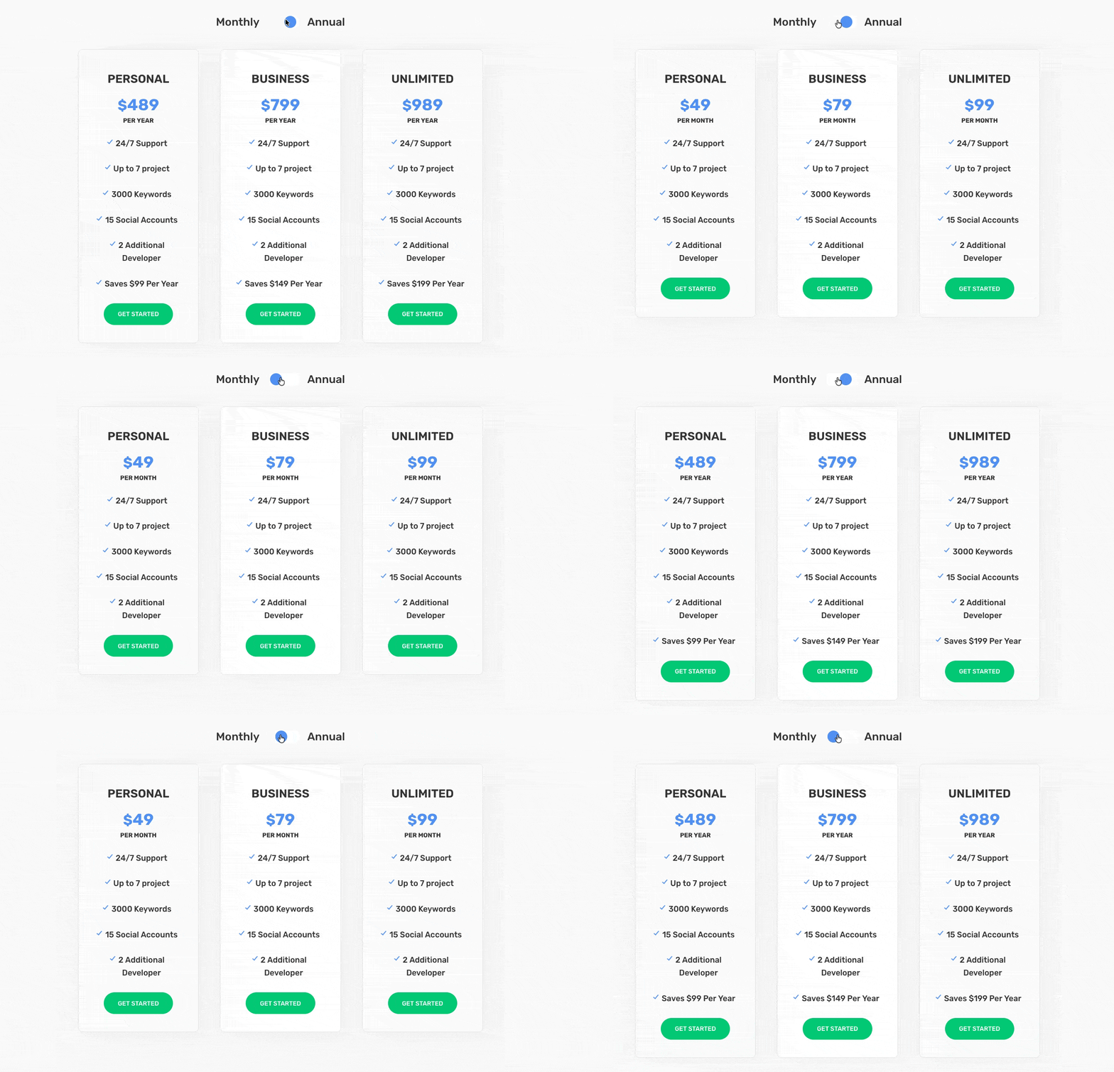
This solves what native modules cannot:
- Monthly versus yearly pricing tables.
- Lunch versus dinner menus.
- Before and after showcases.
- Feature tier comparisons.
- Any scenario where you need horizontal replacement instead of vertical reveal.
Both layouts load simultaneously on page load. Keep them lean for best performance.
The Content Toggle Module requires Divi Modules Pro. You can buy it individually or get it through the All Access Pass.
Now that you’re familiar with how it works, let’s go over how to use the Content Toggle module.
Setting up the Content Toggle Module
First, ensure the module is active and ready for use:
1. Install and activate Divi Modules Pro
2. From your admin dashboard, go to Divi > Divi Modules Pro.
3. Scroll through the list of modules and ensure Content Toggle is toggled to On.

4. Click Save Settings.
Now, you’re ready to use it within the Divi builder you know and love:
1. Click the + icon in a row where you want to add the module.
2. Search for “Toggle” and select the one marked Pro Content Toggle.

3. In the module settings, set Content Type to Divi Library for both the First and Second content options, then select your saved layouts.
4. Add labels in the First Title and Second Title fields (e.g., “Monthly” and “Yearly”).

9. In the Design tab, style the toggle switch colors, background, size, and title typography for each state.
Divi Module Pro also includes pre-built demo layouts for common use cases like pricing tables, restaurant menus, and product comparisons that you can import and customize.
Styling and optimizing the Content Toggle Module
The Design tab controls switch color, background color, size, and title typography for each state. The same styling principles from the native Toggle apply here. Use clear visual contrast between the First and Second titles so users can immediately identify which state is active.
💡 Both layouts render in the page HTML on load. Dynamic asset loading handles CSS and JS, but the actual content for both states is present in the DOM from the start. This means heavy galleries or complex modules in both states will increase page weight significantly. Keep your Library layouts lean.
As for testing and mobile optimization:
- Test both toggle states across screen sizes for display issues, animation smoothness, and content overflow.
- Verify the switch meets the 44×44 pixel minimum touch target on mobile.
- If your layouts are content-heavy, apply lazy loading to images before saving them to the Divi Library.
Start implementing useful Toggle content today
You now have clear criteria for choosing the right tool.
Native Toggle works best for FAQ sections and any content where users benefit from keeping multiple items open. It gives you full control over default states without code.
Native Accordion suits situations where space efficiency matters more than simultaneous viewing. Remember, it lacks default state control and always opens the first item.
Both native modules come free with Divi. They handle most expand and collapse needs effectively.
Layout switching requires the Content Toggle Module. When you need to swap complete pricing tables or menu sections, native modules cannot help. The Content Toggle Module references Divi Library layouts and replaces one with another on click.
Get started with Divi Modules Pro to unlock the Content Toggle Module. Build professional layout-switching interfaces without writing any custom code!


0 Comments