
Ultimate Divi Sticky Sidebar Mobile Guide
It’s easy for sticky sidebars that work on desktop to break on mobile. They frustratingly overlap footers, eat up viewport space, stop sticking entirely, or cause scroll conflicts.
The root cause is almost always the same: mobile wasn’t part of the plan.
Join us as we go over how to configure sticky sidebars specifically for mobile in Divi, when to disable them, and how to fix the issues that show up only on phones. We’ll also cover Divi Hacks as a solution that automates mobile sticky behavior, including footer detection and viewport handling.
💡 If your goal is improving mobile navigation rather than keeping sidebar content visible during scroll, Divi Mobile Menu is the dedicated solution for custom mobile menus. We don’t cover it in this article, but it’s worth checking out.
How to set up sticky sidebar for mobile with Divi
Divi 5 handles sticky behavior through responsive toggles, meaning you can configure how your sidebar behaves at each breakpoint independently. As a result, changes you make in the mobile view won’t override your desktop configuration. Each viewport maintains its own sticky rules.
Before starting, you need a page layout with a sidebar column already built and populated with your desired modules.
💡 We already have an extensive tutorial on making sidebars sticky across all devices. You can use it as a starting point if you’re completely unfamiliar. The steps below zero in on the mobile-specific decisions that determine whether your sidebar helps or hurts the small-screen experience.
First, create your sidebar content:
1. Add a new single-column flex row.

2. Open the new row’s settings and, under the Content tab, expand the Elements section and click Add Element.
3. Add a new column so you have two side by side.
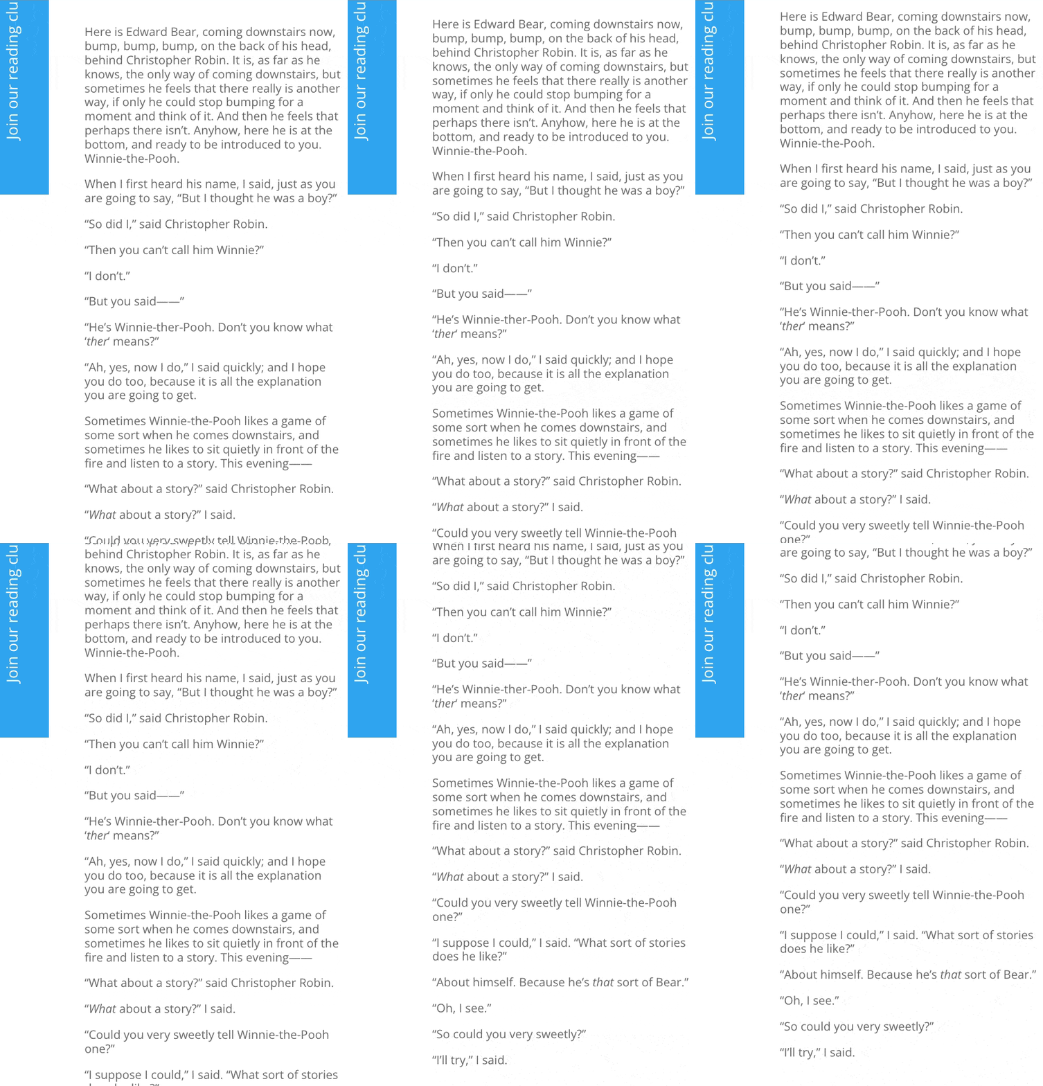
4. Add your modules to each of the columns, where one is the main content and the other is the sidebar content. For this walkthrough, we’re using a rotated CTA on the left and a text module on the right.

5. Open the row’s settings, then go to Design > Sizing and change the Column Class to change how the space is split between the two columns.

With the sidebar content in place, making it sticky on mobile is straightforward:
1. Open the settings for the sidebar content module.
2. Change the responsive controls to the mobile version on the top right.

3. Go to the Advanced tab, then open the Scroll Effects section.
4. Change Sticky Position to where you want the sidebar to stick to when users scroll along the page. We’re doing Stick to Top and Bottom.
Settings to keep in mind
Disable Equalize Column Heights in Row > Design > Sizing. This forces all columns to the same height, which removes the extra space sticky positioning needs to work.
Check your Section and Row for overflow:hidden under Advanced > Visibility. If either container clips overflow, sticky elements inside them won’t stick. Parallax backgrounds and entrance animations both inject overflow:hidden automatically, so disable those too if sticky isn’t responding.
Our previously mentioned sticky sidebar guide covers these container issues in more detail.
Keeping columns side by side on mobile
By default, Divi stacks columns vertically on mobile. If you want your sidebar to stay beside your main content instead of dropping below it, add this CSS to Row Settings > Advanced > Custom CSS > Main Element:
/*
display: flex; flex-wrap: nowrap;
*/
This prevents the default stacking behavior and keeps columns side by side. It works best for two-column layouts where both columns have compact content. Test at 375px width to make sure nothing overflows or becomes unreadable on smaller screens.
Alternative methods to implement sticky mobile sidebars
Divi’s native sticky settings work for basic setups, but mobile introduces problems they weren’t designed to solve: viewport overflow, footer collision, and cache plugin conflicts. Here are two alternative approaches, each suited to different levels of complexity and control.
Method 1: Use Divi Hacks
Divi Hacks is a power-up plugin for the Divi theme that adds tons of extra design and functionality options without needing custom code.

It includes features like popups, content scheduling, layout tweaks, and visual effects you can toggle on as needed.
Add the CSS class sticky-element to any module, column, or row in Divi Hacks. That single class handles sticky behavior across all devices with no additional configuration.
On mobile, sidebars often exceed the viewport height. Divi Hacks detects this and creates a scrollable overflow container so users can still reach content at the bottom of the sidebar.
It also detects your footer automatically and stops the sticky element 20px before collision, regardless of how tall your mobile footer is. You never need to do any manual offset calculation.
Divi Hacks disables sticky on viewports where it would hurt UX without requiring you to set breakpoints manually. It also initializes on DOM ready, even when scripts are deferred.
This prevents the common issue where sticky behavior breaks when script loading is deferred or optimized.
Choose this for production sites, client work, or any scenario where mobile behavior needs to be reliable without per-device testing.
Method 2: Use custom CSS
For full manual control, add a custom class and write your own sticky logic:
1. Open Column Settings for your sidebar and add the class mobile-sticky-sidebar under Advanced > CSS ID & Classes.
2. Then go to Divi > Theme Options > Custom CSS and paste this media query:
/*
@media (max-width: 767px) {
  .mobile-sticky-sidebar {
    position: -webkit-sticky;
    position: sticky;
    top: 80px;
    z-index: 99;
    align-self: flex-start;
  }
}
*/
3. Next, disable Equalize Column Heights in Row Settings > Design > Sizing.
4. Set Horizontal and Vertical Overflow to Visible in the Advanced > Visibility tab for the Section, Row, and Column.
5. Then toggle the Mobile Icon in Row Settings > Advanced > Custom CSS and add this to the Main Element to reorder the sidebar above main content:
/*
display: flex;
flex-direction: column-reverse;
*/
6. Finally, select Section as the Bottom Sticky Limit in Column Settings > Advanced > Scroll Effects to prevent footer overlap.
7. Save and clear all site caches.
Choose this if you want complete control over behavior. You’ll need to calculate footer offsets manually, handle viewport overflow yourself, and write separate media queries for each breakpoint.
When sticky sidebars don’t make sense for mobile
Sometimes the right move is turning sticky off entirely on mobile.
Disable sticky when your sidebar exceeds 400px in height. On a phone screen, that consumes over half the viewport and makes scrolling past it painful.
If your sidebar stacks multiple widgets like a newsletter signup, recent posts, social links, and an ad, it’s almost certainly too tall.
Also disable it when your footer already contains the same CTA as the sidebar. On mobile, the sidebar stacks directly above the footer, so users see the same call to action twice in a row.
And if users experience scroll chaining, where scrolling inside the sidebar unexpectedly scrolls the background page, that’s another sign sticky is doing more harm than good.
Instead of forcing a full sidebar to stick, use Divi’s visibility settings to hide non-essential modules on mobile and keep only the primary CTA sticky.
For long sidebar navigation, convert it to an accordion module that collapses by default to reduce height.
Essential mobile sidebar best practices
Getting sticky behavior right on mobile isn’t just about making it stick. These practices address the sizing, spacing, and device issues to keep sticky sidebars from failing in production:
- Test across real viewport sizes because phones range over 200px in height difference. Use 375px × 667px (iPhone SE) and 402px × 874px (iPhone 16 Pro) as your bounds.
- Keep sticky elements under 400px tall because anything larger eats over 60% of a small screen. Remove or hide modules until the rendered height fits comfortably.
- Size all tappable elements to minimum 44 × 44px because users tap sticky content mid-scroll with less precision. Add padding to links and buttons rather than relying on text size alone.
- Set your sticky top offset to header height plus 10px because without it, sticky elements slide under fixed headers. A 60px header means setting top: 70px.
- Test on a real device because mobile browsers show and hide the address bar dynamically, shifting the viewport height. The Divi builder preview doesn’t replicate this.
- Prevent scroll chaining because when sidebar content exceeds the viewport, scrolling inside it moves the background page. Keep sidebar height under the viewport limit or use Divi Hacks which handles overflow automatically.
- Keep sticky content lightweight because heavy images and CSS blur or shadow effects cause scroll jank on older phones. Strip unnecessary assets and save complex visuals for the main content area.
Troubleshooting mobile sticky sidebar issues
Most sticky sidebar problems on mobile trace back to a small set of causes.
If your sticky options aren’t showing up at all, start by checking the device toggle in Divi’s scroll effects settings. Sticky can be enabled for desktop but disabled for phone without any visual warning.
Beyond that, here are the specific failures you’re most likely to hit.
Scroll chaining
Issue: Scrolling to the end of your sidebar causes the background page to scroll unexpectedly.
Cause: Sidebar content exceeds its container but has no overflow handling.
Fix: Reduce sidebar content to fit within the viewport, or add overscroll-behavior: contain via custom CSS to the sidebar container.
💡 Divi Hacks handles this automatically by wrapping overflow when it detects that the sidebar exceeds the viewport height.
Sticky works on desktop but not mobile
Issue: Sidebar sticks correctly on desktop but loses sticky behavior entirely on phones.
Cause: A parent container is clipping overflow at mobile breakpoints, or mobile-specific CSS is overriding the sticky position.
Fix: Disable Equalize Column Heights in row settings. Check the section and row for overflow:hidden under Advanced > Visibility. Inspect the child theme CSS for mobile media queries affecting the position property. Confirm sticky is enabled for phone view in the device toggle under scroll effects.
Sidebar overlaps footer on mobile
Issue: The sticky sidebar scrolls past its intended boundary and covers the footer.
Cause: Bottom Sticky Limit isn’t configured, or the mobile footer is taller than the desktop footer you originally accounted for.
Fix: Set Bottom Sticky Limit to “Section” in Column Settings > Advanced > Scroll Effects. If using Body as the limit, increase the Bottom Offset to match your mobile footer height.
💡 Divi Hacks detects footer position automatically with a 20px buffer, removing the need for manual calculation.
Sticky breaks after enabling a caching plugin
Issue: Sticky sidebar stops working after activating WP Rocket, Autoptimize, or a similar caching plugin.
Cause: These plugins defer JavaScript, which changes when Divi’s sticky calculations run. The sidebar loads before the sticky script executes.
Fix: Exclude Divi scripts from deferral in your cache plugin settings and clear cache after any sticky configuration changes.
💡 Divi Hacks initializes on DOM ready regardless of script timing, avoiding this problem entirely.
Implement your optimized mobile sticky sidebar today
Enable sticky only for compact elements under 400px, or disable it entirely and let sidebars stack naturally on phones.
Native Divi settings handle simple cases if you’re willing to configure responsive breakpoints and container settings manually. Custom CSS works when you need precise control over a specific layout.
For production sites, client work, or any setup where sticky needs to work reliably without per-device troubleshooting, use Divi Hacks. It automates viewport handling, footer detection, and cache compatibility out of the box.
Get started with Divi Hacks for reliable mobile sticky behavior without manual configuration. And if your goal is custom mobile navigation rather than sticky sidebar content, Divi Mobile Menu is built specifically for that.

Create Better Mobile Experiences
The Divi Mobile Menu plugin allows you to craft custom mobile menu experiences like the big brands do. No more smushing your desktop menu into a mobile screen! 📲

0 Comments