Make Your Divi Sticky Header Shrink When Scrolling
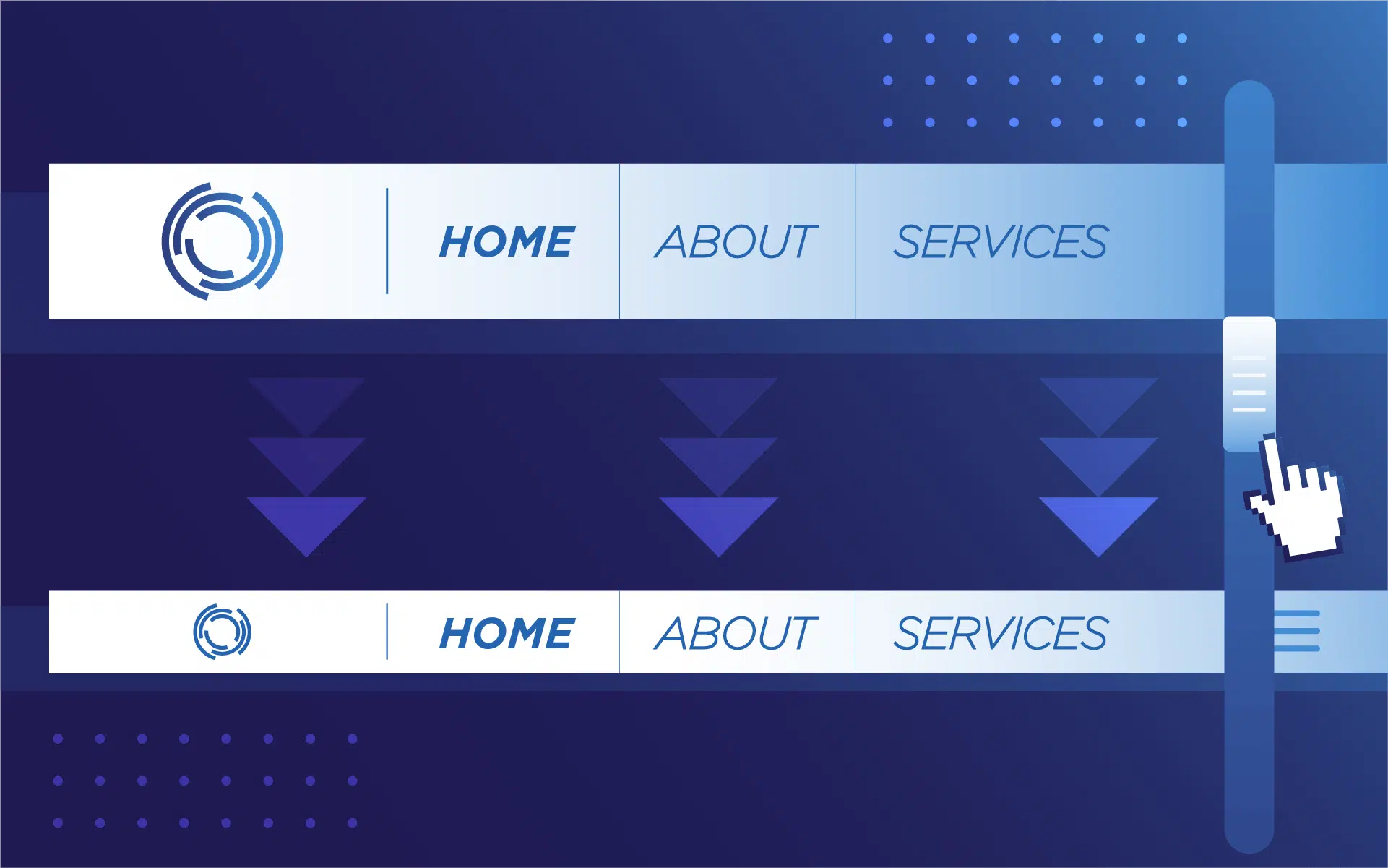
If you’ve ever created a perfect shrinking header in Divi, only to see it warp when someone refreshes the page, there’s a far better solution than tearing your hair out!
Such glitches aren’t random and are simply down to ‘defined’ or ‘non-defined’ states. If you’ve failed to define your header’s shrinking state, your browser has no option but to guess, which can result in a warped view.
All you need is two clear header states – expanded and collapsed – and your browser needs both before anything loads. Forget the panic scripts and last-minute fixes after JavaScript finally kicks in – get it right upfront, and any header-jumps will vanish for good.
We’ll detail three practical ways to master shrinking headers: with Divi’s built-in tools, ready-made Header Layouts from Divi Life, or crafting your own with custom jQuery. Let’s begin!
Key takeaways
- The dreaded header jump comes from the browser lacking clear instructions for both header states.
- Defining your header’s full and shrunken sizes upfront gives you predictable, professional results regardless of design method.
- Mobile presents its own challenges – what works on desktop might wreck your logo/menu on phones without extra tweaking.
- Fixing layout issues is about adjusting surrounding content.
- Pre-built solutions like Divi Life’s Header Layouts offer greater control, consistency, and time savings.
Why headers jump, cover content, and break on mobile
Headers misbehave for a simple reason – browsers don’t know how tall your header should be in every scenario. The following problems are common:
- The jump: The browser loads your header at full height (state A), but your stylish, shrunken final design (state B) only kicks in after JavaScript runs. Your hero image and content get shoved down, then yanked back up.
- Content coverage woes: Even if the header shrinks smoothly, it often floats over your page content. That’s because margins or padding aren’t adjusted for the new header height, leaving text and buttons hidden under the sticky bar.
- Messy mobile appearance: Shrinking ratios that work on desktop cram everything together on mobile view, causing toggles or logos to clash. These headaches happen when only one state is defined, so the browser makes bad guesses.
All three problems occur when you’ve only defined one state, leaving the browser to guess the other. Stick with the two-state principle using one of the methods below – state A (full height) and state B (collapsed) – and you can tame those headers once and for all!
Method 1: Using Divi’s native shrinking headers without code
You don’t need code to build a smooth, shrinking header in Divi 4 or Divi 5. Both versions deliver sticky headers right in the builder, although the interfaces look different. Here’s the step-by-step for doing it solely using Divi.
Step 1: Make your header sticky

Start by selecting the entire header section. Head to the module’s Advanced tab, find the Scroll Effects area, and set Sticky Position to Stick to top.
Step 2: Shrink the header on scroll

Click into the Header module. In its options, hit the desktop icon, then the little pin labeled Sticky. This opens the sticky state controls. In the Design tab, set top and bottom padding to 0px when sticky. This slims the header on scroll.
Step 3: Shrink header content on scroll

Pick the heading or menu module. Again, open sticky controls as in Step 2. In Design, set the sticky menu text size smaller (try 13px to start).

You can tweak any element – logo, text, or buttons – using sticky state settings. This WILL work on mobile, but be sure to test thoroughly. Check for hamburger menu overlap, make sure your menu items stay at least 44px tall for fingers, and consider a fixed height for mobile if things get too cramped.
Method 2: Using Divi Life’s Header Layouts

If you’d rather skip hours of tweaking settings or writing custom code, Divi Life’s Header Layouts are a lifesaver. These premium templates do the hard work for you, bundling 18 beautifully designed headers – most with shrinking effects pre-configured. You just adjust color, fonts, and logos to fit your brand, and the rest is done. Here are a few examples:


And here’s how it works!
After you purchase and download Header Layouts from Divi Life, head to Divi > Divi Library > Import & Export in your WordPress dashboard. Import the header templates (JSON files) into your library.

Next, go to Divi > Theme Builder and edit or create your global header. Click Add From Library and choose a template you like.

Most templates use a Code module to manage the shrinking effect, so you don’t have to touch CSS or JavaScript unless you want to customize it further.
Customizing the shrink values of Divi Life’s Header Layouts templates

1. Assign your Ultimate Header layout to a header template in theme builder:
-
- Add New Template > Build New Template > Custom Header > Add from Library > Your Saved Layouts

2. Edit your header:
-
- Select the Menu module settings, then go to Advanced > Scroll Effects.
- Change the Sticky Position value to Stick to Top.
3. Click the desktop icon next to the Advanced tab.
-
-
- Edit Sticky Position values for each device, reducing padding and font values in the Design tab to shrink sizes.
-
4. Save changes.
Method 3: Build a Custom Header and add jQuery
For those who want maximum control, building a custom header with jQuery lets you dial in unique shrink behavior for any page.
Step 1: Creating your Custom Header

In Divi 5, open the Theme Builder and create a new Global Header. Set up your header section with two or more columns – one for your logo, others for menus or buttons.

- Adjust sizing and padding in Section settings via Design > Spacing.
- Apply your preferred background, text color, font size, and alignments for that polished Divi look.
- Configure your logo. Add the image module, and set max-widths for desktop/tablet/mobile.
- Customize your buttons, updating styles and spacing as needed.
- Go to Advanced > Position and set the z-index to 10 or higher to keep the header above everything else.
Step 2: Add CSS IDs, CSS, and jQuery
- Give your header section a custom CSS ID, like custom-header.
- In Divi, add this ID under Section > Advanced > CSS ID.
- Copy these CSS rules into Divi’s Theme Options > Custom CSS:
/*
#custom-header {
  transition: all 0.3s;
}
.shrunk-header {
  padding-top: 0 !important;
  padding-bottom: 0 !important;
  background: #fff;
}
*/
In the Code module or Divi‘s Integration tab, add jQuery from Elegant Themes’ tutorial:
/*
jQuery(window).on('scroll', function() {
  if(jQuery(window).scrollTop() > 80){
    jQuery('#custom-header').addClass('shrunk-header');
  } else{
    jQuery('#custom-header').removeClass('shrunk-header');
  }
});
*/
Don’t forget to adjust tablet and mobile settings for padding and min-height to prevent mobile header issues.
Step 3: Test your header
Save changes in Theme Builder and reload your site. Scroll up and down to check the shrink effect.

If nothing changes, clear your browser cache or use incognito mode. Test on some real mobile devices of different sizes. Make sure nothing overlaps or breaks as the header shrinks.
Troubleshooting quick reference
Here’s a quick reference for when things go sideways:
Header doesn’t shrink
Check that your header section or module really has Stick to Top enabled in Scroll Effects. If you’re using Divi’s native sticky settings (Method 1), open the settings and click the pin icon. Set distinct padding, sizing, or text values for the sticky state, or nothing will change on scroll. Clearing your browser and plugin caches will flush out stubborn old versions.
Header still jumps on load
This happens when your browser doesn’t know how tall your header will be at first. For Method 1, set initial (non-sticky) padding or height explicitly before defining sticky styles. For templates (Method 2) or custom headers (Method 3), ensure your starting header height in the CSS or Code module matches reality. For a fast fix, punch in top margin or padding for your first page section equal to the full header’s height, so nothing shifts when the header shrinks.
Header covers content after shrinking
If your shrunken header floats over sections, adjust your page wrapper. Add top padding equal to your sticky header’s final height.
For anchor links – buttons or menus that scroll to sections – add scroll padding (CSS property: scroll-padding-top) so content isn’t hidden behind the header. And don’t forget z-index – set your header section’s z-index to 10 or higher to ensure it layers above and not below other elements.
Put your shrinking header into action today
“So now you know the secret – define both your full and collapsed header states, before the page loads – and that nasty jump will disappear for good.”
– Jennifer Rodriguez, Lead Designer at Divi Life
Whether you use Divi’s native tools, slick pre-built templates, or hand-tuned jQuery, the best method is the one that fits your workflow and tech skills. No matter which route you take, always test on every device and page, as desktop perfection won’t guarantee a smooth mobile experience. Prioritize function over flashy effects – a header that actually works beats one that leaves content hidden or jumps above your hero image.
When you’re ready to get started, dive into Divi Life to realize your design dreams and explore Header Layouts for plug-and-play results minus the problems!

The Ultimate Divi Toolkit 🚀
The Divi Life All Access Pass membership is a complete Divi toolbox with all the Divi plugins, child themes, layouts, & templates you'll ever need to create incredible Divi websites.

0 Comments