
Common Divi Responsive Issues and Their Quick Fixes

If you’ve ever changed settings in Divi’s mobile view and didn’t notice any difference on your phone, welcome to the blog you’ve been waiting for!
Let’s face it, we’ve all been there. The builder swears all is well, but your client is complaining about giant text and crop marks. Maybe you’ve refreshed pages, cleared the cache, and deactivated plugins, only to find the same problem.
The fix comes from understanding how Divi’s responsive system actually works. Our guide will demo repeatable solutions for mobile text and image sizing, and help you validate every change – on real devices, and with performance plugins running – so your future layouts will always match the reality.
5 key takeaways
-
Divi’s responsive controls rely on smart inheritance – breaking the chain leads to unpredictable layouts.
-
Real-device testing reveals phone quirks that browser previews miss, especially at tiny breakpoints.
-
Avoid duplicate-and-hide fixes as they slow down load times and create more work later.
-
Consistent cache clearing is essential – stale files often hide real progress.
- When you need reliable, ready-to-go layouts, start with Divi Bricks layouts to sidestep common pitfalls.
How Divi’s responsive system works

Divi’s responsive design gives us control to customize layouts for desktop, tablet, and phone without code. Each setting in Divi can be made device-specific through a concept called ‘inheritance’.
By default, settings you configure for desktop view apply to tablet and phone display, unless you actively override them for those breakpoints. Divi’s Visual Builder previews how each device will display, but those previews only reflect the settings as configured for each device, not the quirks of actual hardware or browsers.
The cascade that controls what you see on each device
The cascade ensures your design remains predictable. If you set a 24px font size on the Desktop breakpoint, that value propagates to Tablet and Phone unless you enter new values for those devices. To do so, switch to Tablet or Phone view in the Visual Builder and set size, spacing, and other options directly.

In Divi 5, this workflow is even more intuitive – when you change a setting while viewing Tablet or Phone, that value applies instantly to the active device. The Responsive Editor icon updates to blue whenever a value diverges across breakpoints, so it’s easy to spot overrides. You can fine-tune for mobile – like tighter padding or smaller font – without risking unwanted changes on desktop.

Why don’t my Divi responsive changes show on mobile?
Divi’s Visual Builder operates in a unique sandbox – it applies your changes immediately by pulling fresh styles from the database with caching switched off. But when you check your live site on your phone, the browser loads layers of cached files – local cache, Divi’s Static CSS, server caching, CDN copies, and even optimization plugins.
This cocktail often means your new tweaks won’t appear straight away. Add to this device pixel ratio – modern phones like an iPhone at 3x density will display images and dimensions differently than Chrome’s 1x simulation.
Chrome’s mobile device toolbar further reduces the viewport height, distorting full-page previews. Live sites apply asset optimization, minification, and image processing on top – none of which occur in the builder preview.
Device sizes vs Divi’s generic breakpoints
Divi 5 uses default breakpoints – 980px for Tablets and 767px for Phones. This means a device like the iPad Pro in landscape (1024px) escapes both. However, in February 2025, Elegant Themes introduced customizable breakpoints to fix this gap.

You can now enable up to seven unique breakpoints – like Phone Wide (860px), Tablet Wide (1024px), Widescreen (1280px), and Ultrawide (2560px) – simply by opening the Sitewide Responsive Breakpoints modal in Divi’s settings. Advanced users can fine-tune even further by layering custom CSS media queries to target pixel-perfect ranges, ensuring every device gets a tailored experience.
Confirm your setup and clear caches systematically
Before chasing fixes, always check your Divi system status and environment. Outdated versions or low system resources will sabotage even perfect responsive settings. Running these checks up front can save ample time later!
Check versions and system status first
Navigate to Divi > Support Center > System Status on your WordPress dashboard. Verify you’re running the latest Divi theme, WordPress core, and especially PHP – anything older than PHP 7.4 risks rendering errors and sluggish performance. The Support Center flags issues with red, yellow, or green indicators. Confirm your active Divi version in Theme Options > Updates.

Divi 5 uses container-based rows and sticky header logic, so older code won’t behave the same. Check your hosting environment details for memory limits – Divi recommends at least 256MB, as low memory causes builder crashes.
The complete cache clearing sequence
To get fresh results, run through every layer of cache without skipping steps. Start with a hard browser refresh using Ctrl+Shift+R (Windows) or Cmd+Shift+R (Mac). Next, disable Divi’s Static CSS File Generation at Theme Options > Builder > Advanced, then select Clear CSS Cache. Remember to Save Changes once you’re done.

Head to your caching plugin’s dashboard and purge its cache – if you’re using WP Rocket, navigate to Settings and select Clear Cache. Then, log in to your hosting dashboard and clear any server-side cache (on WP Engine, Kinsta, or Flywheel).

If you’re using a CDN, such as Cloudflare, open the provider’s panel, go to Caching, and choose Purge Everything. Allow several minutes for changes to propagate across all CDN edges. Each cache layer can serve outdated files even after clearing the layer above, so be sure to check each step.

Test on devices, not browser tools
Always review mobile changes on actual devices instead of relying on Chrome DevTools or browser simulations. DevTools can’t replicate true touch gestures, device pixel density, system fonts, or browser chrome.

Test each fix on at least one iPhone and one Android device, and make sure caching and performance plugins are still active during testing to match real conditions.
While testing, open the Console tab in DevTools to spot any lurking JavaScript errors that may block responsive updates. This real-device validation reveals true display and any mismatched behaviors missed by browser previews.
Fix common responsive issues
Divi’s responsive controls take away the guesswork – if you know where to find them! Common problems include text that wraps awkwardly or spills off the side of the screen, images that scale unpredictably, and modules that don’t stack quite right on mobile. Let’s tackle each with simple, repeatable adjustments that work.
Text wrapping is wrong or bleeding off-screen
Open the module that controls your text, head to the Design tab, and look for the Text or Heading option. Click the responsive icon beside the font size to unlock device-specific values – now you can set different sizes for Desktop, Tablet, and Phone.

Stick to px or em units for body and button text – viewport units like 5vw scale fine on wide screens but produce oversized text (18.75px on a 375px phone, but over 50px on a tablet).

Always preview your layout at 320-375px wide, not just at 768px. For easy reading, reduce line-height and letter-spacing on mobile for tighter, neater text flow.
Images distorting or hurting performance scores
Divi’s Enable Responsive Images setting sounds helpful, but it can conflict with performance plugins like WP Rocket. If you spot vertical squishing or broken aspect ratios, head to Theme Options > General, then scroll down to turn off Enable Responsive Images.

Large header logos often wreck your Largest Contentful Paint (LCP) score, so compress header and logo files to under 50KB and switch to efficient formats like WebP.
For every image, be sure to declare width and height attributes, and use the CSS aspect-ratio property to reserve space and avoid Cumulative Layout Shift (CLS). These pro steps stop images from jumping after load and ensure your Core Web Vitals stay in the green.
Columns stacking in the wrong order
Divi automatically stacks columns top-to-bottom on mobile, which can destroy layouts when an image-left/text-right section suddenly needs text to appear first. You can duplicate and hide versions using Divi’s visibility settings for each device, but this doubles the HTML and hurts load times.
A cleaner, long-term fix is to add a custom CSS class – like reverse-mobile – to your row in Advanced > CSS ID & Classes. Then, use a media query to swap column order:
/*
@media (max-width: 980px) {
  .reverse-mobile {
    display: flex;
    flex-direction: column-reverse;
  }}
*/
Make sure to add the right class name inside both the row and style.css.
Optimization plugins breaking layouts and interactions
Caching and optimization plugins boost speed but often break Divi’s layouts. WP Rocket’s Remove Unused CSS can strip out Divi’s mobile styles, while Delayed JavaScript Execution blocks sliders and modals.
Your site can seem fine in the Builder, but live pages break if you don’t test with caching active. Start troubleshooting by temporarily turning off Remove Unused CSS at File Optimization > CSS. Instead of disabling entirely, add key exclusions.
Divi relies on a modular JavaScript setup, using on-demand files such as et-builder-modules-script.min.js. Instead of excluding individual filenames like this – which can change between Divi releases and is needed in Divi 5 – consider using a performance plugin like WP Rocket, which comes with built-in Divi compatibility.
In the settings, tick the Divi option under Delay JavaScript Execution > One-click exclusions. This will automatically configure all required script exclusions for Divi. If you still need to add manual exclusions, opt for broader matches like /wp-content/themes/divi/ or the term DIVI rather than targeting specific filenames.
Every fix you make should be tested with performance plugins running to match what real users see, not just what’s visible in preview mode
Build layouts that stay responsive
Proactive design beats endless patchwork. Instead of fixing layouts after launch, plan with Divi’s responsive tools up front. Set values that look great across devices and only use custom CSS for edge cases. You’ll save time (and sanity, too!) while delivering a reliable experience every time.
When to use responsive toggles vs custom CSS
Take advantage of Divi’s responsive toggles for everyday adjustments – padding, margin, font size, backgrounds, and colors. These toggles save unique values per device right in the module settings, making targeted tweaks fast and easy.
For reranking columns, niche breakpoints, or pixel-level control, switch to custom CSS. Media queries provide unlimited breakpoint targeting – far beyond Divi’s standard 980/767px splits – so you can catch iPads, wide phones, or even ultrawide monitors.

Always set up Desktop values first, then override on Tablet and Phone. Avoid nth-child selectors for order, since Visual Builder reordering scrambles the output. Responsive toggles cover 90% of use cases, so use custom CSS for the details that only code can reach.
Design for the smallest screens first
Start every build at a 375px viewport. This forces you to prioritize clarity and usability from the beginning. As you test layouts and content, add space and visual elements incrementally for tablet and desktop views.

“Use Divi’s visibility toggles to hide non-essential pieces on small screens. Hiding decorative images, secondary calls-to-action, or lengthy taglines on mobile declutters the interface and focuses attention where it’s needed. After significant changes, test directly on real iOS and Android devices to expose any gaps in your adjustments, as browser tools can miss them.”
– Jennifer Rodriguez, Lead Designer at Divi Life
Avoid duplicate-and-hide patterns that bloat the DOM
Duplicating sections for mobile and desktop might feel quick, but it doubles your HTML output and tanks performance scores. When the DOM grows, the browser takes longer to parse the page, delaying Largest Contentful Paint.

Hidden copies mean Cumulative Layout Shift occurs as visibility toggles, causing sudden movement and confusing users. The more nodes in the DOM, the worse your Interaction to Next Paint (INP) score. Instead, restyle single sections for each device using Divi’s built-in controls, and rely on CSS Grid or Flexbox to reorder items when needed. This cuts bloat and stabilizes your layout across breakpoints.
Follow the validation workflow after changes
After every round of responsive tweaks, follow the full cache-clearing process to ensure you’re testing fresh files. Double-check your adjustments on at least one iOS and one Android device – this exposes device-specific quirks that previews often miss.

Always reconfirm that desktop layouts remain intact, as mobile fixes can occasionally leak up to larger screens. Run every finished page through PageSpeed Insights to spot missed optimization opportunities, especially after using visibility toggles or reordering elements. And remember to keep performance plugins active during checks.
How Divi Life tools solve these faster

Instead of having to spend hours debugging, Divi Life gives you instant access to expert-designed layouts and modules that work across devices – with zero content duplication or performance trade-offs. Let’s take a look at some specific Divi Life tools and the huge advantages they bring to dev creatives.
Divi Bricks eliminates duplicate content performance penalties

Divi Bricks gives you over 500 responsive ‘bricks’ – headers, footers, blog layouts, 404 pages, and more – each built with a single, clean DOM structure.

Unlike duplicate-and-hide patterns, there’s no redundant HTML, so browsers load faster and hit fewer Core Web Vitals snags. Every brick adapts across all breakpoints, also integrating with Divi Cloud, so your whole team can grab exactly the layout they need with ease. Theme Builder bricks snap into any project, and layouts remain light.

Save Time With Divi Bricks!
Like LEGO bricks for your website: Divi Bricks includes thousands of section layouts (aka "bricks") that you can use to mix & match while building Divi websites.
Divi Hacks adds responsive polish with simple CSS

Divi Hacks lets you apply hundreds of responsive tweaks using simple CSS classes. For example, apply .mobile-center to center content only on mobile, or use the settings panel to enable just the hacks you need for each project. This means faster builds without bloating your CSS or triggering extra JavaScript.

Divi Hacks’ performance-first design only loads what’s active, so your site won’t slow down. The tool covers tricky edge cases like mobile-specific hover states, animations, and layout options for headers and menus. If you want creative polish and device-by-device control, Divi Hacks provides a pro-level toolkit.
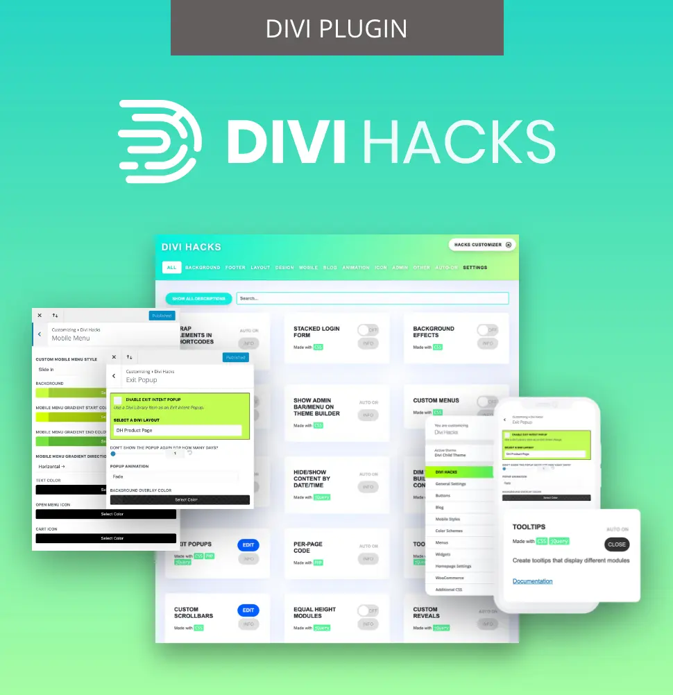
Customize Divi with Over 89 'Hacks'
Divi Hacks is the Ultimate Divi Customization Tool with dozens of options for customizing every aspect of Divi.
Divi Bars for responsive announcement banners and CTAs

Divi Bars makes it easy to build responsive announcement bars using the Visual Builder. You can create device-specific display rules for each bar, ensuring only the right messages show at each breakpoint.

Place notification bars at the top or bottom of the page – they’ll remain visible without disrupting scrolling or hiding main content. Easily set triggers for time delay, scroll depth, or exit intent, so announcements can make the most impact. There’s no duplicate content piling up in your DOM, and bars adapt smoothly as visitors switch between laptop, tablet, or phone.
All Access Pass covers your complete responsive workflow
The Divi Life All Access Pass unlocks every tool you need for rock-solid, responsive sites. With a single subscription, you get Divi Bricks, Divi Hacks, Divi Bars, and over 40 additional premium tools and layouts – plus unlimited site licenses. It’s far more affordable than buying each plugin separately, and all future product launches and updates are included at no extra charge.

Divi Life’s support team can help troubleshoot tricky responsive issues, and every product is fully compatible with Divi 5. Founded in 2016, our All Access Pass suite is proven and reliable – a fab means of keeping sites sharp, fast, and flexible.

The Ultimate Divi Toolkit 🚀
The Divi Life All Access Pass membership is a complete Divi toolbox with all the Divi plugins, child themes, layouts, & templates you'll ever need to create incredible Divi websites.
The perfect response to responsive issues
You’ve now got the blueprint for responsive layouts that hold up. With a clear understanding of Divi’s per-setting cascade, a systematic cache-clearing process, and precise troubleshooting, your changes will stick – on every device. Keep the following workflow in mind:
Understand the cascade > clear every cache layer > validate directly on hardware > fix with the right tools.
The ‘duplicate-and-hide’ approach only leads to performance issues, so always reference your cache and device testing protocols.
When toggles or native options fall short, Divi Life gives you the fastest, most reliable fixes. Start with Divi Bricks for clean, efficient components, use Divi Bars for announcement strips that work everywhere, then grab Divi Hacks for simple CSS class fixes. And for a complete toolkit and much more besides, get all your workflows covered with our All Access Pass.

0 Comments