Divi Hover Effects Decoded: Valuable Insights, Tips, and Tutorials
Websites need some WOW! to compete these days, and hover effects can transform static pages into dynamic, interactive experiences.
The psychological impact of subtle animations just can’t be overstated – they guide attention and influence decision-making in ways that flat designs cannot achieve. When users interact with hover effects, they feel a sense of engagement and responsiveness, making their browsing experience more enjoyable and providing an incentive to stay on your site for longer.
In this article, we’ll take you beyond basic functionality, offering advanced insights tailored for experienced Divi users like yourself. We’ll make the leap into sophisticated techniques for customizing hover effects, innovative applications that enhance user engagement, and expert tips for optimal implementation.
In turn, you’ll learn how to use Divi’s native hover options alongside powerful tools like the Hover Box module from Divi Modules Pro. We’ll also introduce you to a free image hover module that expands your creative possibilities. Master these techniques and you’ll be able to create eye-catching effects that impress visitors and potentially boost conversion rates. Buckle up and enjoy the ride!
Creative Modules Built for Speed
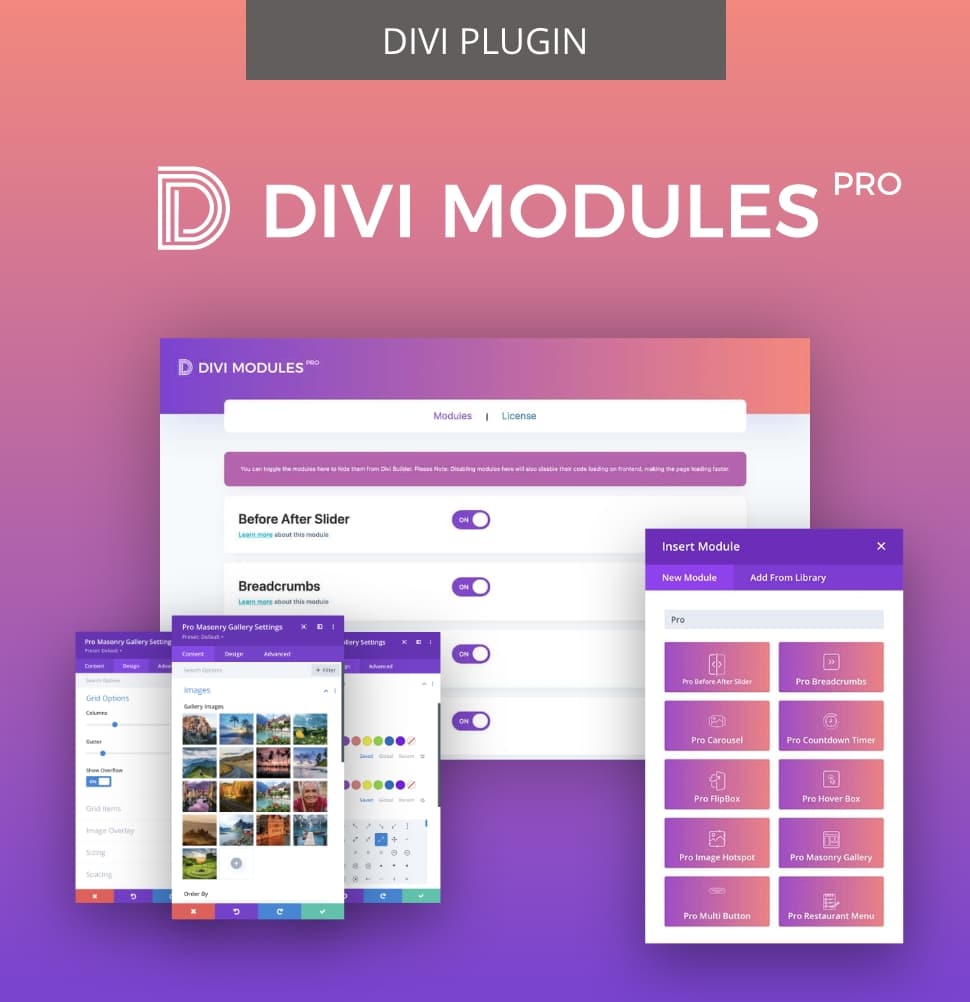
Divi Modules Pro includes gorgeous creative modules without the bloat, & without slowing down your site! Thanks to our dynamic asset engine, you'll get the best modules with the best speed. 🔥
Uses of Hover Effects
For adding interactivity and visual interest to websites, Divi’s hover effects are a great go-to. Divi designers can use these effects to create engaging interfaces for clients and improve the user experience in several ways:
- Revealing additional information: Hover effects can display extra details on product images or team profiles, providing users with more context without cluttering the layout.
- Animating buttons: By animating buttons or call-to-action elements, designers can boost click-through rates, making these areas more noticeable and appealing.
- Creating interactive image galleries: Overlay effects can transform standard galleries into interactive experiences, encouraging users to engage with the content.
- Amplifying navigation menus: Improved usability in navigation menus through hover effects can guide users effortlessly through the site.
- Highlighting key features: On landing pages, hover effects can draw attention to essential features, making them leap out for the viewer.
However, while hover effects improve desktop experiences, designers should exercise caution when implementing them on mobile-focused websites. Since touchscreens lack cursor hovering capabilities, these effects may not translate well and could hinder usability – the opposite effect to that desired.
For mobile-centric designs, we’d recommend alternative approaches like expandable sections or tap-to-reveal functionality to ensure a good user experience across all devices.
Understanding Divi’s Default Hover Options
So what’s the lowdown on Divi Hover Options? This is a native feature that enables the creation of dynamic, interactive elements with no coding skills necessary. These options are easily accessible via the Divi Builder interface for each section, row, column, and module.
Hover effects in Divi can be applied across content, design, and advanced settings. For content, you can change text, images, or even swap entire elements on hover. Design options allow for color changes, opacity adjustments, and scaling effects to make chosen elements more visually appealing. Advanced settings also allow designers to add custom CSS to their hovers, opening up a realm of creative possibilities.
Key features of Divi’s hover options include:
- Transform options: Scale, rotate, and translate elements to create eye-catching animations.
- Transition settings: Control animation speed and timing for a smoother user experience.
- Filter effects: Apply blur, saturation, and brightness adjustments to images or backgrounds on hover.
- Border modifications: Change border color, width, and style to highlight elements more effectively.
How to Create Hover Effects in Divi
Let’s take a look at how to create hover effects in Divi – thankfully, the process is pretty straightforward! Follow these steps to add these fun elements using the Divi Builder:
1. Open the Divi Builder: Start by navigating to the page where you want to add hover effects and activate the Divi Builder. To see your hover effects as you create them, select Build On The Front End.

2. Select a module: Choose a module that you want to apply hover effects to, such as a Button or Blurb. Click on the module to open its settings.
3. Access Hover Options: In the module settings, look for options that feature a mouse cursor icon. This icon indicates that hover effects can be applied.
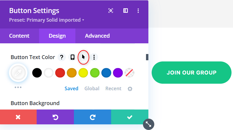
4. Enable Hover Options: Click on the mouse cursor icon to enable hover options for that specific setting.
5. Customize the hover state: Switch to the Hover tab within the module settings. Here, you can customize how the element behaves when users hover over it.

6. Experiment with styles: Try changing colors, sizes, or adding borders on hover. For example, you might set a button’s background color to change when hovered over or increase text size for emphasis.
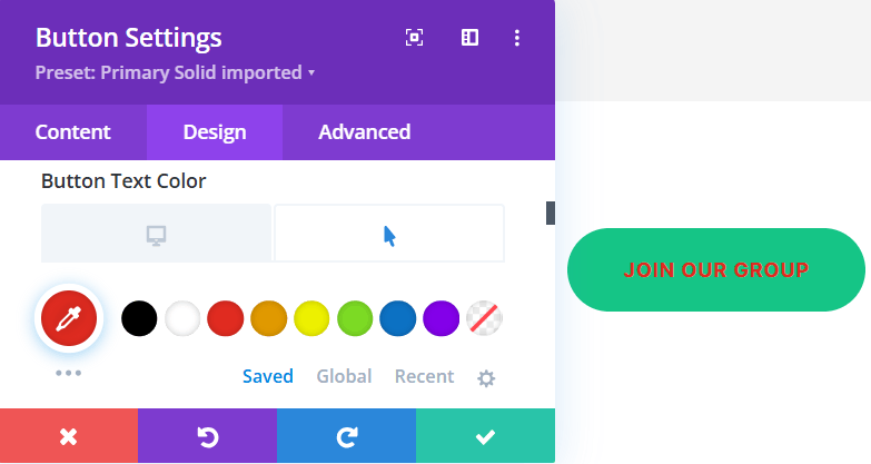
7. Preview in real time: Use the Visual Builder to preview your hover effects in real time, allowing you to see how your changes affect user interaction. If you’re not happy with the results, simply go back and make any necessary tweaks.


Some common hover effects that you can create include:
- Changing button background colors: Make buttons more visually appealing by altering their background color on hover (see above example).
- Increasing text size or changing font styles: Draw attention by enlarging text or changing its style when hovered over.


- Adding filters: Create eye-catching hovers by altering hue, opacity, and saturation for images, texts, or buttons in a hover state.
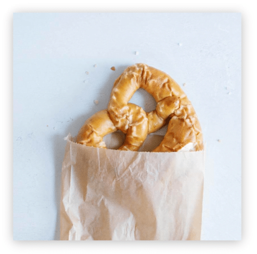
- Adjusting opacity for fade effects: Use opacity adjustments to create smooth fade-in or fade-out effects for images or backgrounds.
How to Use Custom CSS for Advanced Hover Effects
Want to take things a step further? That’s no problem! Divi’s built-in options aren’t enough for everyone, and that’s where custom CSS comes in handy. By adding CSS snippets to your modules, endless additional hover effects can be yours. Here’s how:
- Select your module in the Divi Builder.
- Navigate to the Advanced tab.
- Scroll down to the Custom CSS section.
- Select Module Elements.
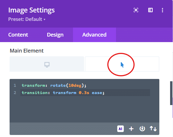
- Scroll down to Main Element.
- Move your cursor next to Main Element until the hover option appears.
- Click on the hover view.
- Add the relevant CSS snippet.
- Save changes.
Try the following examples to get going!
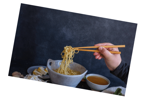
Example: Rotating Image on Hover
  transform: rotate(10deg);
  transition: transform 0.3s ease;

Example: Grayscale to Color Transition
This is a striking effect that shifts an image from grayscale to full-blown technicolor on hover! For this, you’ll need to add two different snippets on the Main Element tab. As before, move your cursor until the hover options appear.
On the desktop tab, add the following snippet:
filter: grayscale(100%);
  transition: filter 0.5s ease;
On the hover tab, add the following snippet:
filter: grayscale(0%);

Custom Border Animation on Hover
This nifty effect adds a border color of your choice for some added emphasis.
On the desktop tab, add the following snippet:
border: 2px solid transparent;
  transition: border-color 0.3s ease;
On the hover tab, add the following snippet:
border-color: #ff0000; /* Change to desired color */

When implementing custom CSS hover effects, consider these essential tips:
- Use browser prefixes: Incorporate browser-specific prefixes like -webkit- and -moz- to ensure wider compatibility across different web browsers.
- Combine multiple properties: Experiment by combining multiple CSS properties – such as transform, opacity, and transitions – to create unique and engaging hover effects that shout “hey, look at me!”
- Consider performance impact: Overly intricate effects can slow down page loading times and negatively impact user experience, so aim for a balance between creativity and efficiency.
Utilizing Transform Effects on Divi Hover Effects
To push things a little further, you can use CSS transform and skew properties to create visually striking hover effects. Here’s how to use them in Divi:
Basic Transform Functions
- translate(x, y) – moves the element
- rotate(deg) – rotates the element
- scale(x, y) – changes the size
- skew(x-deg, y-deg) – tilts the element
Example: 3D Flip Effect on Hover
On the desktop tab, add the following snippet:
transform: rotateY(180deg);
transition: transform 0.6s;
On the hover tab, add the following snippet:
transform: rotateY(0deg); 

Example: Image Skew and Scale
There’s no need to add code to your desktop tab here – just add the following to the hover tab in the Main Element:
transform: skew(-5deg) scale(1.05);
transition: transform 0.3s ease;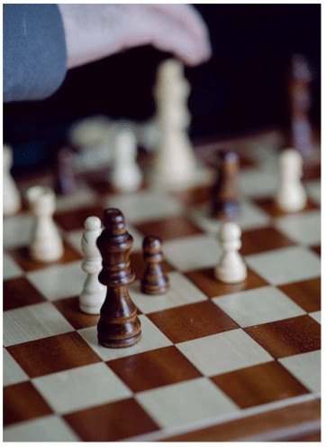
Combine Multiple Transforms for Complex Effects
The following example rotates your module, shifts it slightly, and gives it a size boost. Just add this snippet to the hover view on the Main Element:
transform: translateY(-10px) rotate(5deg) scale(1.1);
transition: transform 0.4s ease-out;

Why Plugins Make Creating Hover Effects Even Easier
So! We’ve gone through the native Divi way of doing things and found a myriad of options. But here’s the rub – you could achieve even more with a dedicated plugin.
“The best tools provide pre-designed, customizable effects that push creative boundaries without requiring coding expertise.”
– Jennifer Rodriguez, Lead Developer at Divi Life
These plugins act as creativity catalysts, simplifying design while inspiring innovative ways to increase user interaction and visual storytelling for those using the Divi theme.
By improving the design process from beginning to end, plugins enable designers to implement sophisticated hover effects across multiple elements quickly, opening up new possibilities to make your pages sing.
Introducing Divi Life for Hover Effects
Divi Life stands out in the Divi ecosystem with our performance-focused approach to hover effects. What sets us apart is our commitment to website speed – unique dynamic asset loading ensures only necessary code is loaded, maintaining optimal site performance, even on busy sites.
Our flagship product – Divi Modules Pro – includes the aforementioned Hover Box module alongside other interactive elements. This feature allows for complex animations and content reveals on hover, surpassing standard Divi functionality.
Let’s take a closer look!
Hover Effects Box in Divi Modules Pro
Our nifty Hover Box module in Divi Modules Pro takes hover effects into the stratosphere. It allows for complex content reveals, multi-directional animations, and smooth transitions that go beyond Divi’s native capabilities.

Using Hover Box, designers can create engaging hover effects that display additional text, images, or call-to-action buttons when users interact with elements. You can create interactive product showcases, team member profiles, or feature highlights that captivate visitors without compromising website performance. For example, you might showcase a product image that expands to reveal more details, or a team member profile that displays contact information on hover.


For more information on implementing these effects, check out our guide on How to Use Divi Image Hover Pro.
Divi Life’s Free Image Hover Module
As another option, Divi Life offers a free Image Hover module, providing a cost-effective entry point to advanced hover effects. This module allows users to add engaging hover animations to images, including zoom effects, overlay text, and color transitions. With over 150 engaging animations using pure CSS, it offers designers a vast amount of options when compared to those possible through native Divi.

Although our free module is more limited than the Hover Box found in Divi Modules Pro, it’s perfect for bloggers, small businesses, or designers looking to experiment with hover effects before investing in a more comprehensive solution. It’s particularly useful for creating interactive image galleries, product displays, or adding visual interest to team member sections.
And guess what? Despite being free, the module maintains Divi Life’s total commitment to performance, ensuring it won’t slow down your website.
Tips and Best Practices for Implementing Hover Effects
When creating hover effects in Divi, be sure to keep them subtle and purposeful. Overusing animations can distract from your content, so focus on using hover effects to highlight important elements, such as calls-to-action or to reveal additional information about products or services. Remember – the aim of the game is to attract the users attention, not overwhelm them in a sea of special effects.
- Consider the mobile experience: Since touch devices lack a true ‘hover’ state, make sure that info isn’t hidden behind hover-only elements. You can use Divi’s responsive settings to adjust or disable hover effects on smaller screens, and so get your brand message across to all users, regardless of their chosen device.
- Be consistent: This contributes to a cohesive design overall. While not every element should have the same effect, similar elements – like buttons or image galleries – should behave similarly when hovered over. Consistency helps users intuitively understand how to interact with your site.
- Test, test, test: Thoroughly test your hover effects across different browsers and devices to ensure compatibility. Pay special attention to load times, as complex hover animations can potentially slow down your site.
To summarize, hover effects should be used strategically to:
- Guide users through your content.
- Highlight important information.
- Add a touch of interactivity to otherwise static elements.
Alternatively, consider using them to create a visual hierarchy on your page. By applying more noticeable hover effects to your most important elements, you can subtly guide users’ attention to key areas of your site without relying on intrusive design elements. This thoughtful approach can improve user engagement and ease navigation across your website.
Elevate your Divi Designs: Start Creating Eye-Catching Hover Effects Today
It’s a wrap! Now that you’ve explored the power of Divi hover effects, it’s time to put your newfound knowledge into action. Keep in mind the options you have at your disposal – even subtle hover effects can keep users engaged and thirsty for more. Why not begin by experimenting with simple hover animations on buttons or images, then gradually expand to more complex effects as you gain confidence? After all, Michelangelo didn’t start with the Sistine Chapel!
For those eager to push their hover effects further, consider exploring Divi Life’s free Image Hover module. When you’re ready to take your hover game to the next level, get Divi Modules Pro to access a Hover Box module that offers advanced options and maintains site performance through dynamic asset loading. Start today and transform your static designs into an interactive wonderland!

Divi Modules Pro
Get Divi Modules Pro & Access Dozens of Interactive Creative Design Modules
Table of Contents
- Uses of Hover Effects
- Understanding Divi’s Default Hover Options
- How to Create Hover Effects in Divi
- How to Use Custom CSS for Advanced Hover Effects
- Utilizing Transform Effects on Divi Hover Effects
- Why Plugins Make Creating Hover Effects Even Easier
- Introducing Divi Life for Hover Effects
- Tips and Best Practices for Implementing Hover Effects
- Elevate your Divi Designs: Start Creating Eye-Catching Hover Effects Today


0 Comments