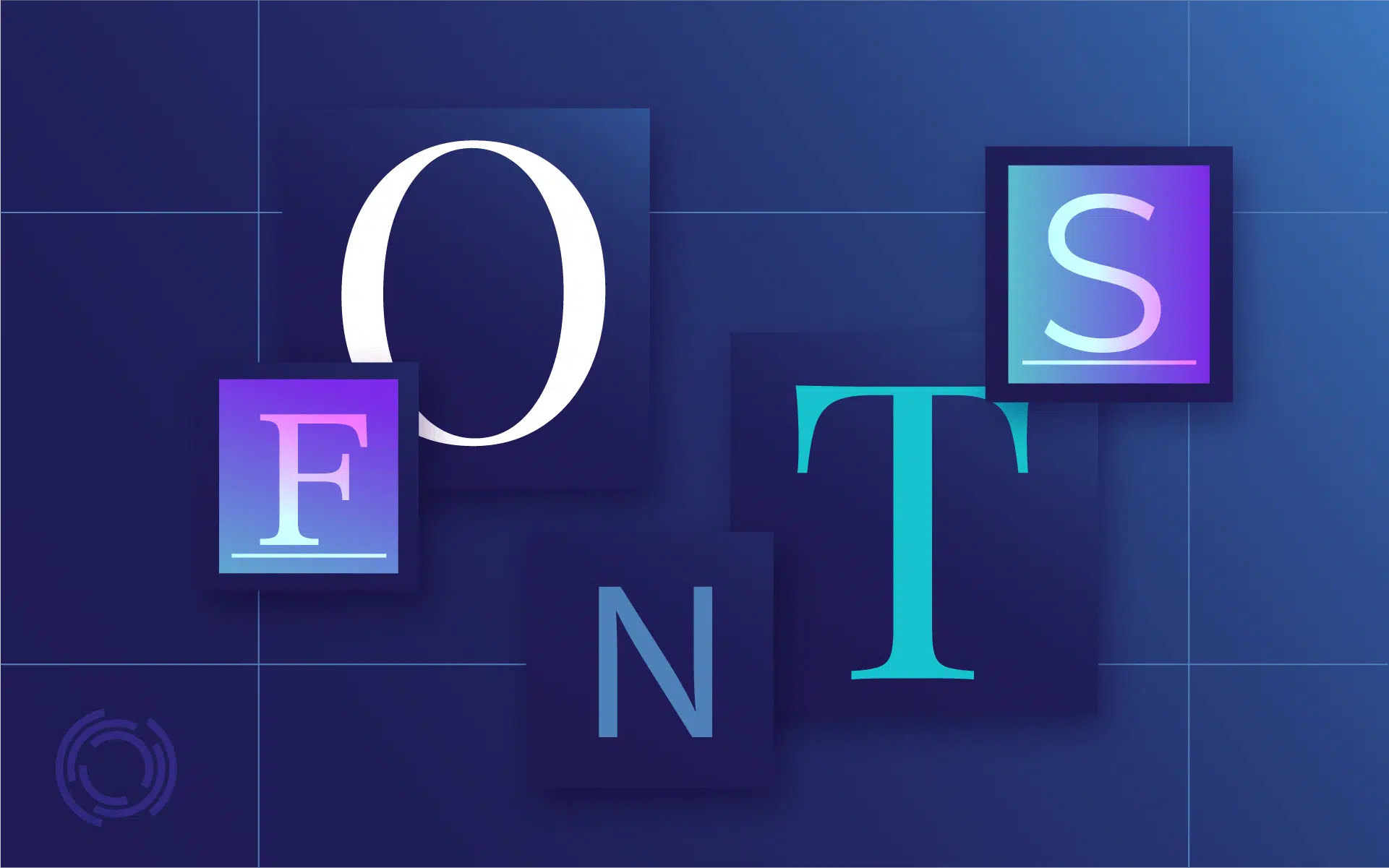
15 Most Popular Divi Fonts With Visual Examples
It’s fair to say that choosing the right fonts can make or break your Divi website. Did you know that typography directly impacts conversion rates and user engagement? A well-chosen font can guide the eye, emphasize key messages, and create a memorable brand experience – treat them with the same importance as image selection and color palette.
Handily, Divi integrates seamlessly with Google Fonts, offering a staggering selection of 800+ fonts. But let’s face it, few designers have the time or energy to wade through so many options. While Divi automatically displays your recently used fonts at the top of the selection menu – perfect for maintaining consistency – you’ll still need to find the right fonts for your brand as a starting point.
And that’s where we come in! We’ve created this nifty guide to help you navigate the world of Divi typography with ease. By the close, you’ll be aware of the most popular font choices among Divi users, and know what to look for when pairing headline and body fonts. Let’s go!
Key takeaways
- Impact of typography on user engagement and conversion rates.
- Headline and body font pairings to capture attention and increase page readability.
- Font examples for specific industry websites.
- Uploading custom fonts to Divi.
- Boosting design skills with the Divi Creator Pro course.
10 most effective Divi fonts for professional websites
Fonts are a major part of your site’s visual appeal, so be sure to spend sufficient time experimenting. With Divi’s extensive font library, finding the perfect typography can be quite a challenge, so consult our shortlist below to speed up the process!
5 best headline fonts to capture visitor attention
To increase time-on-page for your site visitors, consider these headline fonts:

1. Montserrat: This geometric sans-serif is ideal for startups and modern brands. Use weights 600-800 for primary headlines. For desktop, try a font size of 48px with a line height of 1.2. On mobile, reduce the font size to 32px while maintaining the same line height.

2. Playfair Display: Use this elegant serif for making strong brand statements, so consider using a weight of 400, 700 or 900. A desktop size of 52px and a line height of 1.3 can be effective, while a mobile size of 36px works well.

3. Raleway: Employ light font weights for modern, minimal designs. A font size of 44px on desktop and 28px on mobile – both with a line height of 1.4 – provides a clean look.

4. Poppins: With its rounded geometry, Poppins is great for friendly headlines. It’s known as a monolinear font, having a consistent thickness, so match the weight to your wider branding. Opt for a 40px font size on desktop and 26px on mobile, with a line height of 1.3 for both.

5. Nunito: This well-balanced sans-serif with rounded terminals offers a warm and inviting feel, with a professional appearance regardless of weight. Use a desktop size of 46px and a mobile size of 30px, with a line height of 1.25.
“When pairing headline fonts with body text, aim for contrast and readability. For example, pair Montserrat with Roboto or Lora. Playfair Display works well with Open Sans or Source Sans 3. Ensure your body text is legible on all devices, typically around 16px to 18px, and experiment with character spacing to improve readability, especially on mobile devices.”
– Jennifer Rodriguez, Lead Developer at Divi Life
5 readable body fonts that keep users engaged
For long-form content, readability is key. These fonts are optimized to keep users engaged:


7. Lato: Lato is a clean, modern sans-serif perfect for tech and SaaS websites, and nine different weights include a ‘hairline’ style for very large sizes. The semi-rounded details give it a feeling of warmth, while its structure provides stability. Use a font size of 15px to 17px with a line height of 1.6 to 1.8 for optimal readability. Pair Lato with Biryani or Kumbh Sans.

8. Source Sans 3: Designed as Adobe’s first open-source typeface family, Source Sans 3 (formerly Pro) is optimized for screen reading and comes in six weights from regular to black. It also draws inspiration from 20th-century American gothic typeface designs! A font size of 16px to 18px and a line height of 1.5 to 1.75 will work nicely.

9. Inter: Inter is a modern alternative with a tall x-height, enhancing readability. The font has been carefully crafted for computer screens. Use a font size of 15px to 17px with a line height of 1.6 to 1.8. Font weights range from a skeletal 100 to a heavy 900.

10. Roboto: Roboto is excellent for UI elements and navigation, with a dual nature that is both geometric and friendly, and seven weights from thin to bold. A font size of 16px to 18px and a line height of 1.5 to 1.75 provides a comfortable reading experience. Roboto pairs well with Gothic A1.
Expert font pairing guide: Tested combinations for Divi
The right font pairing can be a match made in heaven, hugely increasing your site’s visual credentials. Here are some specific, proven font combinations optimized for Divi, along with practical implementation details:

1. Montserrat (Headers) + Roboto (Body): This combination is optimal for tech and SaaS sites, offering a clean and modern look.
- Font weights: Use Montserrat 700 for H1 and 600 for H2-H3. Roboto should be set to Regular 400 for body text.
- Specific sizes: For desktop, set H1 to 48px, H2 to 36px, and body text to 16px. On mobile, reduce H1 to 32px, H2 to 24px, and body text to 14px.
- Mobile performance: Ensure that font files are optimized and consider using the CSS snippet font display: swap to prevent layout shifts. When this snippet is applied, the browser immediately displays a fallback font, while the custom web font is loading. Once available, the browser swaps the fallback to your preferred font. Highly useful for preventing blank text, and so good for SEO and UX too!
- Accessibility: Maintain a contrast ratio of at least 4.5:1 for body text and 3:1 for large text to meet WCAG standards. For example, use a dark gray (#333333) for text on a white background.
- Fallback fonts: For both Montserrat and Roboto, use a generic sans-serif fallback like Arial or Helvetica. Go safe!

2. Playfair Display (Headers) + Source Sans 3 (Body): This pairing is perfect for luxury and hospitality websites, given its natural elegance and sophistication.
- Font weights: Use Playfair Display 900 for H1; 700 for H2-H3, and Source Sans 3 Regular 400 for body text.
- Specific sizes: On desktop, use 56px for H1 and 18px for body text. For mobile, adjust H1 to 40px and body text to 16px.
- Mobile performance: Optimize font loading by using preloading techniques.
- Accessibility: Ensure a 4.5:1 contrast ratio for standard text and 3:1 for larger text. Use tools to verify contrast compliance.
- Fallback fonts: For Playfair Display, a serif fallback like Georgia or Times New Roman is appropriate. Source Sans 3 can fall back to Arial or Helvetica.
For deeper insights into typography principles, refer to Google Fonts’ guidelines on pairing typefaces. As ever, remember to test your font combinations across different devices and browsers to ensure consistent rendering and readability.
How to add custom fonts to Divi
Adding custom fonts to Divi allows you to extend your design possibilities beyond the default font library, so it’s a handy thing to know!
Before we tackle this (easy) process, remember that Divi supports TTF (TrueType Font) and OTF (OpenType Font) file formats. If your font is in another format, use a free online converter like Font Squirrel to convert it. Keep in mind that Divi has a maximum file size limit of 2MB per font file.

Upload process
1. Open any Divi module with text options (e.g. Text, Blurb, Heading).

2. Go to the Design tab and find the Text section.

3.In the Text Font dropdown, click the font you require, then select Upload.

4. You’ll be prompted to name your font and upload the font files. Be sure to upload the complete font family (regular, bold, italic, etc.) to ensure all styles are available.

Common troubleshooting
In the unlikely event of anything going wrong, here are some fixes to commonly found problems:
- “Sorry, you are not allowed to upload this file type” error: This WordPress security feature blocks certain file types. To fix this, you can temporarily enable unfiltered uploads by adding the following line to your wp-config.php file:
/*
define('ALLOW_UNFILTERED_UPLOADS', true);
*/
Important: This setting is highly discouraged on live sites unless absolutely necessary. You should only enable ALLOW_UNFILTERED_UPLOADS if you fully trust the users who have upload permissions and/or you have strong security measures in place (like firewalls, malware scanning, and proper user role management).
Remove this line after uploading your fonts to maintain security. If you need to allow specific file types without opening up security risks. Use the upload_mimes filter in your child theme’s functions.php to allow specific file types safely:
/*
function custom_mime_types($mimes) {
    $mimes['svg'] = 'image/svg+xml'; // Example: Allow SVG uploads
    return $mimes;
}
add_filter('upload_mimes', 'custom_mime_types');
*/
Alternatively, use a plugin like Easy SVG Support to bypass the error.

- Ensure font files are clean: Always download fonts from reputable sources and scan them for viruses before uploading.
- Test across major browsers: After uploading, check your website on Chrome, Firefox, Safari, and Edge to ensure the fonts render correctly.
Level up your Divi design skills today with Divi Creator Pro
Choosing and implementing the right fonts is a mighty component of crafting stunning Divi websites, but they’re just one piece of the puzzle. It’s by mastering overall web design principles that will truly set your sites apart.

That’s where Divi Creator Pro comes in. Our comprehensive 6-module program is designed to take your Divi skills to the next level – and have we got a next level for you! Within the program, the Design Training Module will help you master font selection, pairing, and implementation, ensuring your typography is perfect for your branding and engaging every time.
As the following testimonial from Martin Young notes:
“The depth and breadth of Tim’s knowledge and experience is so clear… So this training helps move the dial from simply being ‘website designer’ to becoming a ‘marketing consultant’, with tools and techniques that actually help drive improvements to the client’s bottom line.”
Ready to transform your Divi websites from good to exceptional? Explore Divi Creator Pro today for lifetime access to expert typography and design training.

0 Comments