Build Responsive Divi Dropdown Menus

Default Divi dropdown menus fall short when it comes to devising an appealing site navigation. While Divi provides essential menu features, many designers find themselves stuck when aiming for menus that look great and work flawlessly on every device.
Your menu is a constant presence, shaping every visitor’s journey, so it deserves as much care as your most eye-catching design elements. Thankfully, there are lots of options available to give your menus some serious WOW!
This post will guide you through building responsive dropdown menus that match your ideas and ease navigation. We’ll look at why separate strategies for desktop and mobile menus make all the difference, and practical tips for solving common menu challenges. We’ll also show you what a pair of premium plugins can do for your menus, with features on Divi Mega Pro and Divi Mobile Menu. Here we go!
Key takeaways
- Desktop and mobile users require tailored navigation as generic menus often fail to deliver a great experience on both platforms.
- While Divi’s native tools offer basic customization, adding custom CSS allows precise control.
- Multi-column layouts and dynamic content integration make mega menus ideal for complex sites.
- Touch-friendly accordions or slide-in panels are essential for mobile, as dense, multi-column layouts hinder user experience.
- Plugins like Divi Mega Pro and Divi Mobile Menu empower designers to build device-optimized menus that boost engagement.
How to create a responsive dropdown menu with default Divi methods

Divi’s native menu system delivers basic dropdown functionality right out of the box, but if you want menus that truly fit your design, you’ll need to dive into custom CSS.
By default, Divi lets you control dropdown background color, text color, and active link color through the Appearance > Customize > Header & Navigation > Primary Menu Bar settings.
These options are a solid starting point for most users, but for advanced styling, like precise width control, custom padding, and unique hover effects, you’ll need to add some code.
To modify dropdown width, add custom CSS in the Divi Theme Options > Custom CSS section using the .nav li ul selector. For example, to set a wider dropdown, use:
/*
 .sub-menu {
  width: 240px;
}
*/
Adjusting padding and spacing inside the dropdown is done by targeting the a tags inside the dropdown. For wider spacing, try:
/*
ul.sub-menu li a {
    margin-bottom: 40px;
}
*/
You can also customize the dropdown animation by adding a transition property to smooth out the hover effect:
/*
ul.sub-menu {
    transition: all 0.5s ease;
}
*/
On mobile, Divi automatically converts your menu to a hamburger icon when the screen width drops below 980px. You can change this breakpoint by editing the @media query in your custom CSS:
/*
@media (max-width: 768px) {
  /* Your mobile menu CSS here */
}
*/
To style the mobile menu, use the Customizer’s Mobile Menu settings to change the hamburger icon color or background, or add CSS to fine-tune the dropdown’s appearance. For example:
/*
ul#mobile_menu.et_mobile_menu {
    background-color: #ccd5ae;
      border-radius: 0 0 8px 8px;
}
*/
The Divi Menu module offers another approach, with built-in dropdown styling options for layout, background color, and text formatting. In the module’s design tab, you can adjust the dropdown layout (fullwidth or standard), background color, and text formatting without code. However, for more advanced changes, like background opacity or fixing alignment, you’ll still need custom CSS:
/*
.mobile_menu_bar {
    background-color: #faedcd;
      border-radius: 8px;
}
*/
While these default methods handle responsiveness automatically, you’ll find their control limited compared to dedicated solutions. For example, fixing z-index issues or ensuring perfect mobile behavior often requires extra troubleshooting. But for many, Divi’s native tools and a few lines of CSS are enough for a professional-looking, responsive dropdown menu.
Limitations of this approach
Relying solely on native Divi functionality for dropdown menus comes with several notable constraints:
- Multi-column layouts within dropdowns are not supported, making it difficult to implement complex or visually rich navigation structures.
- Mobile-specific dropdown behavior is limited to basic styling, with no built-in way to include interactive elements like contact forms, image galleries, or dynamic content.
- Dropdown width often needs custom CSS to expand beyond default values, and alignment issues can arise, especially with longer menu items.
- Z-index conflicts are common, causing dropdowns to appear behind other page elements.
According to Baymard Institute, default hover behaviors can lead to usability problems, such as accidental menu closures and flickering effects. These limitations are especially problematic on mobile devices, where intuitive navigation is crucial.
As a result, site owners often simplify their navigation to fit technical constraints, sacrificing the user experience for reliability.
Common troubleshooting techniques with CSS
For many Divi dropdown menu issues, targeted CSS can provide quick fixes.
- To override the default dropdown width, use .nav li ul { width: 300px; } and adjust the pixel value as needed.
- To resolve z-index conflicts that cause dropdowns to appear behind other content, apply .et_pb_menu { z-index: 999; position: relative; }.
- If menu items wrap or double-stack, use .nav li li { white-space: nowrap; width: 100%; } to keep them on a single line.
While these solutions are effective, they require ongoing maintenance, especially after Divi updates, since new versions may change class names or structure.
What’s more, custom CSS might need adjustments for compatibility with different themes or page layouts. These workarounds help maintain a clean navigation experience but highlight the need for careful testing and occasional code updates.
Why two dropdown menus are better than one for true responsive design
Many Divi users assume a single menu can work perfectly across all devices, but this approach often leads to frustration. While Divi’s responsive framework does its best to adapt elements for different screens, navigation often requires more thoughtful customization to ensure a smooth experience.
Dropdown menus that look and function beautifully on desktop can quickly become cluttered and confusing on mobile devices. As screens shrink, text overflow issues emerge, touch targets get too small, and complex menu hierarchies turn into a maze for users.

Divi 5’s responsive editing tools do offer some flexibility. You can tweak menu styles at various breakpoints, but the underlying interaction patterns remain the same. This means that even with adjustments, desktop-style dropdowns rarely translate well to touchscreens. Users may struggle to tap tiny menu items, or worse, accidentally close menus before making a selection.
The professional solution is clear – use two separate menus! One should be optimized for desktop, and another for mobile. This approach lets you tailor navigation to each device, ensuring an intuitive experience everywhere.
“Prioritizing user experience on each device, rather than settling for compromises, is the mark of expert web design.”
– Jennifer Rodriguez, Lead Designer at Divi Life
Dedicated solutions – like a desktop mega menu and a mobile-friendly accordion or hamburger menu – allow you to implement device-appropriate navigation patterns. The result is a site that’s truly responsive, not just responsive in appearance.
Why Mega Menus are the ultimate form of dropdown menus for desktop
Mega menus are a fab solution for Divi websites with complex navigation needs.

With Divi Mega Pro, you can go beyond text links and integrate any Divi module – like forms, product sliders, or image galleries – directly into your navigation. This means you can feature key products, highlight promotions, or showcase important pages right inside the menu, driving engagement and conversions. Here’s an example of a Contact Us-triggered mega menu, giving info, sign-up space, and a map:

The visual nature of mega menus also fits perfectly with Divi’s design-focused approach, allowing you to create navigation that’s both functional and beautiful.

Do More with Divi Mega Pro!
Create beautiful & functional mega menus & mega tooltips with Divi Mega Pro, complete with included templates & advanced functionality. 🔥
Why Mega Menus don’t translate as well to mobile devices
Mega menus excel on desktop, but their multi-column layouts become cumbersome on mobile screens. The same visual organization that helps users on large displays leads to excessive scrolling or forces content to be cut down, frustrating mobile visitors. Research shows that mobile users navigate best with menus that offer a clear, step-by-step hierarchy rather than dense, multi-column layouts.
Mobile users typically seek specific information quickly, not to browse complex hierarchies. That’s why even content-heavy sites avoid using mega menus on mobile and opt for simpler, touch-friendly navigation patterns.
This highlights a responsive paradox. Trying to make one menu work perfectly for all devices often results in compromises that hurt user experience. As we’ve seen, the professional solution is to pair a desktop mega menu with a dedicated mobile menu, ensuring each device gets navigation tailored to its own needs.
How to create a mega menu for desktop with Divi Mega Pro

Divi Mega Pro transforms your site’s navigation by allowing you to build unlimited mega menus as custom post types, all powered by the Divi Builder. Unlike standard dropdowns, this plugin lets you design menus with any Divi module, third-party modules, or WordPress plugins, making your navigation a dynamic, content-rich hub for users.
To start, install Divi Mega Pro via your WordPress dashboard: Plugins > Add New > Upload Plugin). Once activated, you’ll create a new mega menu by going to Divi Mega Pro > Add New.

Here, you have the full Divi Builder at your disposal. For example, if you run an eCommerce site, you can craft a mega menu that displays product categories with thumbnail images and featured items.
Simply drag in a row, split it into columns, then add image modules for thumbnails and text modules for product names or descriptions. You can even showcase featured products with ‘Add to Cart’ buttons directly in the menu.
For service-based businesses, use icons, brief descriptions, and clear CTA buttons. Drag icon modules, text modules, and button modules into your columns. Media sites can organize content categories with recent posts and featured articles by embedding post modules and customizing layouts for easy browsing. Here’s an example of a mega menu, triggered by the ‘About’ menu header:
Divi Mega Pro excels at multi-column layouts. Use Divi’s row and column structure to arrange content logically. You’re not limited to static content – embed dynamic elements like recent posts, WooCommerce products, or custom post types. Interactive features such as login forms, shopping carts, tabs, toggles, and contact forms can all be included, turning your menu into a functional extension of your site.
Visual enhancements are straightforward. You can apply gradients, shadows, and animations directly within the Divi Builder, and configure trigger behaviors – hover or click – by adjusting your CSS or using the plugin’s settings.
Once you’re happy with the design of your mega menu, make a note of the Mega Pro Unique Class, found in the box in the top left-hand corner. Publish your page, as triggers will not work on drafts.

Head to Appearance > Menus, select the correct menu, and click on the dropdown arrow of the menu item that you want to trigger your mega menu. Add your unique CSS Selector code to the Link Relationship box:

Remember to save changes. Finally, test your mega menu by going to a live page and hovering over the menu item of your choice to check that the trigger works okay. You can repeat the process on multiple menu items.
How to create a mobile dropdown menu with Divi Mobile Menu

For Divi sites that rely on powerful desktop mega menus, Divi Mobile Menu is a great companion for mobile navigation. Together with Divi Mega Pro, it forms a complete responsive strategy, delivering optimized experiences on every device. Divi Mobile Menu activates automatically at your chosen breakpoint, transforming your navigation into a touch-friendly interface designed specifically for mobile users.
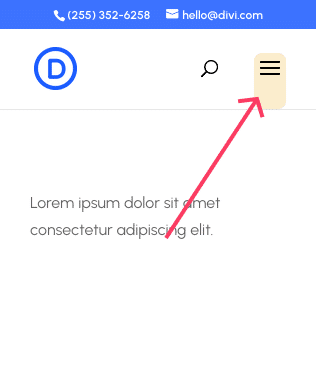
To start, purchase the plugin and install via Plugins > Add New > Upload Plugin. Divi Mobile Menu will automatically replace the default Divi dropdown menu with your custom mobile menu. To configure settings, go to the Divi Mobile Menu option on the left sidebar of your dashboard screen, then select Add New.

Configure your mobile menu settings, from Animation to Location and Design:

Once you’re happy with your menu’s setup, save the draft and access the Divi Builder to craft your menu, just as you did with your Mega Pro desktop menu. Here’s a basic mobile mega menu, relating to a Meet Our Team trigger:

Divi Mobile Menu has a vast selection of deep customization options. Start with menu trigger styles – choose from multiple hamburger icon variations, add custom text labels, and adjust positioning to match your site’s design. Animation effects for the trigger icon ensure smooth, engaging interactions to guide users.
Dropdown behavior is fully customizable. Select from slide-in panels, full-screen overlays, or accordion-style expansion for nested items. These options let you tailor the menu’s feel to your brand and user needs, ensuring easy access to all content even on the smallest screens. Accordion-style menus, in particular, help users navigate complex hierarchies without getting lost or overwhelmed.

The visual styling options available to you are extensive. Adjust background effects, including colors, gradients, and even images, to blend your menu with your site’s aesthetic. Control typography, spacing, and brand color integration for a cohesive look that reinforces your identity. Advanced animation settings let you fine-tune timing, transitions, and interaction feedback, making every tap and swipe feel polished and responsive.
Conditional logic adds another layer of flexibility. Show or hide menu items based on user roles, login status, or other conditions, ensuring each visitor sees only relevant navigation options.
This is especially useful for membership sites, eCommerce, or multi-role environments.
With Divi Mobile Menu, you’re crafting a unique, device-specific experience that prioritizes usability and style. This approach eliminates the compromises of one-size-fits-all navigation, giving your site a professional edge that users will appreciate.

Create Better Mobile Experiences
The Divi Mobile Menu plugin allows you to craft custom mobile menu experiences like the big brands do. No more smushing your desktop menu into a mobile screen! 📲
Get started with Divi Mega Pro and Divi Mobile Menu
Dropdown menus are the backbone of your site’s navigation. Having separate menus for desktop and mobile ensures every visitor enjoys a first-class browsing experience, no matter their device.
Divi Mega Pro lets you build powerful, content-rich mega menus for desktop, while Divi Mobile Menu delivers touch-friendly, mobile-optimized navigation. These plugins aren’t just design upgrades, but more like business performance tools. Every visitor lost to poor navigation is missed revenue, and with these solutions, you’ll retain users who might otherwise bounce off-site in frustration.

For the best value, consider our All Access Pass, which includes both plugins, plus all our Divi products, at a significant discount. Our support team offers unlimited assistance throughout your license, so you’ll never be stuck!
By combining desktop mega menus with mobile-optimized navigation, you’ll create a site that looks awesome while increasing the odds of visitor interaction. Take control of site navigation by trying our Divi Mega Pro and Divi Mobile Menu solutions today.

Table of Contents
- How to create a responsive dropdown menu with default Divi methods
- Why two dropdown menus are better than one for true responsive design
- How to create a mega menu for desktop with Divi Mega Pro
- How to create a mobile dropdown menu with Divi Mobile Menu
- Get started with Divi Mega Pro and Divi Mobile Menu
0 Comments