Create a Standout Divi Site with Custom Menu Styles: A Quick Guide
If you’ve spent more than five minutes thinking about your website’s design, you already know the menu is your users’ roadmap, your brand’s first impression, and maybe the deciding factor on whether a visitor sticks around or bails. It’s not just a list of links.
Divi’s default menu setup is fine – but “fine” doesn’t get you far in a world where attention is currency. Customizing your Divi menu lets you go beyond just ‘functional’. Each tweak is you shaping how users interact with every click.
A smart, branded menu creates a smoother user experience, whether they’re on mobile or desktop, and can subtly guide them toward the pages that matter. And let’s not forget conversions – a well-placed call-to-action here, a spotlighted product page there, and suddenly, your menu is doing more than just guiding visitors; it’s actively engaging them.
In this guide, we’ll look into transforming your Divi menu from functional to unforgettable, using built-in tools, a bit of CSS, and even some third-party flair with our own Divi Bricks and Divi Mega Pro!
Do More with Divi Mega Pro!
Create beautiful & functional mega menus & mega tooltips with Divi Mega Pro, complete with included templates & advanced functionality. 🔥
How to create a menu in Divi
To build a menu in Divi, go to Divi > Theme Customizer from your admin dashboard and click on Header & Navigation.
This will open the header builder, where you should have access to customizations such as where the logo appears, fonts, animations, and colors – it’s all fairly straightforward. You’ll see your changes live within the same window, so you’re always sure what your updates do.
The menu below uses a centered logo, with social icons and email set to show under the Header Elements settings:
Customizing your Divi menu with the Theme Builder
Now that you know how to create a Divi menu, it’s time to get into customizations that can improve your design. Of course, the builder lets you tweak things like the background and font, but that’s there’s more you can do:
- Logo: Display your site logo on the header, with a fully customizable border and background, so your branding is always visible but unobtrusive.
- Cart icon and quantity: Add a cart icon with a live item count to the menu, giving users instant visibility into their cart contents without extra clicks. This straightforward feature subtly keeps the shopping experience top of mind, encouraging users to review their selections and proceed to checkout.
- Alignment: Control precise positioning of menu items – left, center, or right – within the header. Beyond layout choices, this alignment option improves visual flow, helping users scan and interact with the menu intuitively on all devices and platforms.
- Dropdown direction: Adjust the dropdown’s opening direction to up or down, allowing menus to drop below or above a main menu item. This level of control avoids overlap with other content and provides a predictable, clean browsing experience, especially helpful for complex menus or small screens.
- Animation: Bring subtle animation effects, like fade-ins or slides, to menu items and dropdowns. These effects enhance the look and feel of the navigation, drawing attention to where users need to focus next, while keeping the menu engaging and visually dynamic.
- Sticky positioning: Lock the menu at the top of the screen as users scroll down, ensuring it’s accessible no matter where they are on the page. This feature makes long-page navigation effortless by keeping the menu in constant reach, eliminating unnecessary scrolling to reach the top.
Let’s style our menu using some of these options:
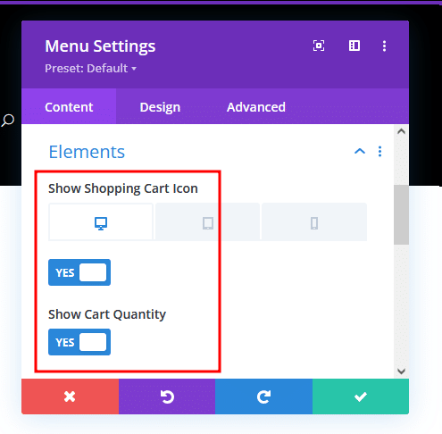
- Under the Content tab, open Elements and toggle the Show Shopping Cart Icon and Show Cart Quantity options on.
- Move to the Design tab and, under Layout, change the Style to Inline Centered Logo.
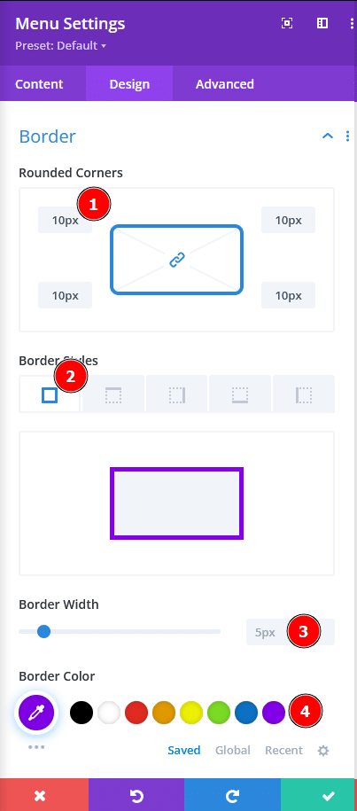
- Scroll to Border and change the Rounded Corners to 10px, Border Styles to solid on all four sides, Border Width to 5px, and choose an option from Border Color.
- Scroll to the Animation section and choose a style that works for you.
- Finally, move to the Advanced tab and, under Scroll Effects, change the Sticky Position setting to Stick to Top.
This should give you a menu that looks a lot better:
Customizing your Divi Menu with CSS
If there’s something you want to do with the menu that isn’t available natively, it’s probably available through custom CSS.
One of the most exciting examples of this involves making the menu fullscreen.
Fullscreen menus are a hard reset for the browsing experience, wiping everything else off the screen and saying, “Here’s what matters.” They strip away the noise in a deliberate pause, giving users a moment to rethink the journey forward, distraction-free.
Follow these steps to create a fullscreen menu in Divi:
- Open the menu module settings and go to the Advanced tab.
- Under CSS ID & Classes, set the CSS Class to your preferred name. For this demo, we’ll use demo-menu-a.
- From your admin dashboard, go to Divi > Theme Options, then scroll down to the Custom CSS section, where you’ll need to paste the code below:
/* Base styling to keep menu minimized by default */
.demo-menu-a {
	position: fixed;
	top: 0;
	left: 0;
	width: 100%;
	height: 70px; /* Normal header height */
	background-color: transparent; /* Transparent by default */
	transition: height 0.4s ease, background-color 0.4s ease;
	z-index: 9999;
	display: flex;
	align-items: center;
	justify-content: center;
}

/* Fullscreen styling when menu is hovered */
.demo-menu-a:hover,
.demo-menu-a:focus-within {
	width: 100vw;
	height: 100vh;
	background-color: rgba(0, 0, 0, 0.95); /* Dark overlay background */
	flex-direction: column;
	align-items: center;
	justify-content: center;
}

/* Style the menu items for fullscreen mode */
.demo-menu-a .et_pb_menu__menu {
	list-style: none;
	padding: 0;
	text-align: center;
}

.demo-menu-a .et_pb_menu__menu li {
	margin: 20px 0;
}

.demo-menu-a .et_pb_menu__menu a {
	font-size: 2rem; /* Larger font for fullscreen */
	color: #ffffff;
	text-decoration: none;
	transition: color 0.3s ease;
}

.demo-menu-a .et_pb_menu__menu a:hover {
	color: #ff6347; /* Hover color for links */
}
This should make it so the menu goes fullscreen when you hover over it, as shown below:
Why header layouts are a great starting point for a custom Divi menu
Starting with a Divi header layout to build a custom menu makes practical sense. These pre-designed templates are crafted with navigation principles in mind, balancing visual clarity and usability in ways that are harder to get right from scratch.
“With a header layout, you’re not wasting time on basic setup or wondering if the design fundamentals are solid – they already are. You’re handed a tested design that works, which means you can put energy into details like font choices, color schemes, and animations, making the experience feel intentional and branded rather than slapped together.”
– Jennifer Rodriguez, Lead Developer at Divi Life
Working with a premade layout inside Divi’s visual builder allows you to tweak, style, and make the menu feel uniquely yours without dismantling the essentials. The result is navigation that’s purpose-built and fine-tuned to enhance user experience rather than distract from it.
Introducing Divi Bricks for Header Layouts
Divi Bricks brings an extensive collection of straightforward, effective header layouts to the table, all built to work seamlessly with Divi’s menu and design tools. These layouts offer flexibility, from clean, centered logos to bold, full-width headers with dropdowns.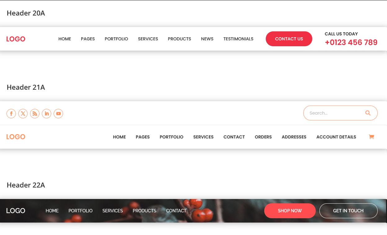
Divi Bricks is a powerhouse for anyone serious about web design – it’s loaded with everything you need to build out full layouts with style and flexibility. But if all you’re after is a set of sharp, well-designed headers, the Header Layout Pack is exactly that. You get responsive, high-quality headers, fully customizable in the Divi Builder and ready to go with any Divi or third-party modules.
Create custom mega menus with Divi Mega Pro
If you need a solid, reliable menu, a standard layout will absolutely do the job. But if you’re looking to go beyond that, with dynamic functionality and next-level customization, then allow me to introduce you to Divi Mega Pro. This plugin takes Divi’s menu capabilities and pushes them into a whole new realm, designed for sites that need more than basic dropdowns.
If you’re unfamiliar, a mega menu is essentially a dropdown cranked up to eleven – a menu that expands to show a whole range of content at once, often with multiple columns, images, and even interactive elements. This is perfect for eCommerce sites like eBay (pictured below), complex blogs, or any layout-heavy website where traditional menus fall short.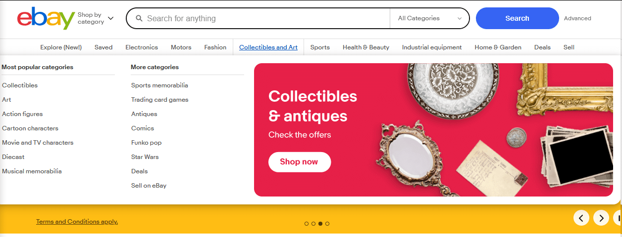
With Divi Mega Pro, you work entirely within the Divi Builder interface, meaning no code or complex workarounds. Instead, you’re visually building out your menu just like any other Divi section, with the flexibility to add forms, shopping carts, sliders, and call-to-actions right inside the dropdown. It’s about turning the menu into a dynamic part of the site, not just a list of links.
Then there’s the Mega Tooltips feature. Unlike traditional mega menus, which usually cover a wide area, Mega Tooltips offer targeted, concise popups that reveal extra details when you hover over or click specific items. Think product specs on an eCommerce site or a quick contact form without navigating away.
With Divi Mega Pro, your navigation does more than just hold information – it becomes an interactive experience, built to be as intuitive as it is powerful. Try it out for yourself:
- Install and activate the plugin, then go to Divi Mega Pro > Add New from your dashboard.
- Create the content you want to display when you hover over a menu item. The best thing about Divi Mega Pro is that you can use whatever module you want, so you should go for whatever you want. For this demo, we’ll use a login form.
- Publish when you’re done then scroll down until you see the Mega Pro Triggers section on the right and copy the value in the Mega Pro Unique Class.

- Paste the unique class name into the CSS Selector Trigger text box right below to connect it to the mega menu item so you can call it from other areas of your site.
- Go to Appearance > Menus from your dashboard and open the menu you want to turn into a mega menu.
- From the top right of the display, expand the Screen Options dropdown and ensure the CSS Classes and Link Relationship (XFN) items are checked.

- Expand the options for the menu item you want to add the mega menu content to and, under Link Relationship (XFN), paste the class name you copied earlier. Hit Save Menu when you’re done.

Now, when you load up a page with the menu you’d created and hover over the relevant item, the mega menu content should show up!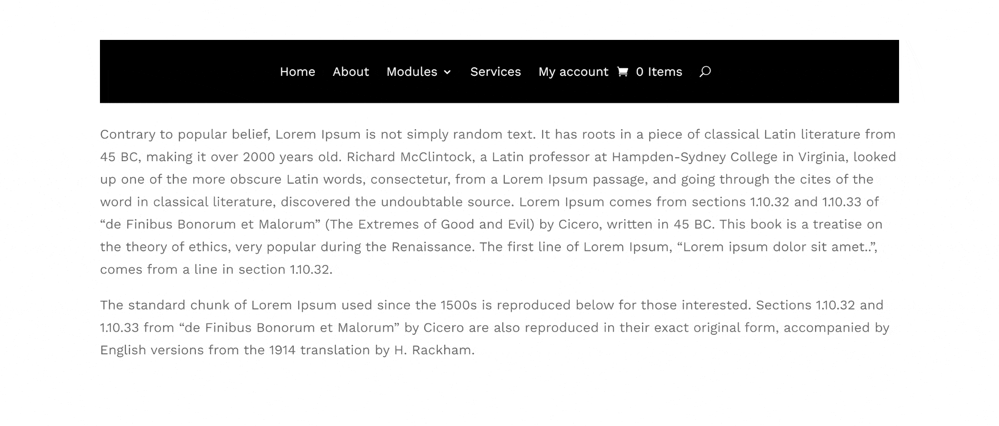
In-depth menu customization with Divi Mega Pro
Divi Mega Pro lets you do so much with menus that you might not believe you’re still working within Divi!
As I stated earlier, you can add multiple modules to a mega menu, which opens the door to some serious customization options. The previous example used a simple login form module, but what if we combined multiple sections that contained text, images, and buttons to create a gorgeous menu item?
Here’s the wireframe: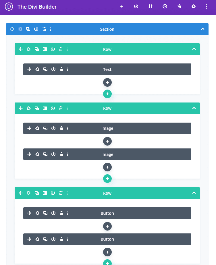
And here’s what it looks like in action when we hover above a new Shop menu item:
Enhance your brand identity with a uniquely customized Divi menu from Divi Mega Pro
Divi’s default menu options are passable for basic sites, but when you need advanced features– multi-layered dropdowns, detailed custom styling, or WooCommerce-friendly navigation – custom code quickly becomes necessary.
Divi Mega Pro changes the equation by offering all of this directly within the Divi Builder, removing the need for code. You get access to a powerful suite of features for building mega menus, including adding anything from icons and images to fully interactive modules and rows.
For e-commerce sites, Divi Mega Pro’s WooCommerce integration allows for intuitive product navigation, transforming standard menus into functional shopping experiences. The responsive controls are tailored for all devices, so your menus adapt perfectly, whether on desktop or mobile.
For those who want a custom menu without the complexity, Divi Bricks offers a straightforward alternative, letting you build polished, responsive headers with pre-designed layouts.
However, if you’re after full control with advanced features, all without writing a single line of code, explore Divi Mega Pro and see how easily you can build detailed, responsive mega menus that are both functional and brand-aligned!


0 Comments