Easy Ways to Customize Divi Bullet Lists
For designers with innovation coursing through their veins, Divi’s native bullet lists can feel a little restrictive. Experienced users are often stuck with default styling options, frustrated by color restrictions, and spacing constraints. Now, just imagine being able to customize pricing tables with unique icons that fit your brand and wider styling. Or how about having eye-catching bullet points that grab attention across your entire site, rather than little dull black dots?
Well, imagine no longer!
We’re going to leap far into advanced customization techniques that will transform your bullet lists. You’ll discover how to utilize ETmodules icons for custom bullets, implement gradient backgrounds, and create nested lists with distinct styling.
Whether you want to apply these techniques globally for brand consistency or to specific sections for unique flair, you’ll find all there is to know right here.
Learn how to:
- Customize bullet points in Divi with CSS snippets and targeting lists with specific classes.
- Replace default bullets with custom icons from the ETmodules library by using Unicode values in CSS and ensuring proper positioning across your site.
- Use Divi’s Global Presets to maintain consistent list styles and nested hierarchies.
- Apply unique styles to specific lists without affecting global styles by setting up modular CSS classes.
Transform your Divi bullet lists in minutes
Divi’s default bullet lists work, but lack visual appeal. Luckily, transforming them into professional elements is easy. Start with the Divi Text Module’s built-in list styling, but should you require advanced styles, you can extend on default styling with custom CSS.
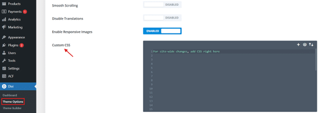
You can add CSS in Divi > Theme Options for site-wide changes, or use page-specific CSS or module-level styling for unique cases. Define your brand’s bullet list style in Theme Options as a baseline, then adjust as needed. This clear style hierarchy maintains consistency while allowing flexibility – use Divi’s native Extend Styles feature to copy styling across elements.
Let’s explore some groovy CSS tricks.
Quick CSS tricks to customize bullet colors and spacing
Take a look at Divi’s native bullet options first:Native Divi bullet points
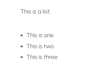
Perfectly fine of course, but a little uninspired! Here are some basic snippets for some cool bullet effects:
- Target specific lists: Before styling, you need to select which list to apply the custom design. The best way to do this is by assigning a class to your <ul> element, such as my-custom-bullet.
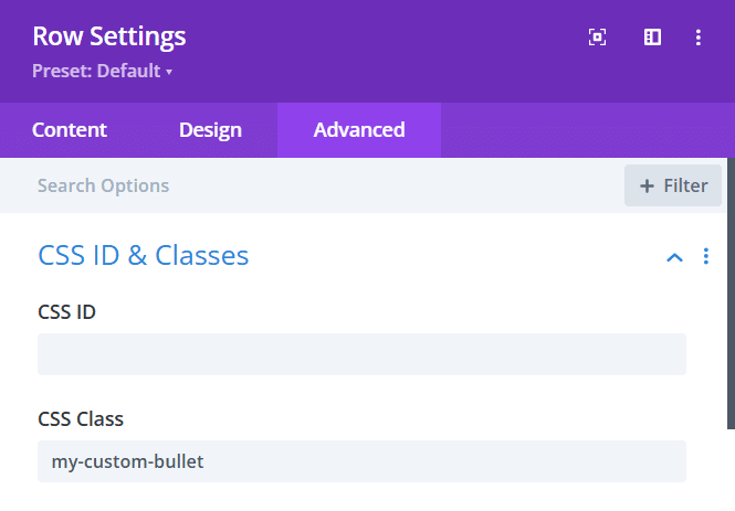
- Remove default bullets: Most browsers apply a default bullet style (a filled black circle). If you want to completely remove bullets before adding custom ones, use:
/*
.my-custom-bullet ul {
  list-style: none; /* Hides the default bullets */
  margin: 0;
  padding: 0;
}
*/
Here list-style: none; hides the default bullets, margin: 0; removes unnecessary spacing around the list, and padding: 0; ensures proper alignment with other elements.
- Add custom colored bullets: Instead of the default bullets, you can use the ::before pseudo-element (gives more control over bullet design, allowing animations, color changes, and custom icons than list-style-type) to create custom bullets. For example:
/*
 .my-custom-bullet ul li::before {
  content: "•"; /* Adds a bullet symbol */
  color: red; /* Changes the bullet color */
  font-size: 1.5em; /* Adjusts bullet size */
  margin-right: 8px; /* Adds space between bullet and text */
}
*/
Here, content: “•”; inserts a custom bullet (you can use other characters like “★”, “✔”, “▶”). color: red; changes the bullet color, font-size: 1.5em; increases bullet size for better visibility, and margin-right: 8px; adds space between the bullet and list text.
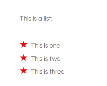
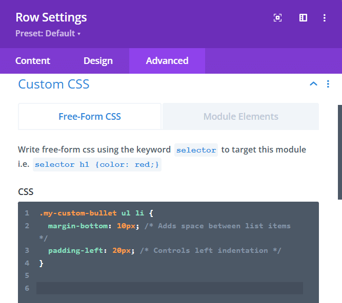
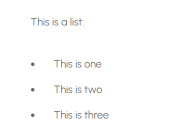
- Adjust bullet spacing: Spacing between bullets and list text can be adjusted using margin-bottom and padding-left like so:
/*
.my-custom-bullet ul li {
  margin-bottom: 10px; /* Adds space between list items */
  padding-left: 20px; /* Controls left indentation */
}
*/
Replace default bullets with custom icons and symbols
Divi comes with the Elegant Icon font, AKA ETmodules, a built-in library of 350+ different icons that can be used across modules and CSS. To implement this, you’ll need to use Unicode values within CSS to call specific icons from the icon library.
To use multiple icon styles on the same page, create unique CSS classes for each list. This allows you to target specific lists and apply different icons without affecting other lists on the page.
The CSS structure involves removing the default list style and using the ::before pseudo-element to insert the icon. Proper icon positioning and alignment are achieved through CSS properties like font-family, content, margin, and padding.
Icon colors can be changed independently of the text by targeting the ::before element and applying the color property. Adjust icon size and spacing relative to the text using font-size, margin-right, and margin-left properties in the CSS.
Here are code examples for circle checkmarks:
In your Divi Builder (or in the WordPress editor), give the ul (unordered list) a custom class – e.g., circle-checkmarks. For instance:
/*
<ul class="circle-checkmarks">
  <li>First Checkmark Item</li>
  <li>Second Checkmark Item</li>
  <li>Third Checkmark Item</li>
</ul>
*/
Now, for the CSS:
/*
/* Target both the UL with the class and any UL inside that class */
.circle-checkmarks, .circle-checkmarks ul {
    list-style-type: none !important; /* or use list-style: none !important; */
    margin: 0;
    padding: 0;
}

/* Position list items to allow space for icons */
.circle-checkmarks li {
    position: relative;
    padding-left: 2rem;
    margin-bottom: 0.75rem;
}

/* Inject your icon with ::before */
.circle-checkmarks li::before {
    content: "\e05b";         /* replace with the correct Unicode */
    font-family: "ETmodules"; /* Divi icon font family */
    position: absolute;
    left: 0;
    top: 0.1rem;              /* adjust vertically if needed */
    color: #2EBF4F;           /* icon color */
    font-size: 1.2rem;        /* icon size */
    line-height: 1;
}
*/
Make sure to:
- Replace \e05b with the exact ETmodules checkmark Unicode value you want.
- Adjust font-size and color to fit your design.
- Tweak left, top, and padding-left on the li to fine-tune spacing and alignment.
Here’s a circle checkmark example:
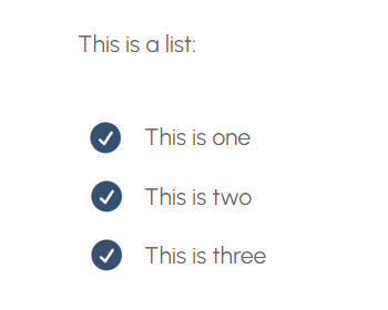
Remember to add the appropriate CSS class to your text module in Divi to apply these styles. Also, disabling Dynamic Icons in Divi’s Theme Options may be necessary if the icons are not displaying correctly. Have fun playing around in there!
Create consistent list styles across your site
Maintaining brand consistency is a no-brainer for a professional website. When it comes to lists, consistency improves UX and reinforces your firm’s identity. Let’s explore advanced techniques for implementing global list styling in Divi to achieve this consistency at scale.
Start by implementing global CSS for consistent list styling. This involves using list-style-position: outside; and padding properties for proper indentation.
The list-style-position property ensures that the bullets or numbers are positioned outside the content flow, preventing them from overlapping with the text. Adjusting the padding then helps align the list items correctly. Add this CSS to Divi’s Theme Options for a sitewide effect. Divi Global Presets and Global Defaults can also help maintain a consistent design across your website.
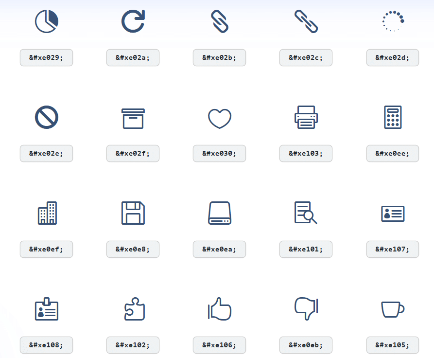
Next up, use the ETmodules font to replace default bullets with custom icons site-wide. This allows you to incorporate your brand’s visual elements into your lists, making them more engaging and recognizable. Implement the appropriate unicode values for your chosen icons. Here’s just a tiny selection of the kind of icons you’ll find in ETmodules:
Creating nested list hierarchies that maintain consistent styling while differentiating levels can be achieved by applying specific CSS rules to different list levels. For example, you can use different icon styles or colors for primary and secondary lists to create a clear visual hierarchy.
/*
/* Remove default bullets for the main list wrapper. This helps ensure we don't see regular bullets.*/
.main-list ul,
.main-list ul li ul {
  list-style: none;
  margin: 0;
  padding: 0;
}

/* Style top-level list items */
.main-list ul li {
  position: relative;
  padding-left: 1.5rem; /* Room for icon */
  margin-bottom: 0.75rem;
}

/* Primary (top-level) icon style */
.main-list ul li::before {
  content: "\e000";        /* Replace with actual Divi icon code */
  font-family: "ETmodules"; /* Divi's built-in icon font */
  position: absolute;
  left: 0;
  top: 0;                  /* Adjust as needed */
  color: #007bff;          /* Primary icon color */
  font-size: 1rem;         /* Adjust icon size */
}

/* Style nested list items */
.main-list ul li ul li {
  position: relative;
  padding-left: 1.5rem; /* Room for secondary icon */
  margin-bottom: 0.75rem;
}

/* Secondary (nested) icon style */
.main-list ul li ul li::before {
  content: "\e001";         /* Replace with your chosen Divi icon code */
  font-family: "ETmodules"; /* Divi's built-in icon font */
  position: absolute;
  left: 0;
  top: 0;                   /* Adjust as needed */
  color: #6c757d;           /* Secondary icon color */
  font-size: 1rem;          /* Adjust icon size */
}
*/
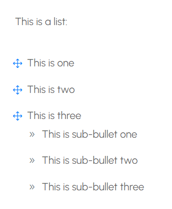
\e000 and \e001 are placeholder icons. Swap them out for the actual codes from Divi’s icon set. Here’s an example of a bulleted list, with sub-bullets for the third row:
To handle exceptions where different list styles are needed, set up modular CSS classes. These allow you to apply unique styles to specific lists without affecting the global styles. For instance, you might create a class for lists within a particular module or page.
Here’s how to structure CSS selectors to target lists across different Divi modules while maintaining consistent spacing:
/*
/* Target lists in all text modules */
.et_pb_text ul li {
  margin-bottom: 10px;
}

/* Target lists in a specific module */
.my-custom-module .et_pb_text ul li {
  margin-bottom: 15px;
}
*/
For responsive adjustments to list spacing and icon sizes, use media queries to adjust the CSS based on screen size 39 – which is still commonly used by monitors. This ensures that your lists look great on all devices.
Finally, create reusable list-style components that can be quickly deployed across projects. Save your favorite list styles as Divi Library items or use Divi’s Global Presets feature to easily apply them to new projects. These can then be managed from the Divi Library page.
Take your Divi designs further with Divi Creator Pro

“Mastering advanced CSS and styling techniques unlocks endless design possibilities within Divi. Remember how easy it was to add custom colors to your bullet points? That’s just a taste of the design control you can achieve. Customizing bullet points is a small part of the wide range of CSS skills you can learn to take your Divi website to the next level.”
– Jennifer Rodriguez, Lead Developer at Divi Life
If you’re ready to dive deeper and master Divi design, check out Divi Life’s Divi Creator Pro course. You’ll learn the fundamentals of Divi design, how to use Divi efficiently, and how to build goal-focused, high-converting websites. As Larry Hearn, one of our students, put it:
“I especially enjoy the teaching style of the trainer, Tim. He made learning easy. I have already levelled up my expertise thanks to Divi Life training.”
To level up your Divi skills and gain a genuine advantage over the design competition, try our Divi Creator Pro course today!


Hello and thanks for this post.
However, I’m unable to simply change the bullet color for an unordered list in Divi. It still retains the default black bullet, showing both. I tried the line of CSS where you remove the default code, But they still display.
I’ve attached a link to the page in question. The unordered list is close to the bottom of the page.
Hi Lou,
The link to your page is coming back as a 404, so I’m unable to look at it. Did you make sure to clear all caches after adding the custom CSS?
I’ve tried the icon css on a Divi 5 Alpha testsite. It shows up correctly when in Divi editor and Divi preview but it doesn’t render properly when the page is opened in browsers. Firefox gives some colored square, Chrome does nothing, not even a bullet.
I’ve waited for Divi 5 release and tried it again in Divi 5.0.2. You need to disable Dynamic Icons in the Performance tab to make it work perfectly across browsers. Thank you!