WordPress Design Guide Using Divi Builder
Are you new to Divi and eager to unlock the full potential of your WordPress website? This article is just for you!
We’ll guide you through accessing the Divi Builder, whether you prefer the front end or backend approach. You’ll discover essential settings that will soon become your best friends as you embark on your site-building journey. We’ll also share valuable tips and techniques to optimize your workflows, and make your creative time with Divi even more efficient.
What’s more, we’ll give you the lowdown on the Divi Theme Builder, enabling you to create global elements and templates that take your designs into the VIP suite. And for those looking to dive even deeper, we’ll introduce our Divi Creator Pro course, which is tailored to help you become an experienced Divi user in no time. Strap yourself in for a fast ride – it’s time to get giddy about Divi!
What you’ll learn in this article:
- A comprehensive guide for beginners using the Divi Builder in WordPress, detailing both the Front End Visual Builder and Backend Builder options.
- Learn the importance of understanding Divi’s core building blocks: sections, rows, columns, and modules, which are essential for creating effective layouts.
- Understand key features such as view modes, core interface elements, and theme options to improve your workflow and design.
- Create global templates through the Divi Theme Builder to maintain design consistency across a website.
- How the Divi Creator Pro course is an ideal next step for users looking to deepen their skills.
Understanding the Divi Builder: Front End Visual Builder vs the Backend Builder
For the best of both worlds, Divi offers two distinct building interfaces – the Front End Visual Builder and Backend Builder. Each caters to different workflow preferences, and it’s easy to switch between them for different tasks.
Front End Visual Builder
To access the Front End Visual Builder, simply click Use the Divi Builder > Build On The Front End. This interface allows for real-time editing, providing instant visual feedback as you make changes. The drag-and-drop functionality is especially beneficial for design-focused tasks and layout adjustments, making it ideal for fine-tuning responsive designs across various device views.
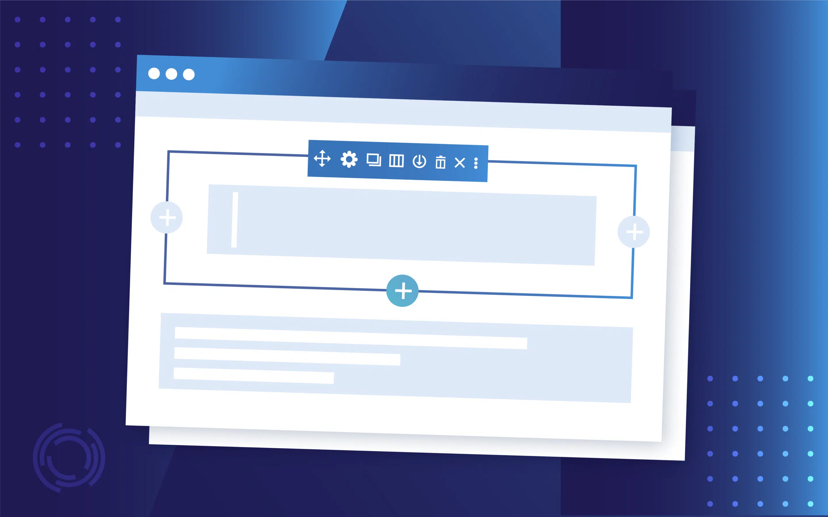
The Visual Builder allows you to work on the page while viewing precisely how that page will look in the front end. Here’s a page section, viewed in the Visual Builder:

Backend Builder
In contrast, the Backend Builder can be accessed through your WordPress dashboard while editing pages or posts. It presents a wireframe view that offers a clear structural overview, which can be more efficient for bulk editing and managing complex page structures. However, it’s important to note that Divi 5 will only feature the Front End Builder, so users transitioning from Divi 4 should adjust their workflow accordingly.
Here’s a page section, viewed in the Backend Builder:

Combining both builders strategically can improve efficiencies – use the Backend Builder for initial structure and content placement, then switch to the Visual Builder for detailed design adjustments. This approach allows you to enjoy the strengths of both interfaces.
Building blocks: Understanding sections, rows, columns, and modules
To create sophisticated layouts efficiently in Divi, it’s essential to master its core building blocks – sections, rows, columns, and modules. If you’re a fan of Lego, you’ll have a whole lot of fun playing around with Divi’s awesome building blocks!
Sections

Sections are color-coded blue, and house rows and modules. When creating a new page from scratch, everything should start with a section. Divi offers three types:
- Standard sections typically utilize 80% of the content width.
- Fullwidth sections extend to 100%, allowing for expansive designs.
- Specialty sections are perfect for complex column structures, giving you the flexibility to create unique layouts.
“Within sections, you can control backgrounds, spacing, and borders at the highest level, ensuring your design vision is realized. Advanced settings like scroll effects and custom CSS provide further customization options.”
– Jennifer Rodriguez, Lead Developer at Divi Life
Rows and columns

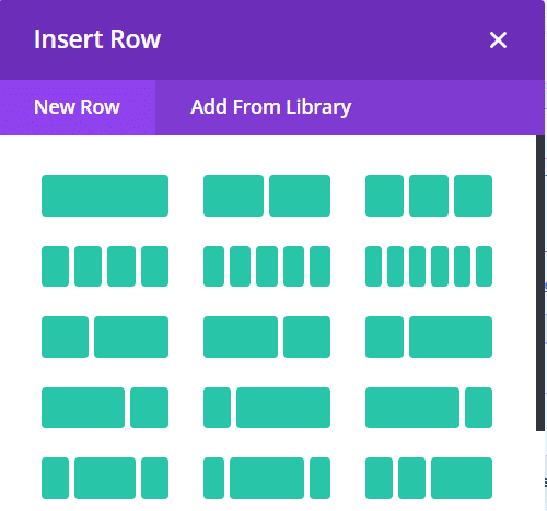
Rows serve as containers for columns, and are color-coded green in the backend. Rows sit within a section, and house modules. You can choose from predefined column layouts or create custom structures to suit your design needs. When you open a new row, you’ll be prompted to choose a column structure, into which your modules will go:
Adjusting column widths is straightforward – just use visual controls or input precise percentages for accuracy. To ensure your design is truly responsive, set unique styling for different device sizes, allowing for an optimal viewing experience across all platforms.
Modules

Modules are the content elements placed within columns; color-coded black. Essential modules include Text, Image, Button, and specialized elements like WooCommerce modules for ecommerce sites.
When you open a new module, you’ll be prompted to select your desired device, either by scrolling through your list of module options, or by using the search bar, like this:

Each module features content, design, and advanced tabs that give you complete control over its appearance and functionality. Improve your workflows by taking advantage of keyboard shortcuts and bulk editing options – these tools can seriously speed up the process of building your layout.

Creative Modules Built for Speed
Divi Modules Pro includes gorgeous creative modules without the bloat, & without slowing down your site! Thanks to our dynamic asset engine, you'll get the best modules with the best speed. 🔥
Essential settings and modes you need to know when starting out in Divi
When starting with Divi, understanding essential settings and modes can add further nous to your workflow and design capabilities. Here’s a breakdown of the foundational elements every Divi designer should know.
View modes
Divi provides several view modes to help you optimize your design process:
- Desktop, tablet, and mobile views: These modes allow for responsive design testing, ensuring your site looks great on all devices.
- Wireframe view: This mode offers a quick structural overview, making it easier to edit layouts without the distraction of design elements.
- Grid mode: Perfect for precise alignment, this mode zooms out on your page, for a better overview from a front end perspective.
Access view modes by clicking on the purple ellipsis in the front end:

You’ll then see this box in the bottom left corner, allowing you to select whichever view modes you desire:

Core interface elements

The core interface consists of three main tabs for each module:
- Content tab: Here, you can add and edit the content of your modules.
- Design tab: This is where you style elements, adjusting spacing, colors, and fonts.
- Advanced tab: Access custom CSS and responsive controls for more detailed adjustments.
Critical theme options settings
To configure global settings for your site, navigate to Divi > Theme Options in your WordPress dashboard.

Key settings include:
- Layout width and spacing: Control the overall width of your site and spacing between elements.
- Default typography: Set your site’s typography styles for consistency across all pages.
- Navigation structure: Customize how your navigation menus appear.
- Color palette configuration: Define a color palette that will be available throughout your modules, streamlining your design process.

Understanding how module settings hierarchy works – where styles cascade from sections to rows to modules – ensures that changes made at a higher level automatically apply to lower levels. Mastering these settings will quicken timescales and open the door to some seriously stunning page designs.
Making your workflow more efficient with presets
We love Divi’s preset system! It’s a mighty feature that can speed up your development process, acting as the building blocks of your design system. By creating presets, you can ensure consistency across your website, and save doing the same creative tasks over-and-over again.
Creating presets
Presets allow you to save commonly used module settings, store section and row configurations, and establish consistent styling patterns.

To create a preset, simply configure a module or section as desired, then click on the Preset option beneath the module title. Select the Create New Preset From Current Styles option, and your new preset will be saved along with any other that you’ve saved within the same module. This enables you to easily apply these settings to new elements in the future.
Using presets effectively
Applying saved settings to new elements helps maintain design consistency throughout your site. With global presets, you can update multiple elements simultaneously, ensuring that any changes are reflected across all instances where the preset is applied.
To make your presets as effective as possible, organize them by purpose and use clear naming conventions. Regular maintenance of your presets will keep your design system efficient and relevant.
Guide to importing, creating, and saving layouts
Managing layouts in Divi can be made easier through the theme’s advanced import and template features, allowing for efficient development and organization.
Importing layouts
You can import layouts via the Divi Library or directly onto a page. To import through the Divi Library, navigate to Divi > Divi Library and click on the Import & Export button. Here, you can upload JSON files containing all of your layouts.

For direct page imports, enable the Visual Builder on a page, click the ellipsis icon, then the + button. You’ll then be able to select the file to import.

Batch importing is particularly efficient as you can upload multiple layouts at once, saving time and effort.
Creating layouts
When creating layouts, focus on setting up reusable section templates that incorporate global color schemes and typography for consistency. Implementing cloud-based storage workflows, such as Divi Cloud, facilitates team collaboration by allowing multiple users to access shared layouts.

Additionally, consider creating starter templates that include common elements like Calls-To-Action (CTAs) and contact forms to expedite future projects.
Saving and organizing layouts
For layout organization, use cloud sync for cross-site consistency, ensuring that your layouts are accessible wherever you work. Create categorized layout libraries within Divi Cloud to keep your designs organized and easy to find. Setting up automated backup systems for your layouts is also crucial – this protects your work and allows for easy restoration if needed.
Mastering global elements and templates with the Theme Builder
The Divi Theme Builder is a super feature that extends the capabilities of the Divi Builder beyond individual pages, allowing users to create custom templates for their entire website.

Unlike the Visual Builder – which focuses on designing specific pages or posts – the Theme Builder enables you to design global elements like headers, footers, and various page layouts that can be applied site-wide.
To get started with the Theme Builder, navigate to Divi > Theme Builder in your WordPress dashboard. Here, you can create templates that define how different parts of your site will look. For instance, you can design a global header that appears on every page, or a custom footer that reflects your brand’s identity.
Creating reusable global sections
One of the key features of the Theme Builder is its ability to create reusable global sections. To create a global section, build your desired layout using the Visual Builder.

Once satisfied, right-click on the section settings and select Save to Library. Check the box for Save as Global, which allows any changes made to this section to automatically update across all instances where it is used. This is particularly useful for elements like headers and footers that need to be consistent throughout your site.
Implementing cloud-based storage workflows
For teams collaborating on website projects, implementing cloud-based storage workflows using Divi Cloud can improve your overall efficiencies. This allows multiple users to access and share global templates, ensuring everyone is on the same page regarding design elements.
Creating starter templates
Consider creating starter templates that include essential components such as CTAs and contact forms. By saving these as global items in your library, you can quickly deploy them across various pages without needing to recreate them each time.
Saving and organizing layouts
To maintain organization within your layouts, use cloud sync for cross-site consistency. Create categorized layout libraries in Divi Cloud to keep your templates organized by purpose or project type. Additionally, setting up automated backup systems for your layouts ensures that you can recover previous versions if needed.
Become a Divi expert with Divi Creator Pro

Once you’ve mastered Divi’s core features, what next?
Well, the next logical step in your journey is to become a Divi Jedi Knight by joining Divi Creator Pro. This is a comprehensive training program designed to build on everything covered in this guide. Through live coaching sessions and hands-on training, you’ll learn how to create goal-focused websites that drive real business results.
The program delves into advanced implementations of Divi’s Visual Builder, Theme Builder, and dynamic content features. You’ll also become au fait with essential workflows that polish your site building proficiencies. With lifetime access to course materials, you’ll become part of an active community of Divi professionals in a private Facebook group, providing ongoing support and networking opportunities.
As student Linda Mattson shares:
“The ‘Divi Creator Pro’ course is changing the trajectory of my life and my business. I have been creating websites using Divi since 2017 because Divi is an amazing product. There seems to be no question that Tim cannot answer concerning Divi, SEO, marketing and so much more. In 2020 I paid a business coach 8 times as much as I paid to take this course, learning only a fraction of what I am learning from Tim.”
We wish you all the best on your Divi journey! If you’re ready to take your skills further, join us at Divi Creator Pro and transform your web designs today!

The Ultimate Divi Toolkit 🚀
The Divi Life All Access Pass membership is a complete Divi toolbox with all the Divi plugins, child themes, layouts, & templates you'll ever need to create incredible Divi websites.

Table of Contents
- Understanding the Divi Builder: Front End Visual Builder vs the Backend Builder
- Building blocks: Understanding sections, rows, columns, and modules
- Essential settings and modes you need to know when starting out in Divi
- Making your workflow more efficient with presets
- Guide to importing, creating, and saving layouts
- Mastering global elements and templates with the Theme Builder
- Become a Divi expert with Divi Creator Pro
0 Comments