Divi Tooltips: How to Customize for Better User Experience

Ever noticed how it’s the little things that often make the biggest difference? Tooltips – those small pop-up boxes that appear when you hover over an element – are a fab example of how a simple element can boost your overall user experience. From eCommerce platforms like Amazon using tooltips to provide product details to educational platforms like Coursera using them to offer additional context for complex concepts, these handy little helpers are an integral part of many websites.
The beauty of tooltips lies in their ability to provide extra information without cluttering the main content. They can help users understand complex terms or features, and improve overall navigation. Moreover, tooltips encourage users to spend more time exploring your content, staying longer on the page. Furthermore, they can make a website more accessible by providing additional context for users with disabilities, ensuring everyone can engage with your content.
Considering all these wow factors, it’s no wonder so many Divi users are eager to incorporate tooltips into their websites! Here we’ll explore the different options for creating and customizing tooltips in Divi, from shortcode solutions to user-friendly plugins with advanced functionalities. The path to an interactive website is just around the corner!
Creating a Simple Tooltip in Divi with the Tooltip Shortcode
Divi’s built-in tooltip shortcode offers a quick and easy way to add tooltips to your website without the need for additional plugins. Follow our guide below and you’ll be able to create informative and engaging tooltips in no time at all:
1. To create a tooltip, begin by adding a text module to your Divi layout. In the content area of the module, insert the Divi tooltip shortcode using the following format:
[tooltip text="Your tooltip text here"]Your trigger text here[/tooltip]

Coding note: The ‘text’ parameter defines the content that will appear in the tooltip when the user hovers over the trigger text, which is placed between the opening and closing shortcode tags.
2. Replace “Your tooltip text here” with the information you want to display in the tooltip. Keep the text concise, providing an explanation relating to the trigger text.
3. Replace “Your trigger text here” with the text that will trigger the tooltip when hovered over. This text should be relevant to the tooltip content and provide context for the user.
4. Save your changes and preview the page to see the tooltip in action. Hover over the trigger text to ensure the tooltip appears as expected and make adjustments to the text if needed.

To further customize the appearance of your tooltips, you can add custom CSS classes. For example, to change the cursor to a question mark when hovering over the tooltip, you can use the following CSS snippet:
.et-tooltip {
  cursor: help;
}
To apply this CSS, navigate to Divi > Theme Options, scroll down to Custom CSS, and paste the snippet there. You can also use CSS to modify the tooltip’s colors and size, and even add an arrow for a more distinctive look. That’s all there is to it!

Using the Divi Code Module for Extra Customization Options
While the Divi tooltip shortcode provides a simple way to add tooltips to your website, the Divi Code Module offers much greater flexibility and customization. This handy little platform allows you to change tooltip colors, add fonts, and icons, adjust positioning, and improve tooltip interactivity by adding custom HTML, CSS, or JavaScript to your Divi pages. Here’s how:
- Open the Divi Builder and navigate to the section where you want to add the Code Module.
- Click the ‘+’ button to add a new module, and search for Code in the search bar.

- Drag and drop the Code Module into the desired location within your layout.
- Click on the Code Module to open its settings.

In the Code Module’s settings, you can add custom CSS to style your tooltips. Here’s an example of how you can modify the tooltip’s appearance:
.et-tooltip-box {
    background: #32952d !important;
    color: #fff !important;
    border: #32952d solid 1px;
    border-radius: 5px;
    -webkit-border-radius: 5px;
    -moz-border-radius: 5px;
    line-height: 1.8;
    left: 0;
    bottom: calc(100% + 25px);
    font-size: 1.2rem;
    padding: 15px;
    box-shadow: 2px 2px 10px 2px rgba(0,0,0,.5);
    -moz-box-shadow: 2px 2px 10px 2px rgba(0,0,0,.5);
    -webkit-box-shadow: 2px 2px 10px 2px rgba(0,0,0,.5);
}
.et-tooltip {
    cursor: help;
}
This CSS snippet changes the background color, text color, border, border radius, font size, padding, and box shadow of the tooltip, as shown below. It also sets the cursor to a question mark when hovering over the tooltip trigger – talk about control!

When using the Code Module to customize tooltips, keep the following in mind:
- Keep your code organized and well-commented for easier maintenance.
- Test your tooltips across different browsers and devices to ensure compatibility.
- Ensure that your tooltips are mobile-responsive and adapt well to smaller screen sizes.
- Use JavaScript sparingly and only when necessary to avoid performance issues.
Using the Divi Blurb Module to Create Tooltips
Fun fact: While the Divi Blurb Module was designed to display brief info as well as icons or images, it also offers a hack method to create tooltips.
However, as the module is not primarily intended for tooltips, it has limitations in terms of functionality when compared to dedicated solutions. It’s also worth bearing in mind that the process is a lengthy one, as each tooltip needs to be individually customized by its creator.
For the purpose of tooltips, the Blurb Module may be handy for those needing simple and occasional tooltips. You can achieve these by taking the following steps:
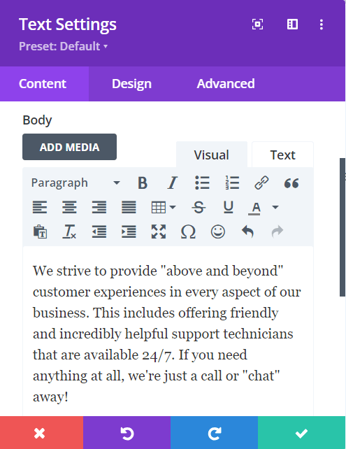
1. Begin by adding a Blurb Module to your Divi page. To do this, click the ‘+’ button in the Divi Builder, search for Blurb, and drag the module into your desired location.

2. Open the Blurb Module settings and select the following options to mimic tooltip behavior:
- In the Content tab, enter the tooltip text in the Body field.

- In the Design tab, adjust the Icon settings to select an appropriate icon or image for your tooltip trigger.
- Navigate to the Text settings and customize the appearance of your tooltip text (e.g. font, size, color).
- In the Advanced tab, add a custom CSS class (e.g. tooltip-blurb) to the Blurb Module for easier targeting with CSS.
3. To enhance the appearance and functionality of your Blurb Module tooltips, add the following custom CSS to your Divi Theme Options or the Custom CSS field in the Blurb Module settings:
.tooltip-blurb {
  position: relative;
  display: inline-block;
}

.tooltip-blurb .et_pb_blurb_content {
  visibility: hidden;
  width: 200px;
  background-color: #555;
  color: #fff;
  text-align: center;
  border-radius: 6px;
  padding: 5px;
  position: absolute;
  z-index: 1;
  bottom: 125%;
  left: 50%;
  margin-left: -100px;
  opacity: 0;
  transition: opacity 0.3s;
}

.tooltip-blurb:hover .et_pb_blurb_content {
  visibility: visible;
  opacity: 1;
}
Coding note: This CSS code positions the tooltip text above the trigger icon, sets a background color and text color, adds padding and a border radius, and includes a fade-in effect on hover.
The Easiest Method: Use a Plugin
When it comes to creating and customizing tooltips in Divi, using a plugin is undoubtedly the easiest and most efficient approach. Why make life harder than it needs to be? Plugins give you a range of benefits that make the process of adding tooltips to your website a walk in the park, even if you don’t have extensive coding knowledge. Let’s take a look at the finer details:
- Ease of use: Plugins come with user-friendly interfaces and visual editors that simplify the process from start to finish.
- Time-saving: Instead of spending hours writing custom code, you can have professional-looking tooltips up and running in a matter of minutes.
- Advanced features: Many plugins offer customization options that go beyond the basic capabilities of Divi’s built-in tools, giving you greater flexibility and design options.
- Consistent updates: Reputable plugin developers regularly update their products to ensure compatibility with the latest versions of Divi and WordPress.
- Support and documentation: Well-established plugins come with comprehensive documentation and dedicated customer support. This makes it easier to troubleshoot any issues and ensures you can get the most out of the tool.
“Plugins are a game-changer for Divi users looking to create eye-catching tooltips. Instead of wrestling with code and CSS, you can drag, drop, and customize to your heart’s content. It’s like having a professional developer at your fingertips but without the hefty price tag or steep learning curve. Why spend hours tweaking code when you can create stunning tooltips in minutes?”
– Shafaq O Sheikh, Support Manager at Divi Life
Introducing Divi Mega Pro

So which plugin should you use? Well, Divi Life has been creating premium-quality plugins, layouts, and tutorials for the Divi theme since 2016. And our incredible Divi Mega Pro tool happens to be the ultimate solution for creating and customizing tooltips.
Divi Mega Pro can create Mega Tooltips, which are hover popups that display additional content or information without you navigating away from the page you’re reading. These tooltips can be triggered by hovering or clicking on various elements like text links, buttons, or images, making them highly versatile and user-friendly.
What sets Mega Tooltips apart from regular tooltips is their ability to display a wide range of content, including text, images, videos, forms, and more. Website owners can create rich, engaging content that thrills their readers and keeps them on the page for longer:
- Extensive customization options: Customize tooltips with gradients, box shadows, and other design tools, ensuring they match your website’s feel and design.
- Responsive design: Tooltips created with Divi Mega Pro are super-responsive and work on desktop, mobile, and tablet devices.
- Trigger options: Our tool supports both On Hover and On Click trigger types, offering flexibility in how tooltips are activated.
You can follow these steps to join in the fun:
1. Install and activate the Divi Mega Pro plugin on your WordPress site.
2. Go to Divi Mega Pro > Add New in your WordPress dashboard.

3. Use the Divi Builder to design your tooltip content, incorporating any desired modules, such as text, images, or videos.
4. Customize the appearance of your tooltip using the plugin’s design settings, such as gradients, box shadows, and fonts. You can also make changes using Mega Pro’s Display Settings, as seen below.

5. Copy your Unique Mega Pro Class – you’ll find this on the right-hand side in the Mega Pro Triggers box. Add an anchor link in the CSS Selector Trigger field i.e. #open

6. Go to your Divi Module where you want to trigger your Tooltip and open Settings > Advanced > CSS ID & Classes > CSS Class. Paste your Unique Mega Pro Class.

7. Remember to save your Changes and exit from the Divi Builder to see the changes on the front end.

Wait a second, there’s more! Tooltip creatives are spoilt for choice in the Divi Life stable, so check out Divi Hacks while you’re here!
Introducing Divi Hacks

Divi Hacks might be the Swiss Army Knife of Divi plugins, as it comes with hundreds of customization options – or hacks – including those in the tooltip department:
- Trigger types: Divi Hacks supports different trigger types. ‘Hover’ tooltips appear when a user hovers their mouse over the element, great for delivering quick, supplementary information. ‘Click’ tooltips appear when a user clicks on the designated element, perfect for displaying more detailed info or interactive content, as it requires deliberate user action.
- Customization options: Users can easily change colors, fonts, and sizes to match their branding and design. You can also add animations to create a more dynamic and interactive user experience. Further customizations can be made through custom CSS.
- Ease of use: Divi Hacks is user-friendly and can be easily integrated into existing Divi websites. Documentation and tutorials are available to guide users through the process of setting up and using our plugin.
To get started, just follow our guide below:
- Install and activate the Divi Hacks plugin on your WordPress website.
- Navigate to Divi > Divi Hacks to locate the settings panel.

3. Enable the Tooltips hack and configure its global settings, such as default colors, fonts, and trigger type.
4. Open the Divi Builder on the page or post where you want to add a tooltip.
5. Select the element (section, row, column, or module) that will serve as the tooltip trigger and add the appropriate CSS class (e.g. tooltip-trigger-blurb) to it.

6. Create a new element that will serve as the tooltip content and add the appropriate CSS class (e.g. tooltip-content-blurb) to it.
7. Customize the appearance and behavior of the tooltip using the Divi Hacks settings or by adding additional CSS classes to the tooltip content element.

8. Save your changes and preview your website to test the tooltip functionality.
Boost Your Site’s UX Now with Custom Divi Tooltips!
Now you’ve seen the options at your disposal, which is best for managing your Divi tooltips? Well, given their ease of use, time-saving qualities, and extensive customization features, the most efficient and user-friendly choice is undoubtedly to use a dedicated plugin.
Two recommended choices for Divi users are Divi Mega Pro and Divi Hacks. Divi Mega Pro allows you to create advanced Mega Tooltips, which can include a wide range of content types such as forms and buttons. It’s a perfect solution for lead generation and conversion optimization, as you can provide your visitors with engaging, interactive content without navigating away from the page.
Alternatively, Divi Hacks offers a more basic approach to creating tooltips, along with a host of other essential modules and customization options. While not as feature-rich as Divi Mega Pro, Divi Hacks is an excellent choice for those who want to add simple, yet highly customizable tooltips to their website.
So, whether you’re looking to create complex, interactive tooltips or simply want to improve your site’s user experience with informative hover-based content, consider Divi Mega Pro or Divi Hacks today!

Divi Mega Pro
Start Creating Gorgeous Full-Featured Mega Menus with Divi Today

Is it possible to have the tooltip triggered by a specific piece of text within a module.
I have a design to build out which includes reference numbers (like a footnote) and when the user hovers over the number, the idea is for a tooltip to appear with a link to the paper or papers referenced.
Would that be possible with your plugin?
Thank you so much
Hi Will, yes absolutely. You can easily do that with Divi Mega Pro 🙂