Modify Divi Tooltip on Hover Behavior
Hover over a carefully curated image, and suddenly that raw ‘IMG_2847.jpg’ filename pops up, undoing all the hours spent working on your tooltip. And for designers, this means clients calling to complain, or worse still, users bouncing off-site due to tooltip glitches.
Default browser tooltips undermine trust in your work when something goes wrong, making it a good idea to look for an alternative – or at least grab some troubleshooting knowledge!
We’re gonna detail all you need to know right here, from emergency relief – swift ways to remove embarrassing popups and fix bugs – to building pro-level hover systems that work on all browsers and devices. You’ll also see how Divi Mega Pro transforms tooltips from bandaid fixes into refined content modules, so you’ll never dread the next hover again.
Key takeaways
- Every tooltip should anticipate mouse and keyboard users for true usability.
- Testing across multiple browsers prevents design surprises and maintains your professional standard.
- Prioritizing accessibility up front saves time and protects against future legal and client headaches.
- Distinguishing between content and trigger types helps avoid common CSS frustrations.
- Divi Mega Pro lets you turn tooltips into powerful, reusable content modules with no advanced coding required.
Critical tooltip problems in Divi
A Divi tooltip is a small text box that appears when users hover over or click an element, providing extra info without cluttering the main interface. But these tooltips can create problems for site owners, triggering unprofessional browser popups, display bugs, and user frustration.
Three main tooltip disasters
Unwanted browser tooltips pop up with confusing filenames or unwanted alt text, ruining your visual designs. Cross-browser chaos unfolds when hover effects look fine in Chrome but malfunction in Firefox, sometimes causing the entire module to light up unexpectedly. And regarding mobile issues, touch devices can have no real hover, leaving visitors blind to crucial details and making sites feel unfinished.
Understanding tooltip architecture
Tooltip architecture separates content (the information displayed) from triggers (what causes it to appear), allowing designers to control both independently rather than cramming content into CSS pseudo-elements. A tooltip isn’t a decoration to style – it’s content that needs a trigger.
Cramming tooltip details into CSS pseudo-elements can lead to unpredictable browser behavior and frequent bugs because styling and content management become tangled. Recognizing this separation will help you choose the best technique for your needs, whether the goal is simple labels or complex, reusable modules.
Understand tooltip architecture, and options like Divi Mega Pro, custom code, or visual builders become a strategic decision, rather than simply searching for something to get the job done.
Do More with Divi Mega Pro!
Create beautiful & functional mega menus & mega tooltips with Divi Mega Pro, complete with included templates & advanced functionality. 🔥
Two methods to add custom tooltips in Divi
Let’s take a look at the native Divi method for custom tooltip creation first, followed by a mega tooltip tutorial with our own Divi Mega Pro.
Method 1: The quick fix with native Divi tooltip shortcode
Divi offers a basic shortcode that you can add to any text or words within your page to create a basic tooltip upon hovering.
1. Start by adding a text module. In the Content area of the module, insert the following Divi tooltip shortcode:
/*
[tooltip text="text on hover"]original text[/tooltip]
*/
Note: tooltip text is the content that you want your tooltip to display on hover; original text is the text that needs to be hovered upon.
2. Replace the necessary text with your own information. You can see how this looks in Divi 5’s Text module below:
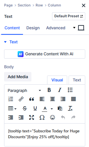
3. Save your changes and preview the page. Test your tooltip with a hover and check everything’s working okay.

To ensure users notice your trigger words on text-heavy pages, style them with bold, italics, or add color – a visual cue that there’s more info available.
Vanilla Divi can cope with simple text hints and basic styling options, making it a useful solution for definitions, quick explanations, and temporary solutions. Minimal design options can be extended by adding a bit of custom code, like the following example for custom styling:
/*
.et-tooltip-box {
  background: #333;
  color: #fff;
  border-radius: 4px;
  font-size: 15px;
}
*/
If you want more, though, you’ll need to look elsewhere.
Method 2: Create professional tooltips with Divi Mega Pro’s Mega Tooltips
Divi Mega Pro is a super-nifty plugin for Divi that moves beyond text-only hints by letting designers build fully custom mega menus and pop-up tooltips using the Divi Builder interface.
Mega Tooltips, a signature feature, are advanced hover or click-triggered popups. They support rich content – forms, images, video, or entire page layouts – making them far more versatile than traditional tooltips.
Adding a Mega Tooltip with Divi Mega Pro is straightforward:
1. In your WordPress admin, go to Divi Mega Pro > Add New.
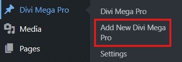
2. Give your tooltip a clear title and enable the Divi Builder.
3. Design your tooltip just like any regular Divi layout – use sections, rows, and modules to add anything from product galleries to contact forms.
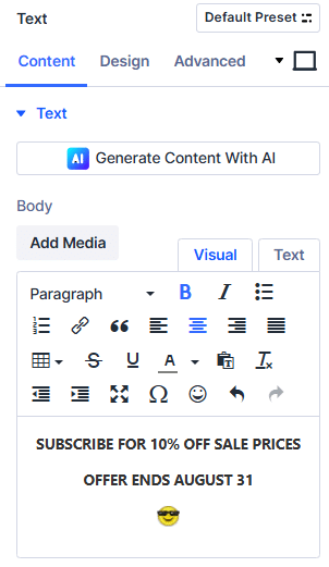
4. After publishing, locate your unique Mega Pro class (like .dmp-123) in the ‘Mega Pro Triggers’ box.
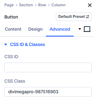
5. Navigate to the page and edit the element you want to trigger the tooltip. In the Advanced > CSS ID & Classes settings, paste the Mega Pro class into the CSS Class field.
6. Set the trigger element’s link URL to #open – this critical step activates the hover or click action.
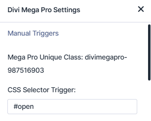
7. In Mega Pro settings, choose whether the tooltip opens on hover or click, make your page live, and test your tooltip! We’ve linked our example to a CTA button and set the trigger on hover:
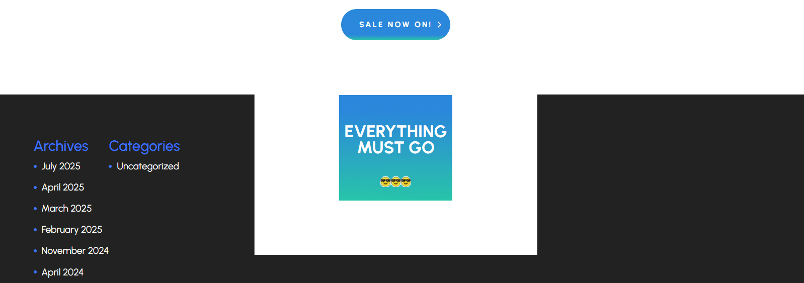
“This method transforms tooltip management as you can design once and deploy anywhere, update in a single place, and control every aspect of appearance, without coding. With Mega Tooltips, any Divi module from product carousels to videos can be used, giving designers unmatched flexibility!”
– Jennifer Rodriguez, Lead Designer at Divi Life

Do More with Divi Mega Pro!
Create beautiful & functional mega menus & mega tooltips with Divi Mega Pro, complete with included templates & advanced functionality. 🔥
Styling your tooltips and ensuring browser compatibility
Now you’re an expert at basic tooltips, let’s tackle a common problem – how to stop them breaking! Thankfully, most problems are straightforward and can be fixed in minutes with a little know-how.
Cross-browser compatibility: Why your tooltips break in Firefox
Tooltip animation bugs in Firefox are a headache for Divi designers. Divi hover effects often break when the CSS transform property is used without the -moz- vendor prefix. This omission causes Firefox to highlight the entire module, instead of just the intended element, making your tooltip look clumsy and unprofessional.
Chrome, Edge, and Safari each interpret CSS differently, so a perfectly functioning tooltip in one browser can misbehave in another. Guarantee uniform rendering by including vendor prefixes for transforms:
/*
.tooltip-class {
  -webkit-transform: scale(0); /* for Safari and Chrome */
  -moz-transform: scale(0);    /* for Firefox */
  transform: scale(0);         /* standard */
  transition: transform 0.3s ease-in-out;
}
*/
Add this code to your Theme Customizer under Additional CSS or inside a Code module. While most modern browsers support the standard transform property, using prefixes is crucial for legacy compatibility. Vendor prefixes are seldom needed today, but adding them ensures complete reliability for those with older browsers.
Thoroughly test tooltips on the latest versions of Chrome, Firefox, Safari, and Edge. Include mobile devices like Safari on iOS and Chrome on Android.
Divi Mega Pro solves most compatibility and mobile issues automatically, delivering consistent tooltips across platforms. But for full peace of mind, review results in older browser versions as well.
The mobile challenge
Should tooltips be hover or click? That depends on the device. Use hover tooltips for desktop supplementary information and click tooltips for mobile devices or interactive content like forms.
Native Divi tooltips, tied to the hover event, simply don’t show up when tapped on phones or tablets. There’s no automatic touch detection, no click alternative, and crucial information disappears for half your audience.
Divi Mega Pro fixes this by offering built-in click triggers on touch devices, ensuring every tooltip works, regardless of platform. Close buttons help users dismiss tooltips, and responsive breakpoints guarantee readable layouts at every screen size.
Visual design with Divi Mega Pro
Divi Mega Pro takes tooltip styling further with dedicated visual options in the Divi Builder. Try the following design options for your Divi Tooltip.
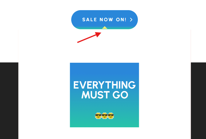
- Adding arrow graphics: Toggle the setting on, then adjust size and color for clear directionality.
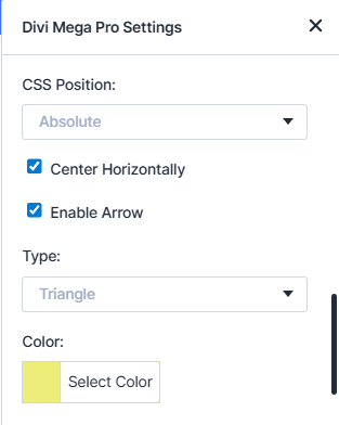
This adds a subtle arrow to your trigger module, following hover or click:
- Shadows and borders: These are fully customizable using standard Divi controls, allowing you to add depth and separation for each tooltip.
- Entrance and exit animations: Fades, slides, or zooms are handled via the built-in animation settings.
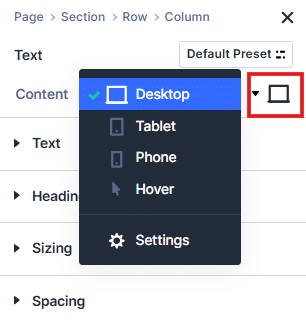
- For responsive width: Set custom sizes for desktop, tablet, and mobile right by selecting desktop icon > select device, then customizing within the Divi Builder’s design tab.
Best practices to improve tooltip usability
Make tooltips clear, accessible, and performance-minded by following tested design and tech approaches that protect user trust and simplify future updates.
Making tooltips accessible
For Divi tooltips that work with screen readers, every tooltip element should include role=”tooltip”, plus ARIA attributes (aria-describedby or aria-label) to ensure context is delivered clearly. Guarantee keyboard accessibility by assigning focus states to tooltip triggers, allowing users to tab or shift-tab through links, buttons, or icons using standard browser keys.
For Mega Pro tooltips containing important content, supplement hover triggers with keyboard navigation or visible links. This prevents confusion, protects against complaints, and ensures compliance with future accessibility standards. Always provide alternative access for any information critical to completing a task, whether as inline text, accessible popups, or context-sensitive help buttons.
Accessible tooltips are a defense against future legal challenges, visibility gaps, and inconsistent user experiences across devices.
Performance optimization
Limit rich or complex tooltips to five per page to avoid slowdowns and layout glitches. Set up global defaults in Mega Pro for consistent styles, reducing repetitive code and improving maintainability.
Use lazy-loading for heavy tooltip content, such as images or videos, to keep initial load times fast. These steps help keep tooltips snappy and minimize resource strain, ensuring a smooth client experience for every site visitor.
Real-world use cases
Mega tooltips created with Divi Mega Pro open new possibilities for interactive user experiences.
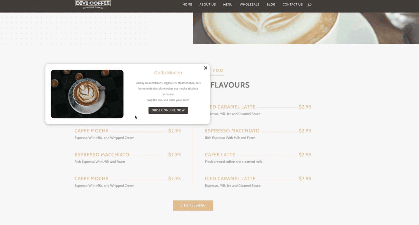
For restaurants and food/drink vendors, tooltips transform a standard digital menu into a rich showcase. Add hovers over any dish name to instantly see mouthwatering images, detailed ingredient descriptions, and even special notes or dietary tags. This method keeps the menu itself uncluttered, delivering details only on demand.
To implement, simply build a Mega Tooltip layout with both image and text modules, then assign it to each dish using the plugin’s unique trigger class.
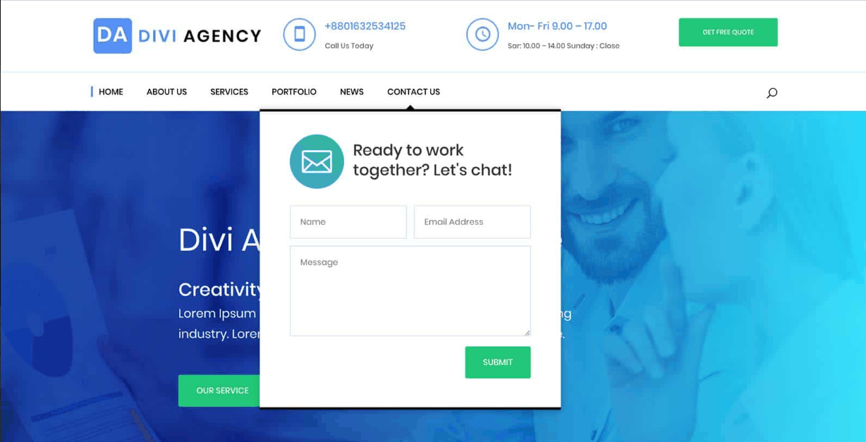
Another practical example is to add contact popups. ‘Quick Contact’ tooltips let visitors access forms from any text link, menu item, or button, so they can submit inquiries without navigating away from their current location.
To implement, use Divi Mega Pro to design a tooltip layout containing a contact form module. Set up the trigger in your desired module, then follow the usual steps with your unique trigger classes.
Quick summary of your options and when to use them:
For short text (under 50 words), use Divi’s native shortcode. Want text-only but with special styles? Add custom CSS. And if you need rich tooltips – images, forms, or videos – choose Mega Pro. Likewise, for multiple tooltips that must look and act consistently, Mega Pro is the best option.
Master your Divi tooltip game today
We’ve detailed how to remove ugly browser defaults, craft polished tooltips with native shortcodes, and unlock rich content layouts. You’ll now know how to manage cross-browser issues and ensure mobile access, whether it’s basic text or complex visuals.
Mastering Divi tooltips adds a point of difference between your site and those of your competitors, so give them the attention and TLC they deserve! Don’t think of them as merely a fun effect, and think of the impact they can have on navigation, the user journey, and even conversions.
To guarantee the best user experience for your customers, start creating responsive, customizable tooltips with Divi Mega Pro today.

Do More with Divi Mega Pro!
Create beautiful & functional mega menus & mega tooltips with Divi Mega Pro, complete with included templates & advanced functionality. 🔥
Table of Contents
- Critical tooltip problems in Divi
- Two methods to add custom tooltips in Divi
- Method 1: The quick fix with native Divi tooltip shortcode
- Method 2: Create professional tooltips with Divi Mega Pro’s Mega Tooltips
- Styling your tooltips and ensuring browser compatibility
- Best practices to improve tooltip usability
- Real-world use cases
- Quick summary of your options and when to use them
- Master your Divi tooltip game today


0 Comments