Unlock Advanced Content Toggles in Divi
Content toggles are a great secret weapon for creative web designers, improving the user experience by providing easy access to information – without overwhelming your layout. Perfect for use cases like FAQs, pricing tables, and interactive content, toggles promote a clean and organized presentation to keep visitors engaged while making the best use of space.
For Divi users, the native Divi Toggle module offers a straightforward way to create and manage these essential elements within your design, ensuring your site remains functional and visually appealing.
Here, we’ll guide you through the process of setting up the native Divi Toggle module, with tips for styling and customization. And for those seeking advanced features, we’ll show you how our own Divi Modules Pro plugin simplifies the creation of sophisticated content toggles, helping your website really stand out from the crowd.
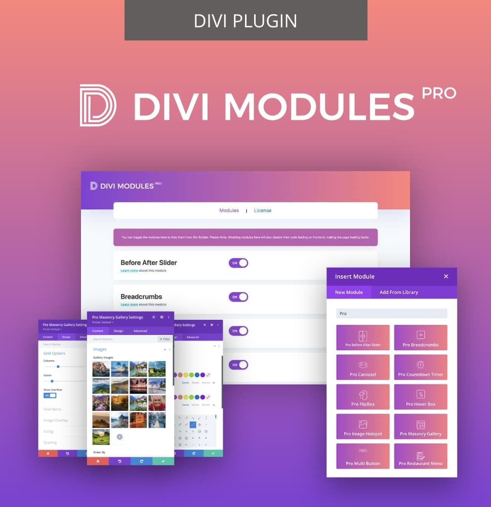
Creative Modules Built for Speed
Divi Modules Pro includes gorgeous creative modules without the bloat, & without slowing down your site! Thanks to our dynamic asset engine, you'll get the best modules with the best speed. 🔥
How to Add Content Toggles Using Native Divi Tools
Without further ado, here’s an insight into creating toggles using Divi – from basic functioning to styling tips and native Divi alternatives.
How to Use the Native Divi Toggle Module
Let’s start at the very beginning – a very good place to start! Here’s how to get, ahem, ‘toggling away’ with Divi’s native Toggle module:
- Click on the + button to add a new module and select Toggle from the list.

- Customize your toggles using the options available. Each toggle can be personalized with a title, body content, and icons for added visual appeal.
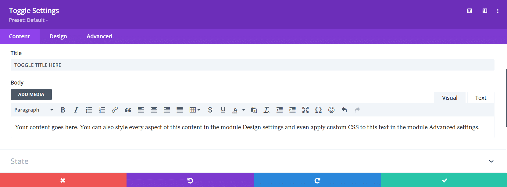
- In the State panel, use the Close or Open options to control the initial state of individual toggles.

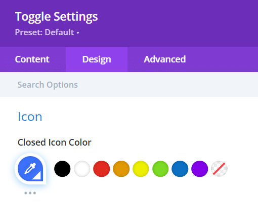
- Configure your settings in the Design tab, selecting different text colors, backgrounds, and icons.
- Finally, save your changes and preview your work to ensure functionality and visual alignment within your overall page design.


Tips for Styling and Customizing Toggles in Divi
Styling and customizing toggles in Divi can add some real flavor to the dish, so it’s worth taking some time to get to grips with the various options available. Using the various options in the Content, Design, and Advanced tabs, try these pointers to get going:
- Typography adjustments: Use the Design tab to customize typography. Adjust font size, weight, and color to improve readability and ensure alignment with your branding.
- Background colors: Apply distinct background colors for each toggle to create contrast between open and closed states – much better for user experience.
- Padding and margins: Strategically use padding and margins to ensure toggles fit well within your layout for a clear visual hierarchy.
- Custom CSS: For advanced styling, implement custom CSS. Use properties like transition to create smooth transitions when toggles open or close, providing a polished effect.
- Interactive buttons: Consider using buttons to reveal topics, transforming toggles into interactive elements that boost engagement.
- Responsive design: Integrate CSS media queries to ensure toggles are responsive, adjusting layouts and sizes for various devices, including mobile and tablets.
- Hover effects: Experiment with hover effects by changing background colors or adding subtle shadows to indicate interactivity, making your toggles more dynamic and playful.
Native Alternatives to the Divi Toggle Module: The Accordion Module
Heads-up – while the Divi Toggle module offers a straightforward way to display content, it does have its limitations. Although it’s functionally identical to an accordion, it lacks the versatility of Divi’s native Accordion module, making the latter a preference for many web designers.
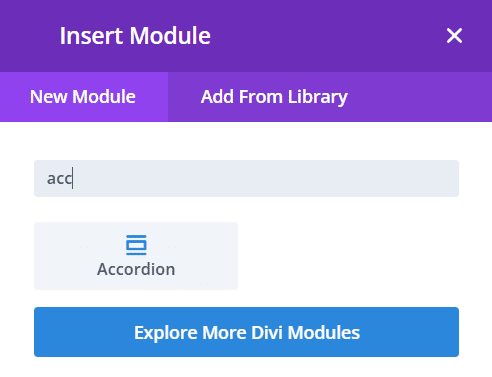
- Click on the + button to add a new module and select Accordion from the list.
- To add titles and content, simply click on the settings’ cog.
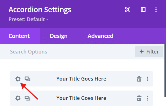
- Just as in the Toggle module, you can then customize your accordions using the options available, including title, body content, icons, and backgrounds.
Here’s what a sample accordion looks like in the module window: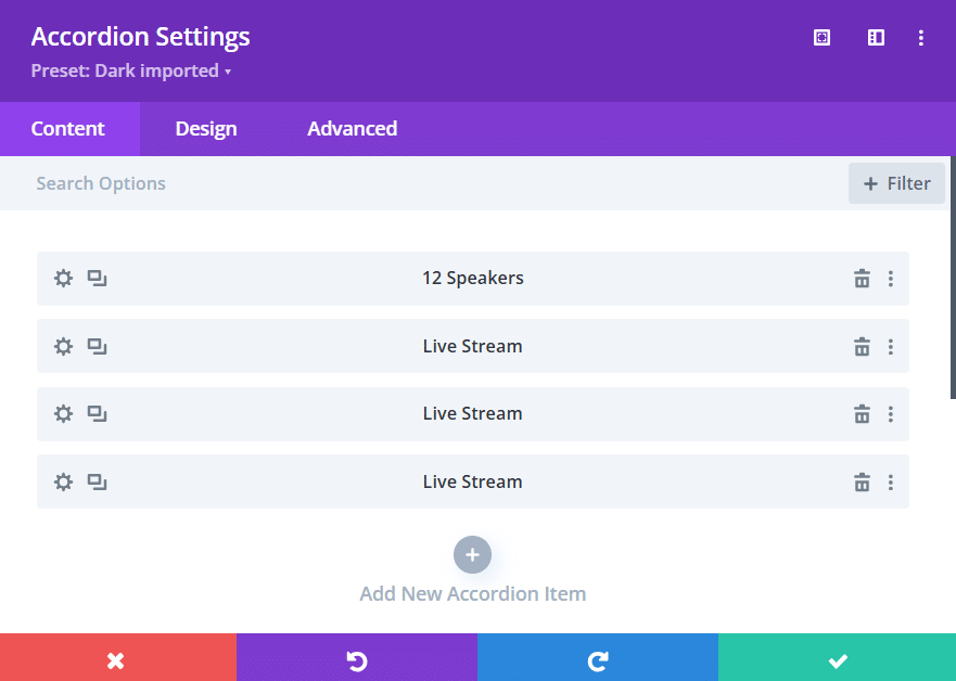
Which translates to this right-hand section on a live site. This Accordion has been paired with Header, Text, and Button modules on the left:
Here’s what using the Accordion module brings to the party:
- Automatic closing: The key feature of the accordion module is its ability to automatically close other items when one is opened, providing an excellent, uncluttered user experience.
- Space efficiency: Accordions maintain visual consistency and can improve page load times, which benefits SEO.
- Versatile content: Each accordion item can contain text, images, or other modules, allowing for diverse content combinations.
- Custom animations: You can customize the accordion’s open and close animations in the Design tab, with effects like fade or slide to draw attention to the expanded section.
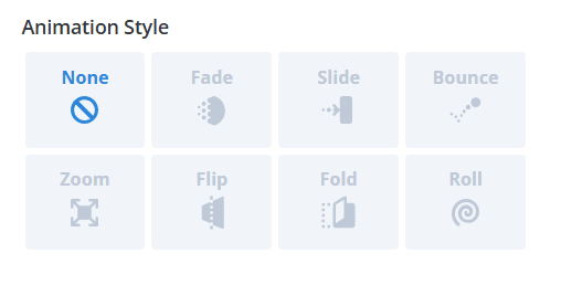
- Default state control: Adjust settings to change the default expanded state of an accordion item for greater control over what content users see first.
- Styling options: You can style the accordion using the same design tools as the Toggle module, including unique backgrounds, borders, and spacing for each section.
- Use cases: Accordions are particularly effective for FAQ sections, providing a clear structure that enhances user engagement and content accessibility. Consider adding icons to each accordion header to visually distinguish different topics, making your designs even more user-friendly.
Why Divi Modules Pro is the Best Choice for Advanced Content Toggles
So why did we build a Content Toggle module within our very own Divi Modules Pro plugin?
Well, in short, he native Divi Toggle module has several limitations that can hinder creative designs. For instance, it primarily supports text content, while our own Content Toggle allows for toggling between various content types, including images and videos. 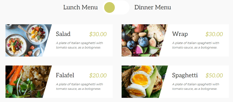
Another significant advantage is the dual toggle functionality, which allows users to present options like Monthly/Yearly pricing – something that isn’t possible with Divi’s native version. Additionally, our Divi Modules Pro plugin supports dynamic content integration from custom fields, offering a data-driven approach that static native toggles cannot match.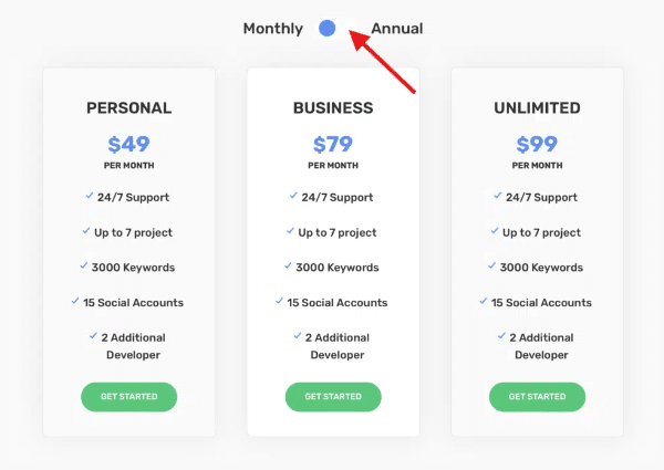
“With advanced triggers and animations, Divi Modules Pro enhances user engagement through more sophisticated transitions and interactions, surpassing the basic functionality of Divi’s toggle module. Users can also take advantage of pre-built layouts and templates, which speed up development and provide a variety of design options that are unavailable in the default settings.”
– Shafaq O Sheikh, Customer Support Manager at Divi Life
Our Content Toggle module also features fully customizable icons and buttons, allowing for real design flexibility. With advanced styling options like color gradients, borders, shadows, and spacing adjustments, users can achieve a unique look tailored to their brand.
These features empower users to create more interactive content without custom coding, save time with ready-made toggle layouts, and improve user experience with smoother content transitions. Hey, what’s not to like?!
How to Create Content Toggles with Divi Modules Pro
Best of all, creating content toggles with Divi Modules Pro is a straightforward process. Follow this step-by-step guide to add the Content Toggle module to your Divi page:
- Navigate to the page where you want to add the toggles and enable the Divi Builder.

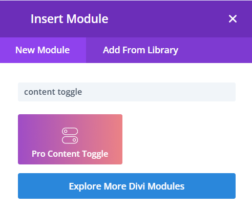
- Click on the + button to add a new module. In the search bar, type Content Toggle and select it from the list.
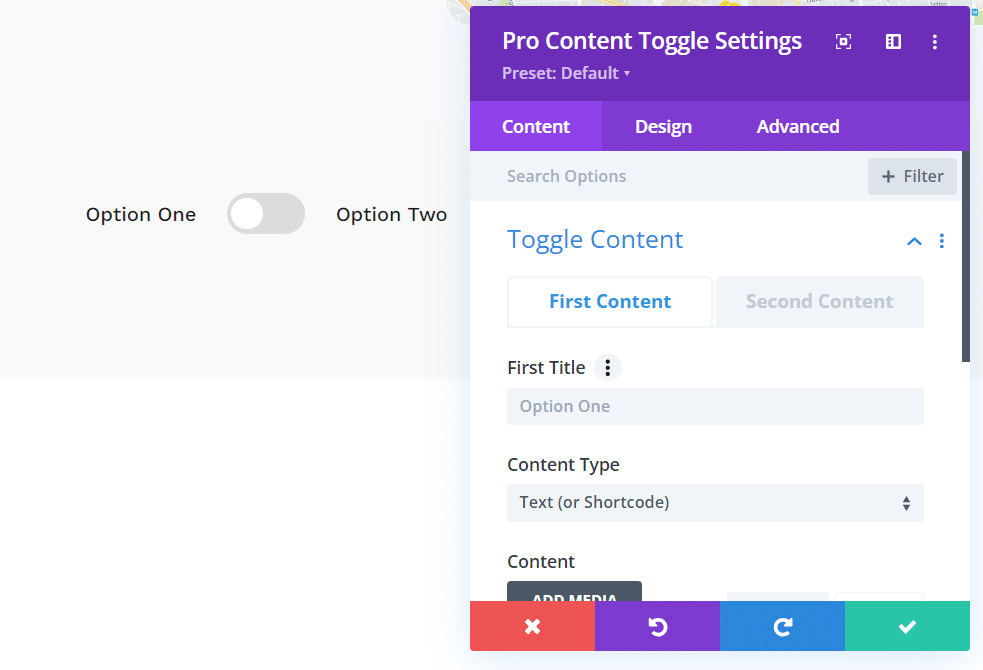
- In the settings panel, you can start adding toggle items. Each item can be customized with a title, body content, and icons. Adjust settings, such as whether the toggle should be open or closed by default.
After configuring your toggle items, consider the following use cases to get started:
- Pricing tables: Create toggles for different pricing plans, allowing users to switch between monthly and yearly options easily.
- Time-based restaurant menus: Use toggles to display different menus for lunch and dinner service, providing relevant information at a glance.
- Contact information: Present contact details for various team members or departments, allowing users to toggle between different contacts.


Add Advanced Content Toggles to Your Site with Divi Modules Pro
Adding advanced content toggles to your site with Divi Modules Pro can truly nurture user engagement and improve how your content is presented. While Divi’s built-in toggle module offers basic functionality, our own Divi Life Content Toggle module takes matters further with features such as:
- Customizable toggle designs with multiple style options.
- The ability to toggle between entire layouts, not just text.
- Animation effects for smooth transitions.
- Easy integration with other Divi modules.
These advanced capabilities allow you to create interactive elements like dynamic pricing tables, before/after comparisons, or multi-step forms – all without the need for complex coding. By using these tools, you can dramatically improve your site’s user experience and conversion potential.
Are you ready to take your Divi toggles to the next level? Explore the Content Toggle module in our Divi Modules Pro plugin to unlock these advanced features and more. And for even greater flexibility in your Divi projects, consider the Divi Life All Access Pass, which includes this module along with a full suite of powerful Divi enhancements!


Hi There
I have been playing around with your content toggle module and got it working. However, I now need to be able to add a button in another page that open the page with the content module and is able to select a specific toggle state eg if we have a monthly and yearly prices toggle with monthly the default. In some cases with want to link a button to directly open the Yearly toggle.
Is this possible? can you help?
Open a support ticket and we’ll see what we can do 🙂
Hey Tim,
I’m reaching out because I’m looking for a solution to create something like this:
https://adwe.hu/liebherr/wp-content/uploads/2025/06/CleanShot-2025-06-04-at-09.48.18.gif
I was wondering if you might have any ideas on how to achieve it. Essentially, I want to display a product—with all its data—or a post with the complete content created in Divi.
Thanks in advance for your response!
Kind regards,
Viktor