Implementing Sticky Sidebars in Divi (No code and CSS options)
Learn three reliable methods to create sticky sidebars in Divi – native settings, our Divi Hacks plugin, and custom CSS – and finally get all the troubleshooting solutions you need!
We’ll tackle setup first so you can get your sidebar sticking fast to desktop and mobile. Next, we’ll detail the most common sticky sidebar killers – overlapping the footer, vanishing on mobile, and breaking after caching or plugin updates. And if your current sidebar efforts won’t stick even after checking your settings for accuracy, we’ll show you a fix for that, too.
Whether you’re starting fresh or rescuing a client project, you’ll leave this guide with a sticky sidebar that’s reliable, responsive, and ready to go.
Key takeaways
- Sticky sidebars only work when every parent container allows them – one hidden overflow setting can stop them cold.
- The height and layout of your sidebar must match the viewable area, or scrolling issues on mobile are guaranteed.
- Most sticky failures are down to structure and not settings – understand the hierarchy and you’ll save hours of troubleshooting.
- Native sticky performs best in clean, standard layouts; not in heavily customized or plugin-rich environments.
- For smart, automated sticky behavior across all page types, tools like Divi Life’s Divi Hacks handle real-world site complexities.
Making sidebars sticky with native Divi settings
You can create a sticky sidebar using Divi’s native builder settings by combining section position controls with the right layout structure.
How to create a sticky sidebar with Divi
You can create a sticky sidebar using Divi’s native builder settings by combining section position controls with the right layout structure.
How to create a sticky sidebar with Divi
1. Create a new page. Open a new section and build your sidebar content. We’re adding a CTA for the purpose of this example.

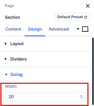
2. Go to the section settings, Design > Sizing, and add a width of 20%. Go to Advanced > Position, and set it as Fixed. Set the vertical offset to 80px.
3. Add your layout or build your page in a separate section below your sidebar content. Our page example begins with an image.

4. Go to your separate section’s settings, Design > Spacing, and set the left margin to 20%, and height to 100%.

5. Your sidebar should now be in place on the page, and remain there when you scroll. Remember to edit the tablet and mobile page views – smaller devices will need an edited sidebar, or a completely different layout.
Essential success requirements
Native Divi sticky sidebars work best when you stick to standard sections, configure all sticky settings – position, offset, limits, and transitions – and avoid containers with overflow:hidden.
Sidebar height should fit most viewports, so test with Divi’s responsive controls for tablet and mobile. For best results, set column sticky position, use proper offset values, define section-level sticky limits, and ensure rows are structured properly.
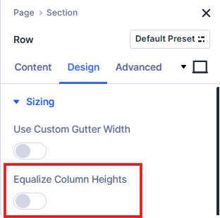
Always turn off ‘Equalize Column Heights’ in Row Settings > Design > Sizing, as this setting breaks sticky behavior for most layouts.
Building reusable sticky sidebar page templates
Efficiency means creating one master sidebar template in Divi’s Theme Builder and applying it everywhere. Start with Theme Builder to build or import a sidebar layout, ensuring sticky settings are configured correctly. Divi’s layout library includes blog layouts with ready-made sidebar structures, which are easy to customize and save hours over manual setup.
Always pick layouts with mobile-optimized sticky sections that match your specific needs. After importing, test sticky behavior straight away, as some layouts include effects that add overflow:hidden, causing sticky failures. Catch these early and adjust before diving into advanced styling or custom code. It’s always best to discover a problem before your potential customers do!
Mobile-first sticky strategy
A tall sidebar – think 2000px – just doesn’t work on mobile screens when an iPhone 13 only displays 844px. Most users end up with cut-off navigation and inaccessible content – pretty annoying.

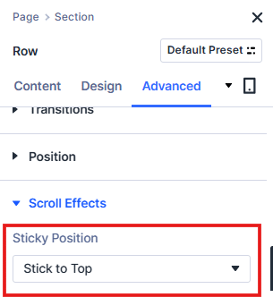
Thankfully, Divi’s responsive controls make it easy to fine-tune sticky behavior. You can toggle desktop, tablet, and mobile settings by clicking the device icons in the builder. As a starting point, you might set behavior as ‘Stick to Top’ on desktop, Conditional Sticky for tablet, and ‘Do Not Stick’ for phones.
Only enable sticky on mobile for compact sidebars (under 400px) or those filled with must-see CTAs, and disable sticky below 768px for anything content-heavy. Test sticky at 375px (iPhone SE), 768px (iPad), and 1024px (iPad Pro) to catch any problems.
Smarter sidebar patterns mean swapping big sticky menus for accordion sections on phones. Sticky CTAs should keep the essentials in view rather than the whole sidebar, and floating action buttons offer a less intrusive way to boost conversions for mobile.
Improved conversion rates are often seen when allowing mobile users to focus on core content – instead of fighting for screen space with sidebars.
Why your Divi sidebar refuses to stick properly
Here’s a look at troubleshooting when your native Divi sidecar fails to behave.
The parent container permission problem
Sticky sidebars rely on every container in the path, allowing sticky positioning. The browser won’t let an element stick unless each parent has overflow set to visible.
Let’s take a garage door with a low ceiling. The door’s motor might be powerful, but if the ceiling is too low, that door stops dead. In Divi, overflow:hidden in any parent container acts as that low ceiling, trapping your sticky sidebar. Technically, any overflow value except ‘visible’ – like hidden, scroll, or auto – creates a new scrolling context that disconnects your sidebar from the viewport, blocking sticky behavior.
In Divi, modules go inside columns, inside rows, inside sections. Every container is a potential ceiling. If your sidebar sits in a column wrapped by a row with overflow:hidden (often triggered by background or animation settings), your sticky element can’t escape and stick to the viewport. This is why a sidebar that works on your blog page fails on your shop page – even with the same sticky settings.
Shop page layouts often nest extra containers (for filters or controls), creating hidden overflow boundaries. The sticky sidebar looks identical, but hits an invisible barrier and stops short.
Divi’s hierarchy – Module → Column → Row → Section – means you must check overflow at each level. Sticky failures almost always happen because a parent container has hidden overflow, not because the sidebar settings are wrong.
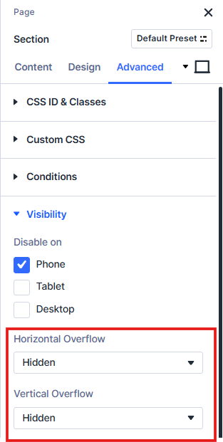
In practical troubleshooting, always inspect the row or section for overflow:hidden – and set it to visible via Advanced > Visibility – a quick fix that resolves sticky bugs in minutes.
The CSS position:sticky requirements
Sticky positioning has four strict requirements:
- Set an explicit inset value like top:20px – without it, sticky can’t activate.
- The parent container must be taller than your sidebar – sticky elements need space to scroll before sticking.
- Every parent must avoid overflow:hidden, auto, or scroll – these act as a picture frame, stopping sticky from extending to the viewport.
- Modern Chrome, Safari, Edge, Firefox, and mobile browsers all support position: sticky natively; Internet Explorer does not, but it is now obsolete.
Sticky behavior is defined by the containing block – the nearest ancestor with scrolling or overflow, which becomes the sticky bounding box. If any of these requirements are missing, your sidebar cannot truly stick, no matter which settings or code you apply
Common Divi overflow culprits
Common Divi overflow issues often come from features that modify layout or positioning. Equal height columns (Row > Design > Sizing) use a flexbox layout, which can interfere with sticky positioning and cause unexpected scroll or spacing problems, especially when combined with background effects or animations.
Parallax backgrounds rely on overflow to properly contain and move background images during scroll, while animation effects also trigger overflow to manage entrance transitions.
Additionally, many third‑party sliders and gallery plugins introduce their own overflow rules that may conflict with Divi’s CSS. Identifying these culprits helps prevent unwanted scrolling or hidden content issues.
Solving the footer overlap nightmare
Sticky sidebars, by default, act like a Post-it note stuck to your monitor – they follow the viewport as you scroll, blissfully unaware of page boundaries. The sticky element doesn’t see the footer and will happily sit over it unless told to stop.
You won’t always catch this problem in quick tests, as footer overlap often rears its head at the bottom of long pages. But clients almost always manage to spot these things first!
The fix is all about boundaries. Divi’s Bottom Sticky Limit controls where the sidebar stops:
- ‘Body’ makes the sidebar stick until the page ends – often causing footer overlap.
- ‘Section’ defines the boundary at the end of the section.
- ‘Row’ or ‘Column’ restricts stickiness within those edges.
If you set the limit to ‘Section’, your sidebar will stop above the footer – but only if your footer is actually inside a section, not added as a global module outside any section.
Using ‘Body’ limit demands a Bottom Offset matching your footer’s height, but footer sizes fluctuate. You might find 200px on desktop, 400px on mobile, and maybe even more with dynamic content. Manual boundaries work for one site, but tracking these across multiple sites would take an enormous amount of time! And life is short, eh?
When native Divi sticky shines (and when it doesn’t)
Native Divi sticky sidebars can fail in several common scenarios:
- Footer collisions: Divi’s sticky settings don’t detect footers, so your sidebar slides right over unless you manually set bottom limits.
- Long sidebars on mobile: On mobile, native sticky doesn’t handle tall sidebars – a sidebar taller than the viewport will never show its bottom half, frustrating users.
- Cache plugin interference: Caching plugins like WP Rocket or Autoptimize can break sticky calculations by changing when Divi runs its JavaScript, resulting in erratic sticky behavior.
- Parent container conflicts: Native sticky can’t override overflow:hidden set by custom CSS, third-party modules, or effects – any boundary along the chain can block stickiness.
- Inconsistent mobile behavior: Each device (desktop, tablet, phone) must be configured and tested separately – Divi doesn’t know to change settings automatically for you.
These aren’t bugs, by the way – Divi’s sticky feature is deliberately basic, designed to work for most users and keep things user-friendly. Handling all edge cases would mean much more complexity and confusion for non-technical users.
When troubleshooting, always check Section > Advanced > Visibility, Theme Customizer’s Additional CSS panel, and your child theme’s style.css for overflow:hidden hiding in your layout.
Native sticky really shines for simple layouts – a two-column blog with a newsletter widget, a basic shop with product categories, or a service page with contact details. In these cases, sticky is fast, effective, and easy to set up.
For a one-site owner, it’s perfectly adequate, but agencies managing varied, complex sites hit its limits quickly. When professional reliability and cross-scenario consistency matter, consider Divi Life’s advanced sticky solutions for peace of mind.

Save Time With Divi Bricks!
Like LEGO bricks for your website: Divi Bricks includes thousands of section layouts (aka "bricks") that you can use to mix & match while building Divi websites.
Extending Divi with Divi Hacks for code-free enhancements
Divi delivers a strong foundation for everyday builds, but when you need professional-grade features, Divi Hacks gives you all of the options you need.
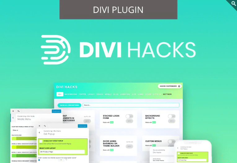
How Divi Hacks adds intelligence to sticky behavior
Divi Hacks makes the process easy and adaptive. With its one-class simplicity, you only need to add the CSS class sticky-element to any module, column, or row, and leave the tool to do the rest.
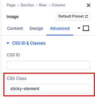
The plugin handles everything, including automatic footer detection, even if your footer height varies between pages (see section below!).
It also provides smart viewport handling. When sidebars extend beyond the viewport, Divi Hacks automatically creates scrollable overflow to keep content accessible. And through responsive automation, sticky is disabled on viewports where it would hurt UX, requiring no extra device-specific settings.
“Divi Hacks is built for cache compatibility, initializing on DOM ready even if scripts are deferred or delayed. Plus, it uses optimized observers instead of scroll events, avoiding the 300-1400ms performance hit of basic JavaScript sticky plugins.”
– Shafaq O Sheikh, Customer Support Manager at Divi Life
In short, one CSS class replaces hours of troubleshooting!
How Divi Hacks solves the footer overlap problem
Remember the old footer collision problem where you had to manually calculate offsets for desktop and mobile? Divi Hacks completely eliminates that problem!
Its stop-at-parent parameter automatically detects when a sticky sidebar or module would collide with the footer, then stops it 20px before overlap.
The solution is fully intelligent, adapting to dynamic footers, varying heights, and different layouts across devices. All you need to do is add the sticky-element CSS class, and the plugin handles boundary detection automatically, so your sticky elements will behave as desired.

Customize Divi with Over 89 'Hacks'
Divi Hacks is the Ultimate Divi Customization Tool with dozens of options for customizing every aspect of Divi.
Creating sticky sidebars in Divi using custom CSS
As a third method, sticky sidebars in Divi can be created using custom CSS by using the position:sticky property and specifying the top offset.
1. In the Divi Builder, edit the module, column, or row that you want to make sticky. Go to the Advanced settings and add a custom class, e.g. sticky-sidebar.

2. Copy the following CSS to keep the sidebar visible as the user scrolls, pausing when it reaches its container’s boundary:
/*
.sticky-sidebar {
  position: -webkit-sticky;
  position: sticky;
  top: 40px; /* Distance from top of viewport */
}
*/
3. Paste the custom CSS in Divi > Theme Options > Custom CSS.

4. Test everything’s working and you’re good to go! Your Divi sidebar should stay visible as users scroll down the page.
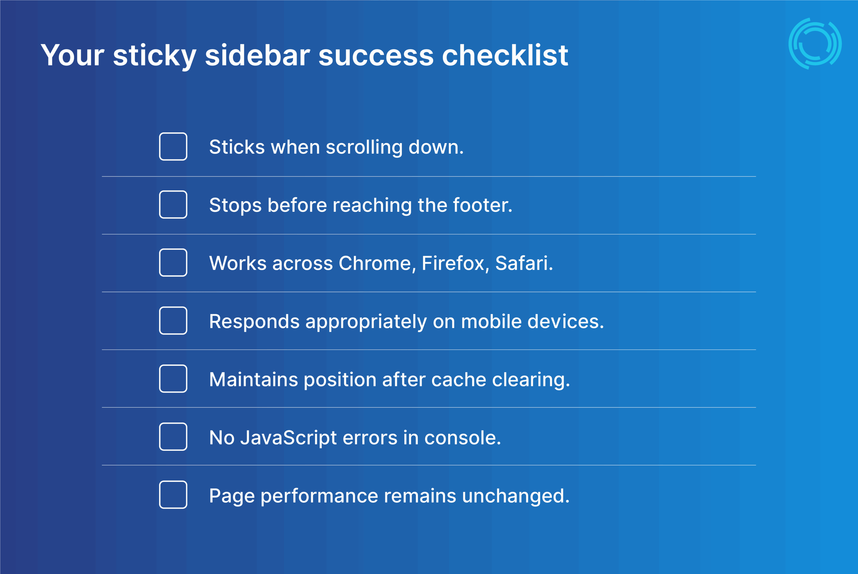
Start adding working sticky sidebars to your pages today
Overflow:hidden is the invisible barrier stopping sticky sidebars in their tracks, while viewport height is the hurdle that breaks them on mobile.
Whether working on your own site or managing many for clients, pick the solution that matches your needs and saves you time! For simple blogs and basic layouts, native Divi sticky is fast and works with the right setup. But for client projects, tools like Divi Hacks are needed for automatic, intelligent sticky sidebars with zero debugging required.
For truly optimized, sticky sidebar functionality every time, try adding Divi Hacks to your website today and never worry about broken sidebars again!


0 Comments