Implement Professional Divi Menu Hover Effects

Hover effects are amazing when you’re building with Divi and want your menus to do more than just sit there like furniture. A simple hover animation can also subtly guide users and make your site feel more dynamic without sacrificing professionalism. These little micro-interactions give your site a sense of responsiveness that makes users feel like they’re engaging with something alive.
But why stop there? Hover-triggered mega menus, image previews, and cart displays let you pack serious functionality into your design without overwhelming users.
This article cuts straight to the point: how to bypass Divi’s built-in limitations with smart CSS tricks and even more flexible tools like Divi Mega Pro. Whether you want minimal enhancements or fully interactive, content-rich menus, these techniques will take your navigation from functional to fantastic.
Let’s make your menus do more – and look better while they’re at it!
Can you add hover effects to the Divi menu natively?
Like most other modules, you can add basic hover effects to the Divi menu with just the built-in tools, but the options are about as flexible as frozen steel. Just so you understand what I mean when I say this, here’s how to add hover effects to a Divi menu using native functionality:
- In the dashboard, navigate to Divi > Theme Builder, then either create a new template or open the header of an existing one by clicking the pencil icon next to Custom Header.
- In the Divi builder, add a menu module and choose a menu from the Content section.
- Scroll down to the Background section, click on the arrow icon, then click the tab with the arrow section. This is where you can set a background color that appears on hover.
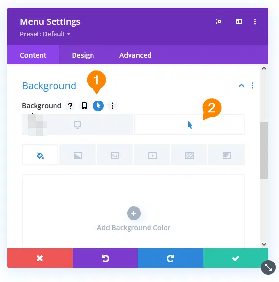
- Choose your preferred background color, then save your settings.
💡 You can hover over a module’s elements to see which ones you can add hover effects to – just check for the arrow icon!
- Next, go to the Design tab and use the same process to change the color of the menu text to change on hover. Repeat this with the border so it appears, rounded and colored, on hover.
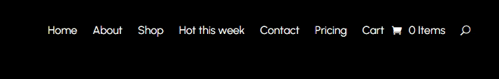
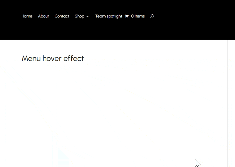
- Save the settings, visit a page where you expect the menu to appear, and here’s what you should see:

Now, you might have noticed that this method is more “bare-minimum functional” than “pixel-perfect polished.” For instance, you can’t change the transition time or effect, and if you were hoping for advanced triggers – like hover states that change based on custom user interactions – Divi’s default settings will leave you hanging.
This isn’t just a nitpicky critique, either. These limitations directly impact your site’s ability to stand out. Without creative, modern hover animations, your menu risks looking like every other Divi-powered site on the web.
For brands with specific design guidelines, it’s often a game of frustrating compromises. While the default features are fine for quick projects, serious designers will need to venture into custom CSS or third-party plugins to build a menu that truly wows.
Simple CSS snippets for basic hover effects
The native menu hover effects won’t get you far but, luckily, you have the tools to add a bit of custom code that gives your designs a more personal touch.
To add custom code, go to your dashboard then open Divi > Theme Options and paste it into the Custom CSS section.
To give you an idea of how it works, here’s some very simple code that makes the menu rise slightly on hover:
/*
.et_pb_module {
	transition: transform 0.3s ease-in-out;
}

.et_pb_module:hover {
	transform: translateY(-10px);
}
*/
Here’s CSS that gives the menu a glow:
/*
.et_pb_module {
.et_pb_module {
	transition: box-shadow 0.3s ease-in-out;
	padding: 20px;
	box-shadow: none;
}

.et_pb_module:hover {
	box-shadow: 0 0 40px yellowgreen;
}
*/
Here’s some code that changes the background color on hover, with an animation that originates from the center of the menu:
/*
.et_pb_module {
	position: relative;
	overflow: hidden; /* Ensures the effect stays within the module bounds */
	background: transparent;
	border: 2px solid transparent; /* Initial border */
	padding: 20px; /* Adds padding inside the border */
	transition: all 0.5s ease;
}

.et_pb_module::before {
	content: '';
	position: absolute;
	top: 50%;
	left: 50%;
	width: 0;
	height: 0;
	background: #007bff; /* Desired background color on hover */
	z-index: -1;
	transition: all 0.4s ease;
	transform: translate(-50%, -50%);
}

.et_pb_module:hover {
	border-color: #007bff; /* Border color on hover */
}

.et_pb_module:hover::before {
	width: 200%;
	height: 200%;
}
*/
CSS is great for giving your Divi menus a bit of flair, but there’s a ceiling to how much you can do before things start getting clunky. If you want your Divi headers to really stand out from the crowd, you’ll have a much easier path if you choose to go with Divi Mega Pro, and its powerful yet usable toolkit for building sleek, functional mega menus.
Create rich hover-activated Mega Menus with Divi Mega Pro
Mega menus are a reimagining of how users interact with your site. They’re are essentially expanded navigation panels that showcase multiple content types – think images, forms, formatted text, and even entire galleries – arranged in sleek, multi-column layouts. Unlike basic dropdowns, which just list links, a well-styled mega menu can elevate the user experience by giving users valuable context at a glance.
Hover activation takes this further by removing friction from the browsing process. No extra clicks, no tedious backtracking – just instant, intuitive access to the content users care about. This is why mega menus are a go-to for product catalogs, service listings, and content directories.
Think of them as content preview systems, offering users a glimpse into your products, services, or content – kind of like how streaming platforms play video previews when you hover. They turn simple navigation into an interactive experience, giving users a reason to engage before they even click.
“Mega menus work because they let users see what’s worth clicking without making them dig around.”
– Shafaq O Sheikh, Customer Support Manager at Divi Life
Divi Mega Pro is the ultimate tool for creating hover-activated mega menus that bridge the gap between static navigation and dynamic content displays.
What makes it the ultimate tool for building mega menus is that it allows you to add any Divi module as the content that appears on hover. Here’s how:
- Install and activate Divi Mega Pro.
- From your dashboard, go to Divi Mega Pro > Add New. Use the Divi builder you know and love to create the content you want to appear in the mega menu.
- When you’re satisfied with your design, scroll downwards. Along the menus on the right, look for the Mega Pro Triggers section. Copy the Mega Pro Unique Class value.

- Scroll further down a bit to the Mega Pro Additional Settings section, for the main event. Find the trigger and exit types, and make sure they’re set to Hover.

- Hit Publish when you’re done.
- From the dashboard, go to Appearance > Menus and open the menu you want to add the content to.
- From the top of the page, expand the Screen Options and ensure Link Relationship (XFN) is checked.
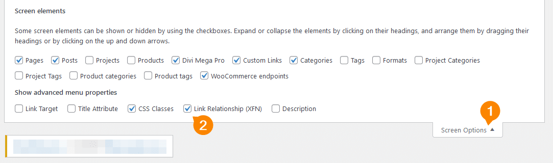
- Expand the options for the menu item you want to link the Mega Pro to and, in the Link Relationship field, paste the unique class name you copied earlier.

- Save your changes and visit a page where you expect the menu to appear and here’s what you should find:
Whether you’re previewing a new collection, showcasing your services, or organizing a sprawling blog archive, Divi Mega Pro makes it easy to build an engaging menu system that transforms site navigation into an interactive journey.
💡 Remember, anything you can create with the Divi builder can be turned into mega menu content with Divi Mega Pro!
Inspire visitors to take action with hover-activated mega menus
Hover effects are a powerful way to make your site more engaging. Even a small detail, like a line appearing under a menu item, can guide visitors toward exploring further. These subtle interactions help transform basic navigation into an intuitive, interactive experience that encourages users to click through.
Divi Mega Pro builds on this idea by introducing Mega Menus that reveal content, catalogs, or even a user’s cart on hover. This approach shifts your menu from a simple navigation tool to a dynamic content preview system, offering valuable information upfront. With its no-code approach, it provides an efficient way to enhance navigation while driving user engagement.


0 Comments