How to Style Your Divi Mega Menu for a Better User Experience
A mega menu is a large drop-down menu that not only displays many options organized into categories but can also include interactive elements like login forms, shopping carts, or calls-to-action. It’s a versatile tool for creating rich, interactive navigation experiences on complex websites.
For content-heavy sites (think eCommerce giants, service directories, or dense blogs), mega menus bring order to chaos, organizing products, services, or topics in a way that helps users find what they want fast. Instead of poking around a dozen submenus, users see the whole layout at a glance, reducing bounce rates and frustration in one clean move.
Now, Divi doesn’t come with a mega menu builder built in, but there’s good news: you can still create sleek, customized mega menus in Divi by combining the Theme Builder with a little CSS wizardry. For those who prefer a no-fuss approach, third-party plugins built for Divi add mega menu functionality with a few clicks.
This guide looks into every step of crafting your Divi mega menu – from layout and advanced CSS to mobile tweaks and exploring the more powerful, customizable Divi Mega Pro plugin for those who want to go pro.
Do More with Divi Mega Pro!
Create beautiful & functional mega menus & mega tooltips with Divi Mega Pro, complete with included templates & advanced functionality. 🔥
Step-by-Step: Building Your Divi Mega Menu Structure
Let’s go through building a custom mega menu in Divi from scratch, using the built-in toolset and a few CSS tricks to bring your navigation vision to life – no additional plugins required.
Creating the Basic Mega Menu Structure
The first step involves creating the menu that we’ll convert into and style as a mega menu later. Here’s how:
- From your admin dashboard, go to Appearance > Menus. If you don’t already have a menu you can create a new one by clicking on create a new menu.
- Use the Add menu items section on the left to choose what you want to include. Move between the Most Recent, View All and Search sections so it’s easier to track down exactly what you need.
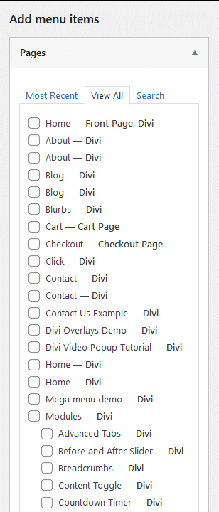
💡 At this stage, you can select the items in whatever order because you’ll get the chance to arrange them later.
- Click Add to Menu when you’re done.
- From the Menu structure section, drag the blocks to arrange the menu how you’d like it to appear. You can nest menu items by indenting the blocks as shown below:
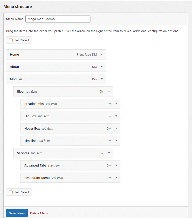
💡 Notice how, for items like Blog in the screenshot above, you can nest sub items.
- When you’re done, scroll down to reveal the Menu Settings section and check the boxes according to your preference. If this is the only or main menu for your site, select Primary Menu.
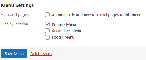
- Click on Save Menu when you’re done.
At this point, you’ve successfully created a menu, but it’s still not a mega menu. Luckily, the conversion is unbelievably simple:
- From the same page, find the Screen Options dropdown at the top right.
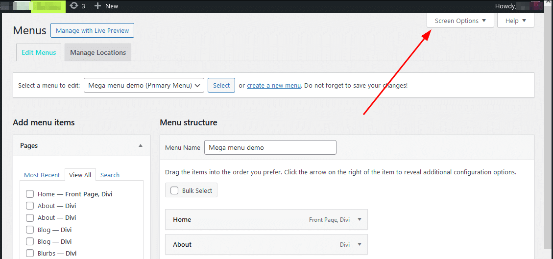
- Toggle the dropdown open and check the CSS Classes box then close the dropdown.

- In the Menu structure section, find an item with sub items, the one you want to turn into a mega menu, and click the arrow on the right end of the block to toggle its options open.
- Fill in the CSS Classes area with mega-menu. This tells Divi to treat it as a mega menu. You can add this class to multiple menu items as needed.
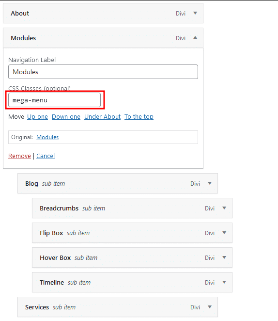
- Click on Save Menu to complete.
Adding Custom CSS
With the basic mega menu structure in place, we can start styling it. As we stated at the start, Divi doesn’t provide a lot of options for doing this, so we’ll need to use custom CSS.
- From your dashboard, go to Divi > Theme Options and scroll to the bottom, where you should see the Custom CSS section.
- Paste the following CSS into this section:
.mega-menu .sub-menu li {
	background-color: #ffebcd; /* Light pastel color for background */
	border: 2px solid #ffd1a9; /* Soft pastel-colored border */
	border-radius: 50px; /* Creates a border with rounded corners */
	padding: 10px 20px; /* Adjusts padding for border corners */
	margin: 5px 0; /* Space between items */
	max-width: 200px; /* Restrict width for better shape */
}- Click Save Changes and open any page on your website where you’ve used the menu you created. When you expand an item with sub items, it should look something like this:

This CSS code styles each list item by applying a light pastel background color, a soft border, and a highly rounded border radius. It also sets padding for spacing and maximum width to enhance the border shape visually.
Advanced CSS Customizations for Divi Mega Menus
Now that you understand how Divi mega menus interact with custom CSS, it’s time for some advanced styling.
CSS Tricks for Customizing Colors and Adding Hover Effects
You can add hover effects to the sub items by adding the following code after the snippet from the previous section:
.mega-menu .sub-menu li:hover {
	background-color: #B3D9FF; /* Pastel blue background on hover */
}
This makes it so that whenever you hover over each item, the background color changes as shown:

Adding Visual Flair With Images
You can also bump up the visual interest by adding images to the mega menu. For example, you can use the ::before or ::after pseudo-elements to insert items to the left or right of elements:
.mega-menu .sub-menu li a::before {
	content: "";
	background-image: url("link to your image");
	background-size: contain; /* Scales the image to fit */
	background-repeat: no-repeat;
	width: 20px; /* Adjust width to fit your design */
	height: 20px; /* Adjust height to fit your design */
	margin-right: 8px; /* Space between icon and text */
	display: inline-block;
	vertical-align: middle;
}

.mega-menu .sub-menu li a::after {
	content: "";
	background-image: url("link to your image");
	background-size: contain; /* Scales the image to fit */
	background-repeat: no-repeat;
	width: 20px; /* Adjust width to fit your design */
	height: 20px; /* Adjust height to fit your design */
	margin-left: 8px; /* Space between text and icon */
	display: inline-block;
	vertical-align: middle;
}
This should give you the following result:

You can also add a background image to the sub items when they’re open using the code below:
.mega-menu .sub-menu {
	background-image: url("link to your image");
	background-size: cover; /* Ensures the image covers the entire area */
	background-repeat: no-repeat; /* Prevents the image from repeating */
	background-position: center; /* Centers the image */
	padding: 20px; /* Optional: Adds padding around menu items */
}
When you try it, you should see something like this:

Using Divi Mega Pro to Create Mega Menus for Your Site
Alright, let’s talk about Divi Mega Pro, the plugin that cuts right through the tedium of custom CSS for mega menus in Divi. You know the drill: endless styling adjustments, responsiveness issues, troubleshooting animations. It’s not pretty, and frankly, it’s a time-sink.
Divi Mega Pro is here to change all that, bringing advanced customization and functionality into a clean, Divi-centric package. Designed specifically for Divi, it integrates right into the Divi Builder with beginner-friendly controls that make the entire experience fast, flexible, and – dare I say – actually enjoyable.
You get all the control and styling flexibility without the constant headache of working through lines of code. This plugin gives you power where it matters: dynamic content integration, animations, and responsive design options, all in a format that feels entirely natural to the Divi environment.
To give you some real-world inspiration, here are some creative uses of Divi Mega Pro on a WooCommerce site:
- Category highlighting: Display product categories with featured images and links, making it easier for customers to visually identify what they’re looking for.
- Seasonal promotions: Include banners for special promotions or seasonal sales directly in the mega menu.
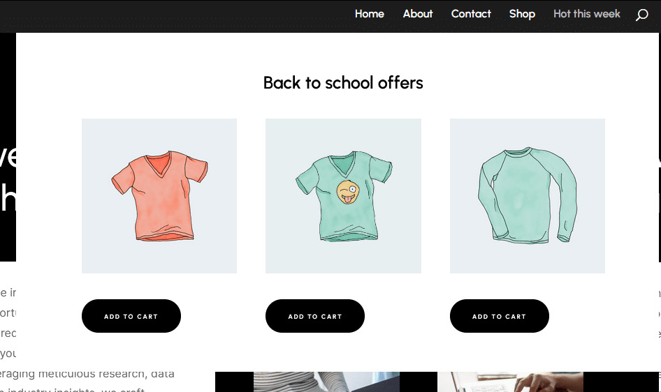
- Interactive product features: Embed interactive content like sliders, video previews, or clickable product feature lists, e.g., a tech store showing a comparison of popular laptops in a drop-down menu.
- Quick access to cart or wishlist: Add mini-cart or wishlist summaries directly in the menu for faster access.
- Helpful links: Add utility links like pricing tables, size charts, return policies, or FAQ sections.
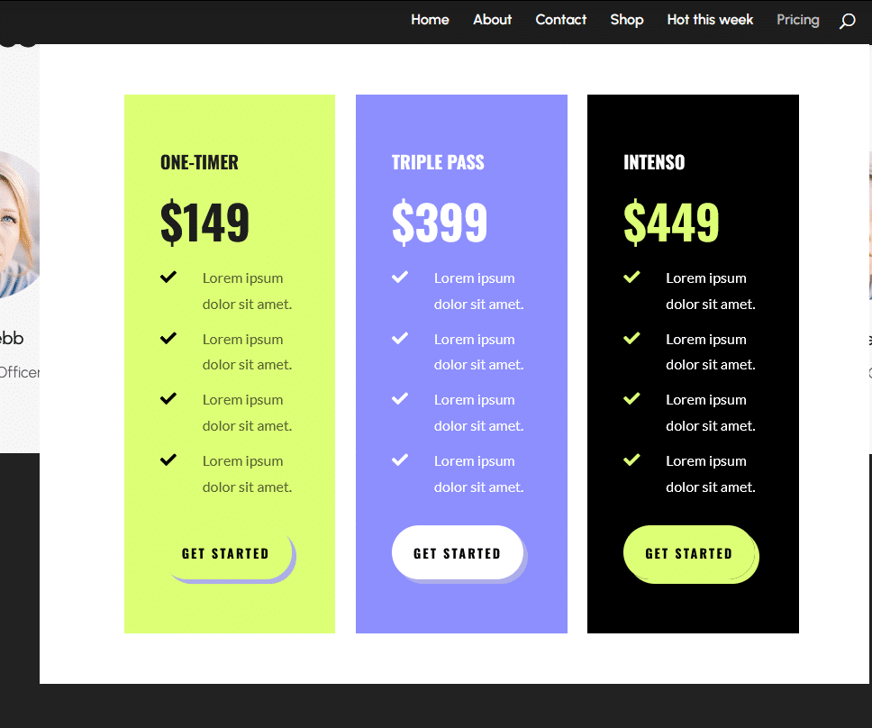
- Call-to-Action (CTA) buttons: Include CTAs for newsletters, memberships, or special offers.
- Login and account management: Add interactive login forms or account management options in the menu for easy access. For example, customers can log in, check orders, or update their account directly from the menu.
- Product feature spotlights: Showcase high-demand or featured products with descriptions and “Add to Cart” buttons.
Here’s what makes Divi Mega Pro a real upgrade for Divi mega menus:
- Drag-and-drop support: Integrated directly with Divi Builder’s drag-and-drop functionality, so you can create and style complex mega menus without touching any code. This speeds up the workflow significantly, letting you focus on design rather than coding.
- Preset layouts: Divi Mega Pro comes with pre-designed layouts for common menu types, like product grids and blog categories. These templates provide a head start, allowing you to quickly create menus that fit your site’s branding and functional needs, without starting from scratch.
- Dynamic content integration: Incorporate WooCommerce products, recent blog posts, and more directly into your mega menus. This capability allows you to keep menus fresh and relevant, using real-time data from your site to populate the content.
- Built-in animation options: From hover effects to fade-ins, Divi Mega Pro includes a suite of animations that can be applied directly within the plugin. No CSS is required, meaning you can quickly add interactive flair to your menus without writing custom code.
- Responsive design controls: Customize how your mega menu looks and behaves on different devices with mobile-specific settings. This ensures that your menu is optimized for all screen sizes, providing a cohesive experience from desktop to mobile.
Divi Mega Pro blows past traditional menus, turning them into dynamic hubs for content and interaction. You can build mega menus or mega tooltips packed with everything from contact forms and product showcases to shopping carts, maps, and embedded videos. Anything Divi’s modules can do, Divi Mega Pro can make mega.
Here’s a brief tutorial for how to build a stunning mega menu with our contact form layout using Divi Mega Pro:
- From your dashboard, go to Divi Mega Pro then Add New.
- Build the content you want to display in the sub menu item. You can use any module(s) you want – it’s that flexible.
- When you’re done, scroll down along the menu on the right until you get to Mega Pro Triggers. Copy and paste the Mega Pro Unique Class value into the CSS Selector Trigger text box.
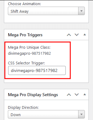
- Save your changes then go back to your dashboard then Appearance > Menus. Paste the CSS class name into the Link Relationship (XFN) area of the menu item you want to connect it to.
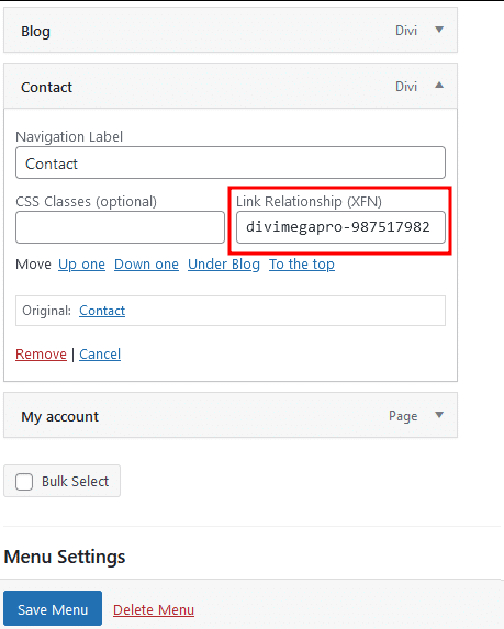
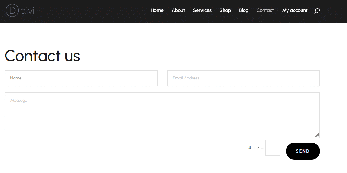
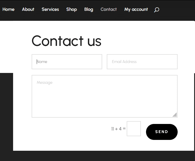
Now, whenever you add the menu anywhere using the Divi builder, the mega menu should work. For example, this is what you’d see if you used a contact form for the mega menu content and connected it to the Contact tab of the menu:
Simple, isn’t it?
Optimizing Divi Mega Menus for Mobile Devices
Obviously, the mega menu we built in the previous section wouldn’t translate well to mobile. Luckily, Divi Mega Pro lets us make some tweaks to correct that.
First, you could change the mega menu item’s size so it’s more manageable on mobile devices. In the Divi Mega Pro item’s settings on the right, scroll to the Mega Pro Display Settings and change the Mega Pro Width and Mega Pro Maximum Height to values that make more sense for smaller screens.
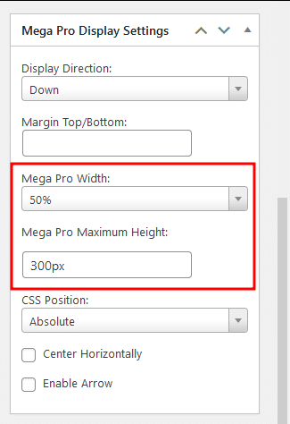
When we apply these settings to the mega menu from the previous section, we should get something that’s more manageable on mobile:
Scroll further down to the Mega Pro Additional Settings and change the Trigger Type and Exit Type options to Click.
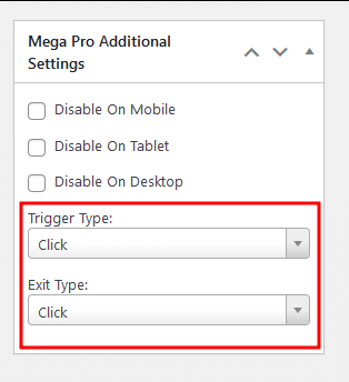
If none of these options work for you, there’s always the option to disable the mega menu item on mobile and tablet, using the options displayed in the screenshot above.
Either way, Divi Mega Pro puts all the control in your hands, and you never have to write a single line of code.
Elevate Your Website with Divi Mega Menus Today
So that’s the deal: a well-designed mega menu goes beyond being a navigation tool and into being an opportunity for your users to engage with your site in a meaningful way. A smart menu layout helps them find exactly what they’re looking for, all while encouraging them to stick around and explore more of your content or products. It’s the difference between a site that feels like a maze and one that guides users to exactly what they want. And if you’re selling products or showcasing content, this is make-or-break.
After all the custom CSS hacks and piecing things together, Divi Mega Pro steps in as the real solution. It’s a plugin that actually “gets” Divi users – designed for easy, powerful mega menus that don’t need code to look custom-built. The drag-and-drop builder, animation presets, and mobile settings? All streamlined for creators who want real control without endless tinkering.
So if you’re ready to level up your site’s navigation, check out Divi Mega Pro and give your users a menu that feels genuinely intuitive.


0 Comments