Style Your Divi Fullscreen Menu for All Screen Sizes
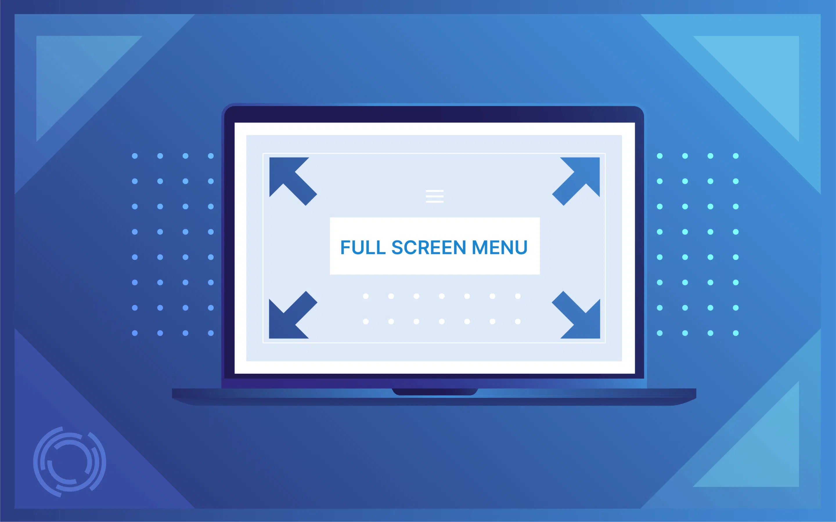
Divi developers know that fullscreen menus are a vital tool for creating focused, distraction-free navigation. Done right, they guide users effortlessly through a site, helping them make clear, intentional choices. On mobile, where screen real estate is tight and touch precision is important, fullscreen menus are even more essential.
But “done right” means granular control over every detail: transitions, typography, spacing, and responsive behavior.
Divi’s native options – the Theme Customizer and Theme Builder – offer some flexibility but often require deep dives into code to achieve professional, user-friendly results. That’s not efficient.
Divi Overlays presents a flexible alternative that simplifies the process without sacrificing control. In this article, we’ll dissect Divi’s native tools for fullscreen menus, highlight their limitations, and explore how Divi Overlays provides a faster, more intuitive way to build polished, functional navigation!
Choosing your fullscreen menu method: Default Divi Menu vs Divi Theme Builder
When implementing a fullscreen menu in Divi, your method determines the design possibilities as well as the level of control you have over styling and functionality. Let’s compare the two primary approaches: the Default Divi Menu and the Divi Theme Builder.
The Default Divi Menu, available in the Theme Customizer, provides a straightforward solution for creating fullscreen menus. It comes with pre-configured animations, standard menu layouts, and basic options for fonts, colors, and spacing. You’ll be working within Divi’s predefined CSS structure, targeting classes like .et_slide_in_menu_container to tweak the design.
While this approach allows you to quickly set up a functional menu, customization is restricted to modifying existing elements.
This means you’re locked into Divi’s default framework for positioning and animations. If you want to, say, shift the trigger button or add a unique layout, you’ll have to work around built-in constraints, which can limit creative flexibility. For developers aiming to fine-tune user experience or branding, this option often feels too rigid.
The Divi Theme Builder, on the other hand, offers deeper customization options. You can build entirely custom fullscreen menus by combining Divi modules, giving you full control over layout, positioning, and design. Unlike the Default Divi Menu, the Theme Builder lets you create unique menu structures with any combination of sections, rows, and columns. This means you can design different menus for specific pages or audiences, each tailored to its purpose.
With enhanced styling options, you can modify individual elements directly, apply custom animations, and even incorporate images or additional content. Want a search bar, social icons, or a multi-column layout? Done.
The Theme Builder also provides greater control over responsive behaviors, making it easier to deliver a more refined mobile experience. However, this flexibility comes with a tradeoff: a heavier reliance on custom CSS and more hands-on styling work compared to the Default Divi Menu.
The verdict: If you need quick and functional, stick with the Default Divi Menu. But if your project demands precision and creativity, the Theme Builder is the clear winner, offering the freedom to craft fullscreen menus that are as dynamic as the rest of your site.
Styling the default Divi fullscreen menu
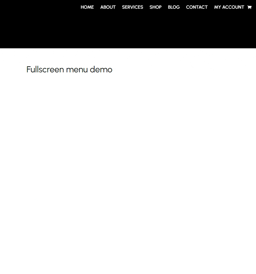
The easiest way to create a fullscreen menu using Divi involves using the Theme Customizer. Here’s how:
- From your dashboard, go to Divi > Theme Customizer.
- Go to Header & Navigation > Header Format and change the Header Style to Fullscreen.

- Test the menu by clicking the hamburger icon at the top right corner, which should show you this:
This menu is good enough: it gives you a straightforward open and close trigger, and a decent fade animation for both. If you need a bit more, you can use CSS to tweak the design. When you open the Theme Customizer, go to Additional CSS and target the class .et_slide_in_menu_container.
For instance, here’s some code to change the font and background color:
/*
 Place Code for Tutorials Here
*/
.et_slide_in_menu_container {

 background-color: #2a9d8f; /* Teal green */

 font-family: 'Courier New', Courier, monospace;

}
Styling a custom fullscreen menu made in the Divi Theme Builder
The Theme Builder gives you more freedom to customize your menu if you’re open to using some CSS. Just follow these steps:
- From the dashboard, go to Divi > Theme Builder and edit the header of an existing or new template.
- Add a menu module then go to its Advanced tab.
- Under CSS ID & CLasses, give it a name. We’ll use fullscreen-menu-1 here.

4. In the Custom CSS section, paste the following code:
/*
Place Code for Tutorials Here
*/
/* Base styling to keep menu minimized by default */
.fullscreen-menu-1 {
position: fixed;
top: 0;
left: 0;
width: 100%;
height: 70px; /* Normal header height */
background-color: rgba(0, 0, 0, 0.3); /* Slightly transparent background */
box-shadow: 0 2px 5px rgba(0, 0, 0, 0.2); /* Subtle shadow for depth */
transition: all 0.4s ease;
z-index: 9999;
display: flex;
align-items: center;
justify-content: center;
overflow: hidden;
}
/* Fullscreen styling when menu is hovered */
.fullscreen-menu-1:hover,
.fullscreen-menu-1:focus-within {
position: fixed;
top: 0;
left: 0;
width: 100vw;
height: 100vh;
background-color: #52796F; /* Fullscreen background color */
flex-direction: column;
align-items: center;
justify-content: center;
transition: all 0.5s ease-in-out;
}
/* Style the menu items for fullscreen mode */
.fullscreen-menu-1 .et_pb_menu__menu {
list-style: none;
padding: 0;
margin: 0;
text-align: center;
}
.fullscreen-menu-1 .et_pb_menu__menu li {
margin: 15px 0;
}
.fullscreen-menu-1 .et_pb_menu__menu a {
font-size: 2rem; /* Larger font for fullscreen */
color: #ffffff;
font-weight: 600;
text-transform: uppercase; /* Different text style */
text-decoration: none;
transition: color 0.3s ease, transform 0.3s ease;
}
.fullscreen-menu-1 .et_pb_menu__menu a:hover {
color: #ff6347; /* Hover color for links */
transform: scale(1.1); /* Slight zoom effect on hover */
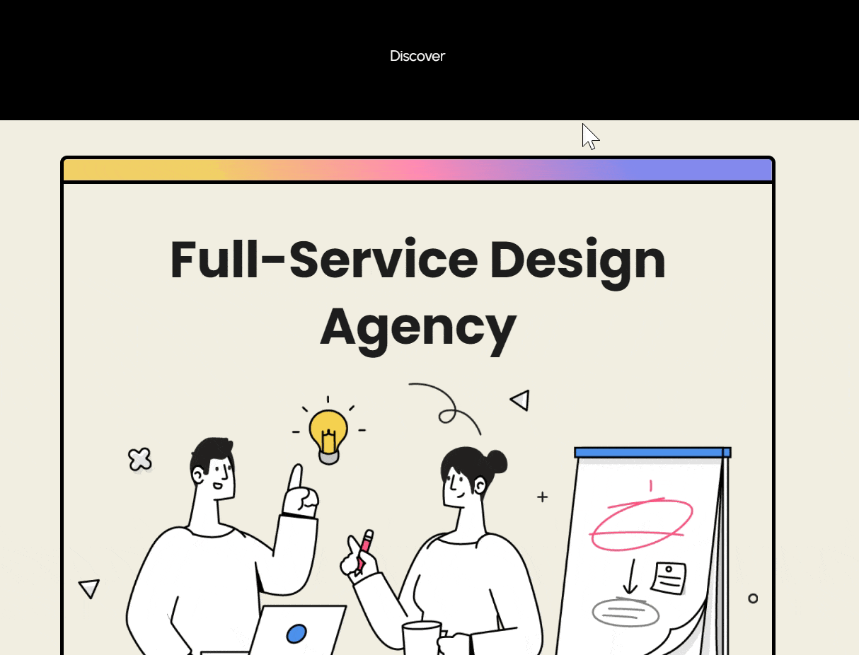
}This should make it so hovering over the menu creates a dark overlay and makes it go fullscreen, like this:
 As we’ve demonstrated, the Divi Theme Builder is useful for web designers seeking more control and creativity compared to the traditional Theme Customizer. While the Theme Customizer provides a streamlined, beginner-friendly interface, it often falls short when it comes to deep customization.
With the Divi Theme Builder and CSS, you can unlock a whole new level of design flexibility:
- Use custom class names to target specific sections or elements, making it easy to tweak styles without changing your entire site.
- Add or move elements around to create unique layouts that aren’t restricted by default settings.
- Set up media queries to make sure your site looks great and works well on all devices, from desktops to smartphones.
- Manage z-index layers to control which elements sit on top of others, helping you create visually striking designs like overlapping images or sticky menus.
- Add animations and smooth transitions to make your site feel more dynamic and interactive, keeping visitors engaged.
If you’re more interested in the design more than the code, though, Divi Overlays gives you everything you need to create the fullscreen menu you’ve always wanted with no code!

Do More With Divi Overlays!
Divi Overlays is the original popup builder for Divi, & remains the most powerful, most popular, & easiest to use popup builder for Divi! Easily create gorgeous, feature-rich popups! 😍
Get pixel-perfect fullscreen menus instantly with Divi Overlays
Even if the Divi Theme Builder paired with CSS is your go-to toolkit for deep customization, you might benefit from using Divi Overlays as the shortcut that saves time without sacrificing control. This plugin simplifies the process of creating fullscreen menu overlays or other dynamic content displays.
What makes Divi Overlays so powerful is its ease of use – no coding is required to achieve polished, professional results.
“Think of your fullscreen menu as prime real estate for creativity. You could showcase an upcoming sale with a bold call-to-action, weave in visuals that enhance the vibe, or structure it to spotlight your most-read articles. By customizing your menu in this way, you can ensure your fullscreen menu truly improves your users’ navigation experience while strategically encouraging them to take desired actions.”
– Jennifer Rodriguez, Lead Developer at Divi Life
Here’s how to use Divi Overlays to create fullscreen content triggered from the menu:
- With the plugin installed and activated, go to Divi Overlays > Add New from the dashboard.
- Use the Divi Builder to create the content you want to appear in the overlay. For this walkthrough, we’ll use text modules, stacked vertically, each linking to a page.

- When you’re done, scroll down and find the Divi Overlays box, where you can adjust various settings related to the overlay. You can change its background color and opacity, entrance and exit animation, positioning, and even the close button’s look and behavior. For this, we’ll set the animation to slide left on entry and slide right on exit.

- Design to your heart’s content and, when you’re ready, publish the Divi Overlay.
- From the dashboard, go to Divi Overlays > Divi Overlays. Find the one you just made and find its Menu ID in the row.

- Copy the ID for the relevant overlay then go to Appearance > Menus and create a new menu.
- Expand the Screen Options from the top right corner and ensure Link Relationship (XFN) is checked.
- Under Add Menu Items, click on Custom Links. In the URL field, enter whatever you want, as long as it starts with a # sign, and make the Link Text whatever label you want for the menu item. This will be the item that you click on to open the menu.

- Click on Add to Menu when you’re done.
- Expand the item from the Menu structure section and paste the menu ID in the Link Relationship (XFN) area.

Save the menu then load up a page where you expect it to show up. Click the custom link you created for the header and here’s what you should see:
With Divi Overlays, you’re not limited to just menus. You can create image galleries that open in a sleek, full-page overlay, making your visual content the star of the show. Need a quick way to showcase a shopping cart or highlight specific calls to action? Divi Overlays lets you do that with minimal setup, giving you full control over design and functionality.
Get started with Divi Overlays
Divi Overlays takes the complexity out of crafting fullscreen menus and extends your design possibilities beyond what native tools and custom CSS can offer.
It lets you turn anything you make with the Divi Builder into a fullscreen overlay, and provides an easier way to create advanced transitions, backdrop effects, and dynamic trigger behaviors – all through an intuitive visual interface.
Whether you’re building sleek navigation, interactive modals, or engaging content reveals, Divi Overlays integrates smoothly with Divi’s existing modules, making it feel like a natural part of your workflow rather than a separate system to master. It’s a powerful tool for developers who demand flexibility without sacrificing efficiency.
Take your Divi projects to the next level: Explore Divi Overlays!

Divi Overlays
Get the #1 Popup Builder for Divi & Start Creating Gorgeous Popups

0 Comments