Boost Engagement with Advanced Divi Flip Box Techniques
Dynamic, interactive website elements don’t get much better than flip boxes. These nifty devices can wow your website visitors, keep them engaged, and make navigation easier. While Divi doesn’t offer flip boxes as a built-in feature by default, various third-party developers have created modules that let you set up flip boxes in the Divi theme. Many of these modules offer advanced features such as animations and 3D effects.
To get the most out of flip boxes, you’ll need to learn how to implement techniques strategically. The end goal is to find a balance between winning your visitors’ attention and not overwhelming them with interactive elements.
Understanding advanced flip box techniques helps Divi users:
- Add more interactivity to their pages.
- Create visually appealing and engaging content.
- Stand out online.
- Improve the user experience.
- Increase time spent on site.
- Showcase info in a space-efficient and eye-catching manner.
Master these techniques and you’ll unlock new possibilities in web design! Thankfully, it’s really easy to create flip boxes that match your imagination by using Divi Modules Pro. Let’s take a look at how it works.
Introducing Divi Modules Pro for Advanced Flip Boxes
If you’re brand new to Divi Life, let us give you the lowdown on Divi Modules Pro. This is an all-in-one plugin for Divi that adds multiple creative modules to the basic setup, allowing you to achieve far more with your designs and functionality.
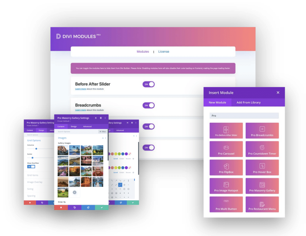
Designed with performance in mind, Divi Modules Pro uses dynamic asset loading to maintain fast load times, ensuring your website remains speedy and responsive. It offers a variety of innovative modules for Divi, such as a Before & After Slider, Countdown Timer, Carousel, Masonry Gallery and of course, the seriously nifty Flip Box.
Why Divi Modules Pro Has the Best Flip Box
With Divi Modules Pro’s Flip Box module, you’ll gain extensive customization options and a logical interface that even technophobes can navigate with ease:
- Content customization: Flip Box allows you to add different content to both the front and back sides of your box. You’ll have options to include titles, icons, images, descriptions, and buttons.
- Animation options: Multiple flip animations are available, including horizontal, vertical, and 3D. You can also adjust the flip speed, and enable 3D content and other effects.
- Layout controls: Layout options include equalizing the flip box height, making it a square box, plus horizontal and vertical alignment controls for content on both sides.
- Design flexibility: Our Flip Box module has customizable backgrounds for front and back, including color, gradient, or image. You’ll gain extensive styling options for text, images, and icons, with button styling, plus border, box shadow, and filter controls.
- Responsiveness: We’ve made the module responsive to ensure proper functionality across desktop, tablet, and mobile devices.
- Advanced customizations: For those needing further freedom with their designs, custom CSS fields allow those adept at coding to add further customizations across the entire Flip Box module.
Read our guide to using the Flip Box module to get set up!
Advanced Customization Strategies with Divi Modules Pro’s Flip Box
Now that you’re acquainted with our plugin, it’s time for a look at the granular details. Here are some recommended customization strategies you can employ:
Mastering 3D Effects for Eye-Catching Flip Animations
3D effects in flip boxes add real depth to the flipping animation, making the switch between the front and back sides more visually appealing. And it’s so easy to achieve this fantastic effect!
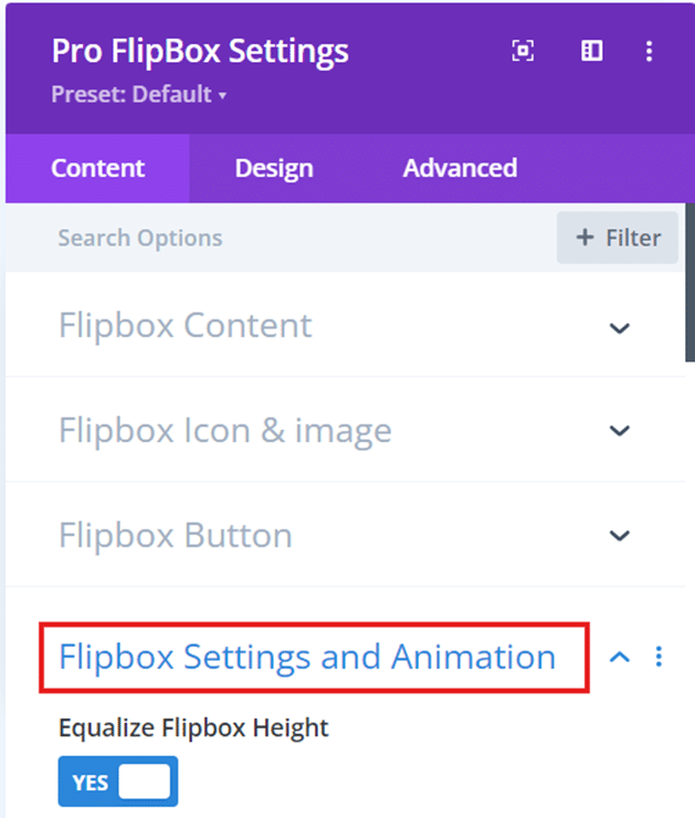
To enable 3D effects using the Divi Flip Box Module, navigate to Content > Flip Box Settings and Animation. Scroll down and toggle on the Enable 3D Content Effect and Enable 3D Flip Box options. Customize the 3D appearance by adjusting the flip direction, speed, and perspective settings to achieve your desired visual impact.
When implementing 3D flip animations, remember to strike a balance between visual appeal and usability. Reserve 3D effects for key elements or calls to action to avoid overwhelming users. Make sure any animations you conjure up improve your content, rather than distract from it.
Optimizing Flip Speed and Direction for Maximum Impact
Flip speed and direction play a major role in user engagement, as they dictate how quickly the flip box transitions between its front and back sides. Optimizing these settings ensures that users can comfortably read and interact with the content without feeling rushed or disoriented.
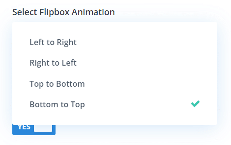
Divi Modules Pro offers customization options for adjusting flip speed and direction within the Flip Box Settings and Animation settings. The Flip Speed slider allows you to control the duration of the flipping animation, while the Select Flip Box Animation dropdown lets you choose the direction of the flip – left to right, right to left, top to bottom, or bottom to top.

When selecting flip speed and direction, consider the nature of your content and user behavior. For simple information or quick reveals, a faster flip speed may be appropriate. However, for content that requires more time to read or comprehend, a slower flip speed can help build anticipation and keep your users hooked. Ensure that the flip direction aligns with the natural flow of your content and does not disrupt the overall user experience.
Creating Compelling Front and Back Content Combinations
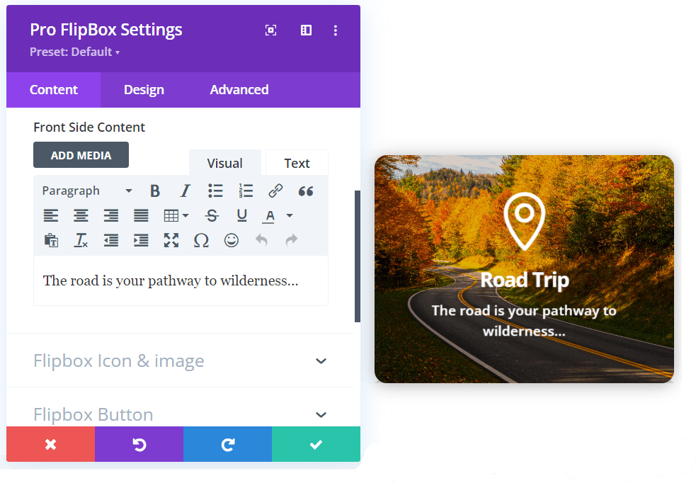
More than a little thought goes into designing effective front and back content for flip boxes, and your choices should be geared toward how to grab users’ attention and keep them engaged. The front side should feature ‘look at me!’ visuals, concise headlines, and enticing snippets that prompt users to flip the box. The back side should provide more detailed information, supporting images, and a clear call to action.
To create visually cohesive front and back sides, maintain a consistent color scheme, typography, and design style. Use high-quality images, icons, or illustrations that complement your content and reinforce your message. The text should be legible and easy to scan, with appropriate font sizes.
Check out these examples of effective content combinations to use as a starting point for your ideas:
- Front: Product image and name | Back: Detailed specifications and Buy Now button.
- Front: Service icon and headline | Back: Service description and Learn More button.
- Front: Team member photo and name | Back: Bio and social media links.

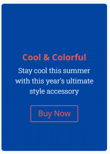
Divi Modules Pro supports dynamic content in flip boxes, allowing you to populate the front and back sides with content from custom fields. This really handy feature enables you to create reusable flip box templates that automatically update based on your website’s content.
Leveraging Custom Graphics and Icons to Enhance Visual Appeal
Custom graphics and icons help to break up text, reinforce key messages, and create a more immersive user experience. By incorporating relevant and high-quality visuals, you can encourage users to interact, keeping them on your site for longer.
To add custom graphics and icons to your flip boxes using the Divi Flip Box Module, navigate to the Front Content or Back Content settings and use the Image or Icon options to upload your visuals. Customize the size, position, and styling of your graphics and icons to ensure they fit in with your overall design.
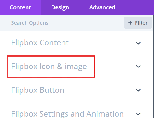
When selecting and positioning graphics and icons, consider their relevance to your content and how they’ll impact the user experience. Choose visuals that are clear, easily recognizable, and in keeping with your brand. Position them strategically to guide users and help them navigate your web pages.
Implementing Strategic Color Schemes for More Conversions
Color has a big impact on user behavior and conversions, evoking specific emotions and guiding users’ actions. Getting to know the effects of different color schemes can enable you to create a more persuasive user experience and potentially boost your sales figures.
Divi Modules Pro offers extensive customization options for fine-tuning color schemes in flip boxes. Go to Design > Flip Box Background, and within the Front side and Back side settings, you can choose from solid colors, gradients, or images to create visually appealing and on-brand backgrounds. Additionally, you can customize the colors of text, icons, and buttons to improve readability.
Examples of effective color schemes for conversions include:
- Blue and white: Conveys trust, professionalism, and reliability.
- Red and white: Creates a sense of urgency and excitement.
- Green and white: Evokes feelings of growth, harmony, and success.
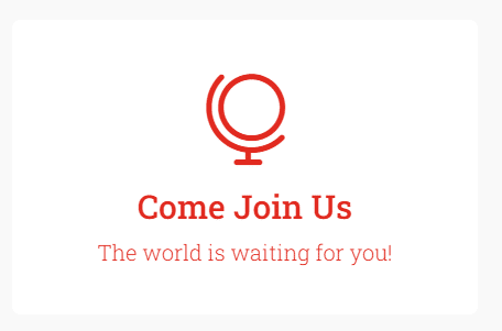
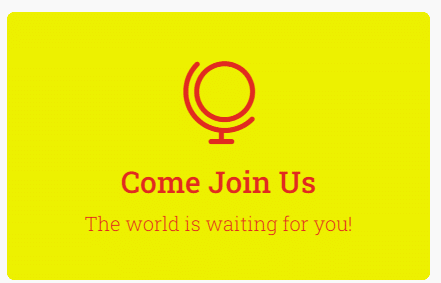
Get to know color psychology and you’ll be better able to harness its power! Be sure to keep matters in line with your house style, but experiment with different colors at different stages of the customer journey to try to evoke different emotional responses from your users.
Perfecting Typography and Text Visibility on Graphic Backgrounds
Typography directly impacts the readability of your content, so proceed with care when selecting a font. Any text needs to be readable, or users will simply miss the points you’re trying to make, and may even go elsewhere.
Divi Modules Pro provides various typography settings to optimize readability, including font family, size, weight, line height, and letter spacing. Experiment with these settings to find the style that suits your brand, thinking of factors such as the amount of text, the size of the flip box, and the complexity of the background.
To ensure text stands out against a graphic background, consider the following:
- Use contrasting colors for text and background to improve visibility.
- Apply text shadows or strokes to create separation between text and background.
- Use semi-transparent overlays to reduce background complexity and make any text stand out.
- Adjust font size and weight to ensure text remains readable at different screen sizes.
Take a look at these examples of effective typography on graphic backgrounds to inspire your own ideas:
- White text on a dark, semi-transparent overlay for a modern look.
- Black text on a light, textured background for a sophisticated appearance.
- Colored text on a complementary colored background for an eye-catching design.
Leveraging Divi’s Transformation Controls on your Flip Box
If you’re new to Divi’s transformation controls, these allow you to perform freehand design within the Divi Builder. You can transform elements directly on the page in ways that would typically only be possible in graphic design programs. Transformation controls include options for scaling, positioning, rotating, skewing, and adjusting the transform origin of elements.
To access these controls in Divi Modules Pro, select your Flip Box module and navigate to the Transform settings. Here, you can make adjustments using the provided sliders or by entering specific values. Play around with different combinations and see what you can create:
- Scale the flip box on hover to create a zoom effect.
- Rotate the flip box slightly to add visual interest.
- Skew the flip box to create a sense of movement.
“When using Divi’s powerful transformation controls, remember that subtlety is key. Start with small adjustments to add visual interest without disorienting your visitors. Use hover effects sparingly to create delightful interactions that enhance, rather than distract from, your content. Test your transformations across devices to ensure a good user experience, and aim for a balance between creativity and usability. The goal is to heighten your design, not complicate it.”
– Jennifer Rodriguez, Lead Developer at Divi Life
Incorporating Interactive Elements like Buttons
Interactive elements like buttons can further help keep users engaged with your content. By incorporating buttons within your flip boxes, you can guide users to take specific steps, such as navigating to a product page, signing up for a newsletter, or downloading a resource.
To add buttons to your flip boxes using Divi Modules Pro, navigate to the Content > Flip Box Button, choose Front Side or Back Side, and enable the Button option. You can customize the button’s text, link, style, and positioning, then refine its appearance using its settings, which include options for colors, borders, shadows, and hover effects.
Some examples of flip boxes with interactive buttons include:
- A product showcase flip box with a Buy Now button on the back.
- A service overview flip box with a Learn More button on the back.
- A team member introduction flip box with a Contact button on the back.
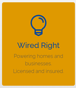
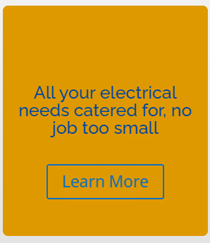
When incorporating buttons, make sure they’re noticeable, easy to read, and communicate a clear message. Your button style should be reflected across your website, and be of good size with adequate padding/spacing so users don’t have to click on them more than once.
How to Boost Conversions with Optimal Flip Box Placement
Phew, we’re almost there! Last but not least, pay attention to placement – a consideration that’s just as important as the quality of the flip boxes themselves. To improve interactions and conversions, weigh up the following placement strategies:
- Place flip boxes above the fold to ensure they are immediately visible to users.
- Use them to highlight key products, services, or features on relevant pages.
- Incorporate them into your content to complement surrounding information and add genuine value to a page.
- Try them in different areas, like sidebars, within blog posts, or as part of a grid layout.
Use data to judge your placement decisions wherever possible. Google Analytics and other tools can track user behavior and engagement through metrics like time-on-page, click-throughs, and bounce rates. Check how your flip box pages are performing and experiment with different placements if necessary.
Some examples of high-converting placements for flip boxes include:
- Featuring a flip box with a special offer or discount code on a product page.
- Placing a flip box highlighting a free resource within a blog post.
- Using flip boxes to highlight customer testimonials or success stories on a sales page.
Create Engaging Flip Boxes with Divi Modules Pro
And there we have it! It’s that easy to create eye-catching flip boxes with Divi Modules Pro and reap all the benefits of adding another feature to your creative box of design tricks.
Flip boxes are a great means of improving user engagement, showcasing key info, and driving conversions on your website. Incorporating advanced techniques such as 3D effects, strategic color schemes, and interactive elements can act as points of difference between you and your competitors, and allow your page designs to truly shine.
Our Divi Modules Pro plugin offers a wide range of customization options and user-friendly settings, so you can design flip boxes that match your brand and creative vision. With flexible pricing plans and a lifetime license option, unlock the full potential of your website and get started with Divi Modules Pro today!

0 Comments