Practical Methods to Equalize Divi Column Heights
First off, there’s nothing wrong with the toggle device itself, as the feature aligns your column containers, not the modules inside them. When gaps remain, it’s because styling tweaks live at the module level, while the height setting targets the columns.
The answer is to change your focus to containers rather than content, and you’ll see a major difference, with perfect backgrounds and aligned buttons. Once you grasp the container logic, any height mismatch becomes easy to solve, so let’s get started.
Key takeaways
- Rethink layout challenges by focusing on column containers, not just the modules you add inside.
- When columns look uneven, check your styling placement – backgrounds and borders work best on containers for stability.
- Flexbox lets you control alignment and spacing visually, adapting layouts as content and devices change.
- Mix techniques by using column backgrounds, absolute positioning, and Flexbox for truly professional layouts that respond to real-world content edits.
- For advanced flexibility across every Divi version, Divi Hacks offers a smart way to match module heights without fuss.
Why the Equalize Column Heights toggle appears to do nothing
Divi layouts may look simple, but there’s an invisible complexity at work here. Columns and modules are two very different pieces of Divi’s architecture – columns are the invisible containers, while modules are the visible content blocks like blurbs, text, or buttons.
When you enable the Equalize Column Heights toggle via Row Settings > Design > Sizing, Divi makes the column containers the same height, but it doesn’t touch the content modules inside those containers.
It’s understandable why confusion can take root! Most Divi users naturally add backgrounds and styling to modules, not columns, because those styling options are easy to find.
When Equalize Column Heights does its job, you don’t see the effect if your visible backgrounds and borders are sitting on unequally sized modules. The result is that containers are equal, but the content isn’t, which creates the illusion that the feature is broken.
To see what’s really happening, try this quick experiment. Strip backgrounds from your modules and add the background to the columns instead. Suddenly, you’ll notice equal heights appear as promised. The fix is found in where you apply your styling, not in the function’s reliability.
Using the native Equalize Column Heights toggle to make columns the same height
Here’s how to use Divi’s built-in tools to get pixel-perfect equal column heights.
How to enable the built-in ‘Equalize Column Heights’ feature
Divi’s Equalize Column Heights feature matches your column containers to the same height across both Divi 4 and Divi 5, minus the need for custom CSS. This setting fixes mismatches arising from uneven module content, but only if backgrounds and borders are on the columns themselves, not the modules.
First, confirm your design is complete and all intended backgrounds and styles are set at the column level.
- Click on the Row Settings where your columns live.
- Go to the Design tab.
- Open the Sizing section.
- Toggle on Equalize Column Heights.

Your columns will now visually adopt the height of the tallest column in that row.
Changing backgrounds and borders to make equalization visible
Moving visuals from the module to the column is a great trick to add to your skill bank. Here’s how:
- Open the module (e.g., Blurb) settings and note any background color, border, or box shadow you’ve set.
- Remove the styling from the modules entirely.
- Open the parent column settings via the Row’s Content tab.

- Add your preferred background, border, or shadow to the column via Design > Background, Design > Border, or Design > Box Shadow sections.
- Apply the styling and save changes.

With backgrounds on the columns and the Equalize toggle switched on, your columns will look visually equal, no matter the content length.
One common pitfall to look out for is leftover padding on modules. Inconsistent module padding may break the effect, causing perceived misalignment even with equalized columns. Styling columns at the container level also ensures future content changes won’t throw off your layout, while module-level styling forces you to revisit and re-edit each module as content changes.
Remember: the toggle assures equal height containers, but modules with custom sizing or extra padding may still look misaligned if not standardized.
Use Divi’s visual Flexbox controls to make modules align across columns
Flexbox is the secret weapon for module alignment in Divi 5, offering granular, code-free control. With Flexbox, aligning your content across columns is easy and super responsive to all screen sizes. There’s no need to juggle backgrounds or hack custom CSS, as the interface handles everything for you.
Setting up Flexbox equalization through the interface
To activate Flexbox equalization:
- Open your Row Settings, and go to the Design tab.
- Select Layout.
- Ensure the Layout is set to ‘Flex’.

- Set Layout Direction to ‘row’ so columns sit side by side.
- Set Justify Content to ‘start’ (for left alignment).
- Choose Align Items > Stretch to guarantee columns always match height.

For each column:
- Open Column Settings and head to Design > Layout.
- Set Layout to ‘Flex’ and Layout Direction to ‘column’.

- Adjust Justify Content to ‘space-between’ – this neatly spaces out content, placing items like buttons at the bottom.
- You don’t have to move backgrounds or redesign modules – this nifty approach works for any type of content and keeps everything aligned as layouts evolve.
Advantages over the traditional toggle method
With Flexbox, modules retain their individual styling and flexibility while aligning evenly. Flex effortlessly handles dynamic content, and responsive breakpoints adjust naturally, so layouts look professional on every device. The result is a polished, tidy module alignment across all columns, with no maintenance headaches at all!
Aligning modules across columns with Divi Hacks

Divi Hacks simplifies module alignment across columns by providing a ready-made CSS class system for equalizing module heights. It works independently of module types and page layouts, automatically matching the tallest module within up to 12 groups on a single page.
With Divi Hacks, you apply classes such as ‘equal-1’, ‘equal-2’, and so on, directly to modules, which inherit the height of the tallest in their group.
“This straightforward method avoids complex column-level Flexbox setups while offering all the control you need. It’s a great setup for aligning diverse module types or creating multiple height groups, enabling professional and consistent layouts without the usual timescales and troubleshooting.”
– Jennifer Rodriguez, Lead Designer at Divi Life
Step-by-step implementation
To implement:
1. Install and activate the Divi Hacks plugin, then open it via Divi > Divi Hacks.

2. Go to Divi Hacks > Settings and enable the Equal Heights Module.

3. Open each module you want to equalize (blurbs, text, etc.).
4. In Module Settings > Advanced > Attributes > Add Attribute, add ‘id’ as your attribute name, then ‘equal-1’. Repeat for the other modules, using ‘equal-2’ for the second column, and so on.

5. Save your changes.
Modules with matching classes will automatically equalize heights across columns. Note that this aligns modules, and not the entire column containers, which still require enabling ‘Equalize Column Heights’ at the row level.
When to choose Divi Hacks over native Flexbox
Opt for Divi Hacks when you need to equalize different module types together, or when your page demands multiple equal height groups. It’s faster if you prefer adding classes rather than juggling several Flexbox settings, and Divi Hacks also ensures consistent behavior on older Divi versions, supporting legacy sites that Flexbox might not fully address.
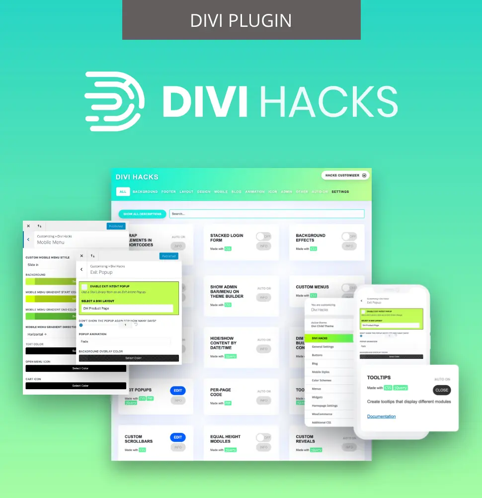
Customize Divi with Over 89 'Hacks'
Divi Hacks is the Ultimate Divi Customization Tool with dozens of options for customizing every aspect of Divi.
Button alignment using positioning techniques
Equal column heights don’t always mean perfectly aligned call-to-action buttons, especially when each column has different amounts of text or content above the button. Standard alignment methods fail because the content pushes buttons down at different rates, making CTAs bob about like sailors lost at sea. Swot up on positioning techniques to keep everything just so.
Absolute positioning method for bottom-aligned buttons
Before starting, ensure columns are equalized using either Divi’s native Equalize Column Heights or Flexbox settings. For precise button placement:
- Open the Button Module > Advanced > Position.
- Set Position to ‘Absolute’.
- Choose ‘left-bottom’ for Location (or another corner as needed).
- Add a vertical offset (25px is common, but match your actual column padding).
- Adjust the horizontal offset to 25px or your preferred value.
- Add at least 25px bottom padding to the module directly above the button to stop overlap.

Absolute positioning removes the button from the normal document flow, letting it stay glued to the bottom of the container, visible in every column, regardless of the content above. This creates perfect button alignment on visually equal columns, no matter what’s inside.
Flexbox method for button alignment
Flexbox is the alternative, and it’s even easier for multi-column layouts:
- Set up your columns with Flexbox as described earlier.
- Set each column’s Justify Content setting to ‘space-between’.
- Divi will automatically push buttons to the bottom of each column.

Use absolute positioning when design calls for fixed placement regardless of content, but opt for Flexbox when you want easier, responsive, and content-aware alignment.
Troubleshooting common equal height problems
Troubleshooting equal height layouts in Divi can save hours of frustration and rescue your designs from unexpected breakage. Let’s check the most common pitfalls, with the proven fixes you’ll need.
Why content updates might break your equal height layouts
As projects evolve, extra text or elements squeezed into one column can break visual balance, even when containers remain equalized. This is the redesign trap – the column heights sync, but new or longer content in one module throws off spacing, especially if styling is applied at the module level. Suddenly, padding and borders appear uneven, pushing you into tedious manual tweaks with every update.
The solution is to keep all background and border styling at the column level, which stays reliable across future content changes.
Mobile responsiveness issues and fixes
Equalization only works while columns are side by side on desktop. As soon as they collapse to stacked mobile layouts, visual equality can fail, and empty columns (like those intended only for background images) can disappear completely.
To solve this little nugget, always preview designs below 768px in Divi’s responsive mode. To keep a background-only column visible, insert a Divider Module and set Show Divider to ‘No’.
Adjust the divider’s spacing for consistent height, or consider changing the column structure for mobile using Row > Content > Change Column Structure.

Image modules don’t stretch to full column height
An image added via a standard module won’t stretch to fill an equalized column, leaving it shorter than adjacent content. To solve this, remove the image module entirely.
Open the parent column’s settings via Column > Content > Background, upload your image there, and switch the Background Image Size to ‘Cover’.

Now, the image will fill the whole column, matching the height perfectly. Tweak Background Position to fine-tune how the image displays.
Handling mobile responsiveness for background image columns
When Divi stacks columns vertically on mobile, empty columns – often used only for background images – vanish, stripping designs of their intended impact.
The invisible divider technique solves this:
- Add a Divider Module to the image column.
- Set Divider Visibility to ‘No’.
- Apply generous top and bottom padding.

This ensures the column stays present on mobile, maintaining its background image display even when no visible content exists.
Empty columns disappear because Divi’s responsive layout engine removes elements without content during breakpoint changes. Inserting a hidden divider gives the column just enough substance for Divi to render it on smaller screens, preserving backgrounds and visual structure where needed.
Modules like sliders, accordions, and toggles resize dynamically after page load, sometimes breaking equal height layouts. AJAX-loaded content – such as WooCommerce results – may appear after equalization, causing column heights to shift unexpectedly.
Always test these modules interactively on mobile and desktop to ensure consistent alignment. Consider reapplying equal height controls or using Flexbox properties to handle post-load changes, anchoring your layouts reliably across devices.
Quick content variation test
Always run a content stress-test:
- Add extra text to one column and observe if the equalization holds.
- Swap in images of different aspect ratios and confirm the column height remains consistent.
- For advanced layouts, verify that nothing jumps out of sync after interaction.
- Explore layouts using browser developer tools – checking how your design behaves at every breakpoint and in different browsers ensures everything is working correctly and your clients’ site performance is unaffected.
Divi 4 vs Divi 5: Understanding the evolution
Divi 4 and Divi 5 approach equal height creation very differently. Understanding these changes will help you choose the right method and avoid unnecessary frustration.
The limitations of Divi 4’s approach
Divi 4’s float-based layout relied heavily on CSS properties never meant for complex grids. The Equalize Column Heights toggle used min-height workarounds, which equalized container sizes but didn’t touch the modules inside.
A real limitation of Divi 4 is the potential need to write lots of extra CSS or jQuery scripts. Such a patchwork approach can lead to frequent layout headaches, increased code complexity, and unreliable results, especially for dynamic or content-rich sites.
How Divi 5 transforms equal height creation
Divi 5 ushers in built-in native Flexbox support at the layout engine’s core, not as a workaround, and the Visual Builder now offers an array of Flexbox options right in the interface.
Options for direction, alignment, and spacing are at your fingertips, making it possible to achieve pixel-perfect, equal-height layouts without breaking a sweat. As your content or breakpoints change, these layouts automatically adapt, eliminating the management headaches found in Divi 4. This overhaul makes equal height layouts dynamic and easy to maintain across every screen size.
Mastering Divi’s container architecture today
Mastering Divi’s container architecture is the secret to layouts that stay polished, no matter what changes come your way.
Equal height is always a container problem, not a content problem, so style your columns, not the modules. The native toggle isn’t broken, and it works exactly as intended by equalizing invisible containers under your visible content.
Now you’ve got a toolbox that includes the native toggle, granular Flexbox controls, and the class-based Divi Hacks approach. You can instantly spot and fix container-vs-module issues, knowing your solutions work across devices and content updates.
A ‘container-first’ mindset results in maintainable, update-proof layouts that won’t break with future Divi releases, so you can build designs confident in the knowledge that future updates won’t harm them!
For the best method of managing advanced equal height controls and dynamic content handling, explore Divi Hacks today.
Customize Divi with Over 89 'Hacks'
Divi Hacks is the Ultimate Divi Customization Tool with dozens of options for customizing every aspect of Divi.

Table of Contents
- Why the Equalize Column Heights toggle appears to do nothing
- Using the native Equalize Column Heights toggle to make columns the same height
- Use Divi’s visual Flexbox controls to make modules align across columns
- Aligning modules across columns with Divi Hacks
- Button alignment using positioning techniques
- Troubleshooting common equal height problems
- Divi 4 vs Divi 5: Understanding the evolution
- Mastering Divi’s container architecture today
0 Comments