Responsive Design for Divi Email Optin Forms

Creating email opt-in forms that look great everywhere is one of those “seemingly simple” tasks that often ends in frustration. You know the drill – forms that work like a charm on desktop but fall apart on mobile, with fields becoming squished or layouts that make the entire thing unusable.
It’s the kind of thing that ruins the user experience and, ultimately, your conversion rates.
A 2021 study found that responsive design accounts for 91.5% of usability variance, so if anything on your site doesn’t work smoothly across devices, you’re losing potential subscribers.
Divi, particularly its email optin module, can really make a difference here. However, while it offers a lot of powerful functionality, its default settings sometimes require fine-tuning to ensure everything stays intact, especially on smaller screens.
We’ll cover how to create email opt-in forms that retain layout integrity across all devices, with practical tips on fixing common responsive issues. We’ll also explore specific CSS tweaks for those annoying layout problems and show you how Divi Overlays can offer an alternative approach for flawless, responsive opt-in forms.
How to create email forms with the Email Optin module
The easiest way to get started with the Divi email option module would be to add it to a post or page using the Divi builder. Here’s how:
1. From your admin dashboard, go to Pages > Add New Page.
2. Click Use The Divi Builder.
3. In a new section, add a new row and insert the email option module.

4. From the menu on the right of the page, add all the relevant info for the module in the Content tab, including the title and button text, email account, and success action.

💡 To prevent content from getting cramped on smaller screens, keep text like placeholders and labels minimal but just descriptive enough to still be useful. Use relative units like rem instead of px for fonts.
5. Switch to the Design tab, and use the device icon on the right to see what the module would look like on different devices.
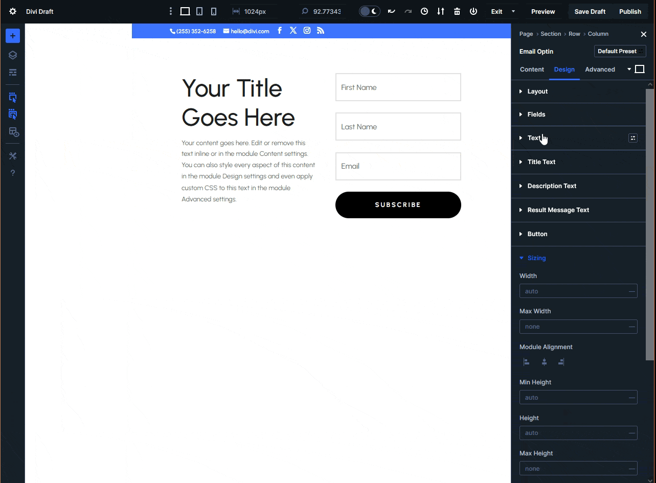
6. Change aspects like the module’s sizing and layout and cycle through the devices to ensure responsiveness.
💡 For the best results, leave settings affecting width and height at the default, usually none or auto.
7. Save your changes and visit the page where the module should appear.
Common responsive design challenges with Divi opt-in forms
If it’s your first time working with the email option module, you might notice a couple of issues that affect its responsiveness:
- Stacking issues on mobile devices occur when horizontal opt-in forms could break into awkwardly stacked layouts on smartphones. This can create a cluttered and unprofessional appearance, as elements shift in a way that disrupts the user experience.
- Uneven field widths and alignment problems might arise at different breakpoints, making forms look disjointed and out of place. These issues happen because the form’s structure is not adapting properly across screen sizes, causing visual inconsistencies.
- Button positioning problems can push call-to-action (CTA) buttons below the fold on mobile devices. This reduces conversion rates as users may not immediately see or access the buttons, leading to missed opportunities.
- Font sizing inconsistencies can happen when form text becomes either too small to read or disproportionately large on different devices. This issue results from the lack of adaptive typography settings, making the text illegible or out of proportion across various screen sizes.
- Excessive padding and margin issues waste valuable screen space on mobile devices. These layout problems occur when spacing elements aren’t adjusted for smaller screens, leading to inefficient use of the limited screen real estate available on mobile devices.
- Form width constraints arise when default settings make forms too wide for mobile viewports or too narrow on desktop views. This happens because the form’s width is set to fixed values that don’t scale correctly, making the form either too cramped or too stretched across different devices.
Fortunately, Divi 5 offers several tools within the visual builder to ensure your email opt-in module is responsive. Everything from automatic sizing to dynamic layouts, and it’s often enabled by default.
For non-technical designers this is a huge relief, as it means less need for custom CSS except in extremely fringe cases.
Essential CSS fixes for responsive Divi opt-in forms
For anyone who’s comfortable working with custom code, the first option involves writing some CSS to give your email opt-in forms a bit of a push.
One of the most frustrating challenges when working with Divi’s email optin module is the limited customization options for the button. You can tweak properties like the color and border, but precise sizing seems to be out of the question.
Depending on the device, it’s possible for the button to shrink to the point it’s barely usable – at which point you’re hemorrhaging conversions.
To address this issue, you need to increase the button’s touch target, i.e. the area where a user can click and an input is registered, even if they don’t hit the button itself.
Google recommends a touch target of at least 48x48dp, which you can add to your button with some CSS. From your admin dashboard, go to Divi > Theme Options > General and add the following code to the Custom CSS section:
/* Ensuring button touch-target size */
.et_pb_email_form button {
	padding: 1rem 2rem; /* Sufficient padding to ensure the button is large enough */
	min-height: 48px; /* Ensures the button is at least 48px in height */
	font-size: 1rem; /* Adjust font size for better readability */
	min-width: 48px; /* Ensures the button is at least 48px wide */
	line-height: 48px; /* Vertically centers text within the button */
	border-radius: 4px; /* Optional: Adds rounded corners for style */
}

@media (max-width: 600px) {
	.et_pb_email_form button {
    	min-height: 48px; /* Ensures the button remains 48px tall on mobile */
    	min-width: 48px; /* Ensures width is consistent */
    	padding: 0.8rem 1.5rem; /* Adjust padding for smaller screens, but maintain accessibility */
    	font-size: 1rem; /* Keeps button text size appropriate */
	}
}
overlays
How email opt-in overlays solve responsive design challenges for Divi designers
Email opt-in overlays, or popups, display forms above your content, ensuring they remain visible without disrupting the page layout.
For designers using Divi, they offer several clear advantages by:
- Maintaining a consistent design across all devices because they are positioned relative to the viewport, unlike inline forms that can break or appear distorted across different screen sizes.
- Automatically centering and scaling, eliminating the need for complex CSS fixes or media queries required for traditional opt-in forms.
- Floating above the content, unaffected by the page’s structure, ensuring they work on both large screens and mobile devices.
- Saving valuable screen real estate on mobile, optimizing the user experience in limited spaces.
- Being triggered contextually, whether by exit intent, scroll depth, or time delay, making them an adaptable solution.
Unlocking the power of Divi Overlays for adaptive forms
In order for you to see any real results with an email opt-in, you need to be more proactive instead of crossing your fingers and hoping your visitors visit the page where you’ve used it.
Divi Overlays gives you more options for displaying your email opt-in form, boosting its impact. It lets you do what would usually take ages and tons of custom coding in a few clicks, using the interface you’re already familiar with.
If you think this sounds too good to be true, let’s show you just how easy it is to use.
Step 1 is laying the foundation:
1. With the plugin installed and activated, go to Divi Overlays > Add New Divi Overlay. This will open the Divi builder with a Divi Overlay popup on the side.

2. Under Display Locations, choose where you want your overlay to appear. You can get really granular here, so don’t hold back.

3. Under Overlay Background, choose a color and opacity for the popup’s backdrop.
4. Change the overlay animation entrance and speed under Overlay Animation.
5. Scroll all the way down to Automatic Triggers and choose what causes the overlay to appear. For this walkthrough, we’re going to use a timed delay of 10 seconds.

6. Use the Divi Builder to create the overlay content. For this walkthrough, we are, of course, using the email optin module.
💡 You might need to add margins to your overlay content so it appears in the right location on the page.
When you’re done, save your changes and visit a page where you expect the overlay to appear, and voila!
Aside from being able to fine-tune what triggers the popup to appear, how it appears, and where, you can also:
- Disable it on specific platforms and leave it active on others.
- Display it once per page load so it’s not an annoyance to your users.
- Add a cookie to the close button with a lifespan of your choosing, so the popup displays less frequently, lowering user frustration and upping your chances of converting them.
- Set an animation entrance that captures your users’ attention.
- Use manual triggers to connect it to other Divi modules like buttons or text.
Impressed? It gets better: you can replicate everything we’ve done with the email optin with any other Divi module, or a collection of modules:
- An image with a promo code triggered by an exit intent.
- A testimonial module for users that spend several seconds on a product page.
- A CTA module after a user scrolls far enough down a page.
There’s also an extensive library of templates for overlay content so you’re not slowed down if you’re feeling uninspired.
For instance, here’s a simple signup modal:

And here’s an external website inside an overlay:

Think of all the things you can do with a beautiful, well-placed popup. Sales and promotions, login forms, the world is your oyster!
Supercharge your email list with Divi Overlays
Divi Overlays helps you boost email signups while solving pesky responsive design issues.
Its focus on responsiveness ensures your opt-in forms look great and work smoothly on all devices, which naturally leads to higher conversion rates. With overlays floating above the content, they avoid the layout problems that can cause inline forms to break, giving users a seamless experience whether they’re on a desktop, tablet, or phone.
There’s also a psychological edge to overlays. Focusing attention on the form allows them to minimize distractions, making it more likely that users will follow through with the signup.
What’s more, Divi Overlays is easy to set up, responsive by default, and offers flexible triggering options like exit intent, scroll depth, and time delay – so you can capture your audience when they’re most likely to engage.
Plus, pre-designed templates get you up and running quickly.
Get started with Divi Overlays and see the difference for yourself!

Do More With Divi Overlays!
Divi Overlays is the original popup builder for Divi, & remains the most powerful, most popular, & easiest to use popup builder for Divi! Easily create gorgeous, feature-rich popups! 😍

0 Comments