Using the Divi Call to Action Module Effectively
Crafting a call to action that actually gets clicks can feel like chasing a moving target. We all know the importance of a great CTA – without them, your site’s conversion rates and engagement stall out. But between design limitations and confusing placement options, it’s a real challenge to get them right.
A flexible and visually appealing solution comes in the form of Divi’s Call to Action module. We’ll take a walk through getting the most out of this native CTA module, with tips on making your CTAs work harder. We’ll also explore Divi Overlays for pop-up CTAs and Divi Bricks for pre-built layouts – tools that seriously increase your conversion chances.
Key takeaways
- Strategic CTA placement above the fold and after key content increases engagement and conversions.
- Customizing backgrounds, buttons, and animations in Divi makes CTAs stand out.
- Responsive editing and troubleshooting ensure your CTAs look great and work on all devices.
- Pop-up CTAs using Divi Overlays grab attention at the right moment, solving the problem of buried or ignored offers.
- Divi Bricks empowers you to launch high-converting CTAs quickly, using proven design principles.
How to set up your first Divi Call to Action module
The Divi Call to Action module is a built-in Divi Builder element for creating clickable promotional sections. Getting your first one live is quick and painless.
Setup process:
- Open your WordPress dashboard and select the page you want to edit.
- Enable the Visual Builder and navigate to your desired section or row.
- Click the black + icon and search for Call to Action in the module library.
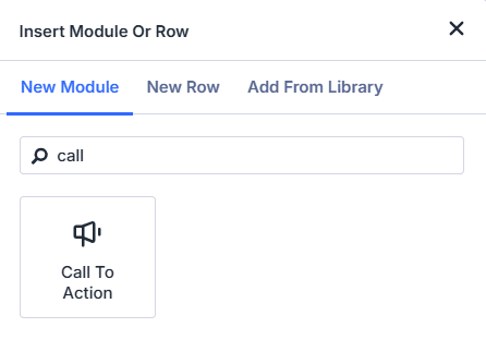
Next, set up the essentials:
- Title: Write a headline that grabs attention. Offers in headlines perform up to 38% better – think Get 20% Off Today instead of Learn More.
- Body text: Add a short, clear message that supports your headline and explains the benefit.
- Button text and URL: Use action-oriented text (Start Now, Get My Guide) and set the destination link. The button won’t show unless you add a URL. Here’s one we made earlier!

Each element drives conversions. The headline hooks readers in, the body builds interest, and the button channels action. Select Save, then preview your CTA to see it in action.
Divi Call to Action customization options that convert
Divi Call to Action customization includes visual and functional options to improve CTA performance. Once your basic CTA is in place, it’s time to give it a polish! Here’s a taste of what you can achieve:
- Background images and videos: A background image or video sets the mood and context for your offer. In the Content tab, add a relevant image or video that reinforces your message. For example, a product shot or a subtle pattern can make your CTA more eye-catching without getting in the way of the text.

- Custom button styles: Your button is the star of the show. In the Design tab, enable Use Custom Styles for Button. Change the button color, font, and size to match your brand, and make it impossible to miss! Add a hover color for interactive feedback. Consider a bold border, rounded corners, or even a shadow for extra flair.

- Borders and spacing: Don’t let your CTA feel cramped. Use the Spacing section in the Design tab to add padding around your text and button, ensuring everything breathes. Borders can help define your CTA area, so try a contrasting color or subtle radius for a modern look.
- Filters and animation: Add animations or hover effects to draw the eye. In the Design tab, explore the Animation section – fade-ins, slides, or bounces can make your CTA feel dynamic. Filters like brightness or blur can help your text stand out against a busy background.
- Text styling: Adjust fonts, colors, and alignment to match your site’s branding and vibe. Use a bold headline and a clear, readable body font. Centered or left-aligned text works best for most CTAs, but experiment to see what fits your design.
Strategic placement of Divi Call to Action elements
Where you place your Call to Action can make or break your conversion rates. Research from Nielsen Norman Group shows that 57 to 80% of user attention is focused above the fold – the part of your site visible without scrolling. Placing your primary CTA here ensures it’s seen by the most visitors, right when their attention is highest.
The primary-secondary-tertiary CTA structure is a proven landing page approach using three strategically placed call-to-action elements.
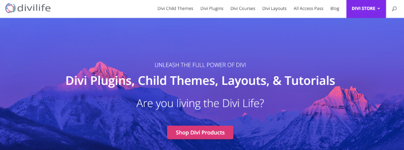
Start with a bold, high-contrast CTA above the fold, like the eye-catching button on our Divi Life homepage. This is your main offer, and it should be impossible to miss.
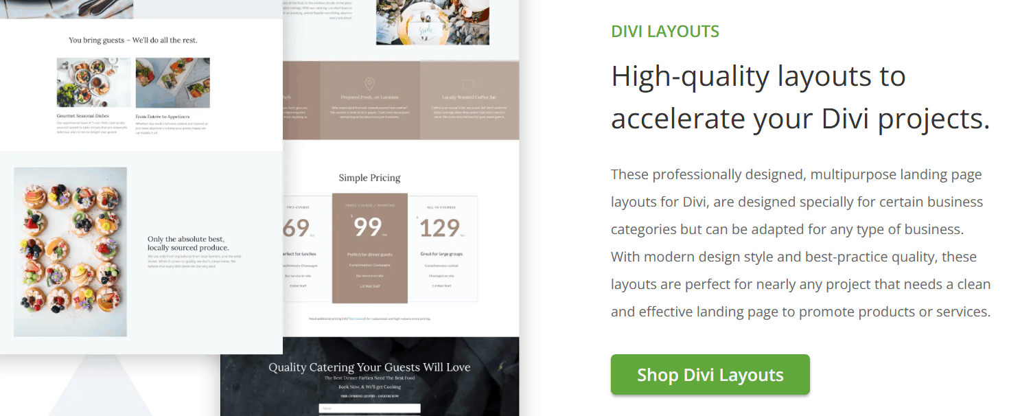
After you’ve explained the benefits or features, drop in a secondary CTA mid-page. This catches users who want more info before acting. The above example links to a product category, with prior info given so users know precisely what they’ll find when clicking.

Finally, place a tertiary CTA at the very bottom. In the above example, we’ve saved our biggest – and best – offer till last.
The recency effect means the last thing visitors see often stays with them. This final CTA is intended for those who read everything before making a decision. Using the Divi Life examples, we’ve provided clear links to our main product page, individual product pages, and our all-inclusive bundle. Over the duration of the page, users can see exactly what we have to offer
You can also add CTAs to your Divi menus and headers. Use contrasting colors and extra white space to make these stand out, but don’t obstruct your navigation. For example, a Book Now button in the menu, styled with a bright background and rounded corners, draws the eye without disrupting flow.
Contextual CTAs boost engagement even further. Place service-specific CTAs after describing each service – think Request a Free Quote after a service summary, or check out the example below:
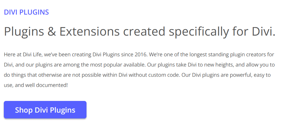
“Add a CTA after testimonials to make the most of social proof, nudging users to act after reading real success stories. Directional cues, like arrows or images of people looking toward your button, can subtly guide attention right to your CTA.”
– Jennifer Rodriguez, Lead Designer at Divi Life
Effective placement matches your CTA to user intent at every stage. With Divi, you can easily add modules wherever you need them, so your offers are seen and acted on.
Troubleshooting common CTA issues: Fixing visibility and responsiveness problems
Even the best-designed CTA can fall flat if it’s not visible or doesn’t work across devices. Here’s how to tackle common issues and keep your CTAs performing everywhere.
- CTA not appearing: If your module isn’t showing up, double-check that you haven’t disabled it for certain devices in the Visibility settings. Conflicts with overlapping elements or custom CSS can also hide CTAs. Try moving your module to a different row or disabling custom code to isolate the problem.
- Contrast problems: If your button text or background blends in, adjust the color settings in the Design tab. Use high-contrast colors for text and backgrounds. If you’re layering a background image, add a semi-transparent overlay to boost readability.
- Content cut-off or overflow: If your CTA content gets clipped, check the sizing and padding. Remove any fixed height settings in the Sizing tab, as these can cause display issues, especially on mobile. Use percentage-based widths for better scaling.
- Background images not displaying: If your background image isn’t showing, ensure it’s set in the module or row background settings. If you’re using both a background color and image, remember that the image will cover the color unless you add transparency.
- Responsive design issues: CTAs that look great on desktop may break on mobile. Use Divi’s responsive editing options – adjust font sizes, button alignment, and spacing for each device. The responsive preview tool lets you test your design across devices before publishing.
Quick fixes:
- Remove fixed heights in the Sizing tab.
- Adjust padding and margins for each device.
- Use percentage widths, not fixed pixels.
- Check the z-index if your CTA is hidden behind other elements.
- Clear your site and browser cache after making changes.
Enhancing your CTAs with Divi Overlays: Create popup CTAs for higher conversions
Divi Overlays is a plugin that creates popup call-to-action elements using the Divi Builder. Static buttons are fine, but popups grab the attention like nothing else. They can appear when users are most engaged or about to leave, making them far more likely to convert than a lifeless button buried on your page.
With Divi Overlays, you can simply design your popup just like any other Divi section, row, or module, then trigger it with clicks, time delays, scroll percentage, or exit intent.
As all design happens in the Divi Builder, you can use any module, like forms, videos, images, buttons, or even entire layouts. This makes your popups as flexible and branded as the rest of your site. Here’s how to create a basic popup CTA with Divi Overlays:
1. Install and activate Divi Overlays.
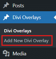
2. Go to Divi Overlays > Add New Divi Overlay from your WordPress dashboard.
3. Design your popup using any Divi modules – add a headline, supporting text, and a bold CTA button.
4. Go to Divi Overlays Settings on the same page, and customize the popup effects you desire. Set your trigger: choose click, time delay, exit intent, or another option. Publish your overlay.
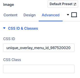
5. Copy the Menu ID of your overlay – you can find this in the page’s Divi Overlay Settings, and it’ll look something like unique_overlay_menu_id_987520020. To add your triggered popup to a page, go to that page and open the Divi builder.
If you want your overlay to popup mid-scroll, add the Menu ID via Page Settings > Advanced > CSS ID. If you want to trigger your popup via a click, go to the module item of your desired trigger point (e.g. an image or button) and add the code there. In the example below, we’ve added our trigger to an image. Save changes.
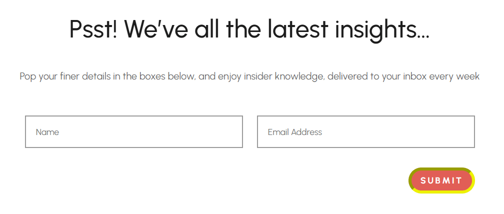
6. Preview and test your popup. We’ve given our basic newsletter sign-up popup an eye-catching button, mellow background, and clear exit path.

Effective Divi Overlay use cases:
- Email signup form after a user scrolls halfway down a blog post (see above example).
- ‘Special offer’ popup triggered when exit intent is detected.

- Featured product with a popup for more info, no page reload needed.

- Lead generation form after a user spends 30 seconds on a high-value page.

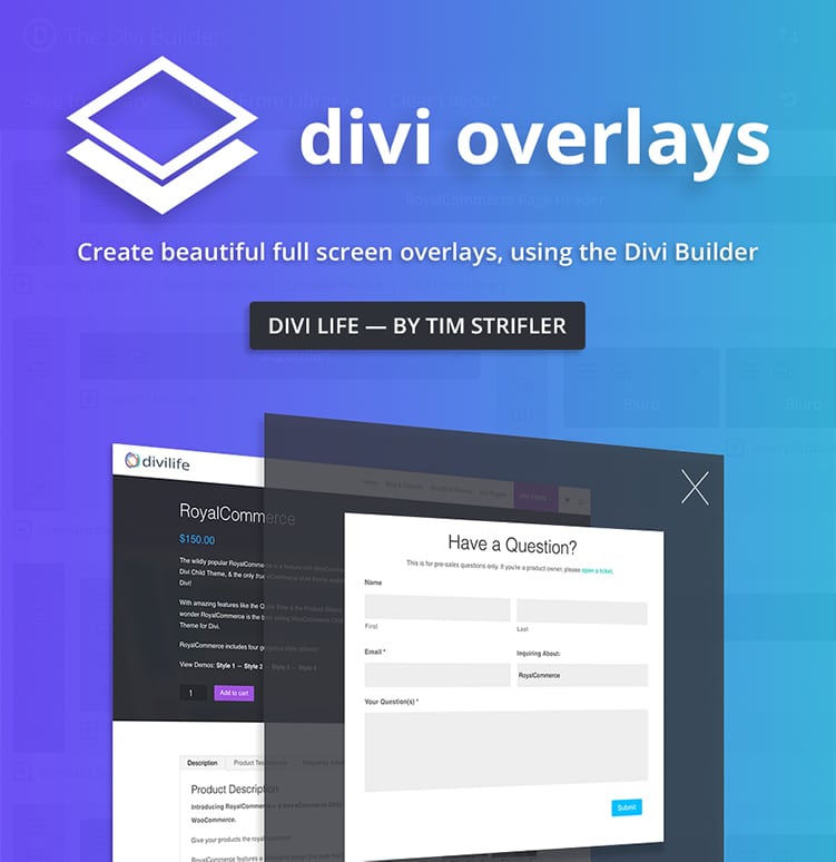
Do More With Divi Overlays!
Divi Overlays is the original popup builder for Divi, & remains the most powerful, most popular, & easiest to use popup builder for Divi! Easily create gorgeous, feature-rich popups! 😍
Divi Bricks: Pre-Built CTA sections that are designed to convert
Divi Bricks are pre-designed, conversion-optimized CTA sections built for the Divi Builder. Designing a high-converting CTA from scratch takes time and experience, so you can make a headstart by using Divi layouts and library items. With Divi Bricks’ layouts, you get proven design, smart placement of elements, and best-practice conversion principles baked in from the start.
Professionally designed CTA sections save hours and are tested for what works – strong headlines, clear buttons, and layouts that guide the eye. Even better, you can easily tweak colors, fonts, and images to match your brand, all the while keeping the conversion-focused structure intact.
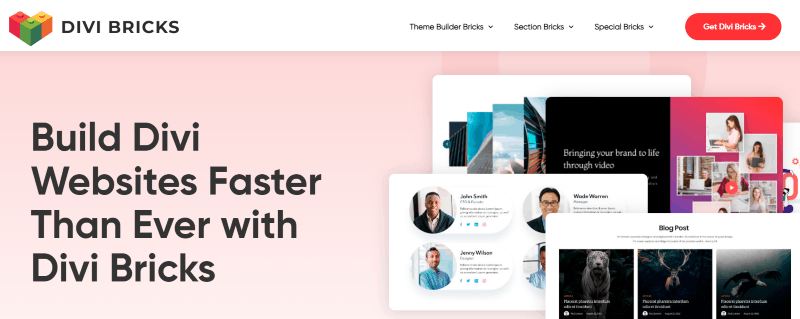
Our Divi Bricks’ layouts take this approach to the next level. Think of it as a massive library of expertly crafted ‘bricks’ that you can drop into your pages. With over 1,000 layouts – including 30 dedicated Call to Action sections – you can mix, match, and customize to fit any landing page, sales funnel, or blog post. Each CTA section is designed to prompt action, whether it’s signing up, booking, or buying.
Examples of Divi Bricks CTA sections include:
- Bold hero CTAs with a headline, subheading, and button.

- Split-section CTAs with an image on one side and text on the other.

- Minimalist CTAs with lots of white space for maximum focus.

- Testimonial-driven CTAs that add social proof right above the action button.

To import, simply add your chosen brick to the Divi Library, insert it into your page, and customize as needed. Divi Bricks lets you build faster, look polished, and keep your CTAs laser-focused on conversion.

Save Time With Divi Bricks!
Like LEGO bricks for your website: Divi Bricks includes thousands of section layouts (aka "bricks") that you can use to mix & match while building Divi websites.
Take your Divi CTAs to the next level
You’ve seen how strategic placement, smart design, and troubleshooting keep your CTAs visible and effective. The standard Divi CTA module provides a solid foundation, but conversion challenges like low click-through rates, buried offers, or a lack of urgency call for more powerful solutions.
Divi Overlays lets you create pop-up CTAs that grab attention at the perfect moment, while Divi Bricks gives you a library of proven, conversion-focused sections you can drop in and customize fast. Both tools help you create more strategic and effective CTAs, so you spend less time tinkering and more time enjoying the results.
If you’re ready to boost your conversions and improve your workflow, explore Divi Overlays and Divi Bricks today! Or, for the ultimate toolkit, check out our Divi Life All Access Pass and unlock every resource you need to realize your site’s potential.

The Ultimate Divi Toolkit 🚀
The Divi Life All Access Pass membership is a complete Divi toolbox with all the Divi plugins, child themes, layouts, & templates you'll ever need to create incredible Divi websites.
Table of Contents
- How to set up your first Divi Call to Action module
- Divi Call to Action customization options that convert
- Strategic placement of Divi Call to Action elements
- Troubleshooting common CTA issues: Fixing visibility and responsiveness problems
- Enhancing your CTAs with Divi Overlays: Create popup CTAs for higher conversions
- Divi Bricks: Pre-Built CTA sections that are designed to convert
- Take your Divi CTAs to the next level


0 Comments